Today is the day of the AMA!

The new app design has been out for a week, and most of you have had a chance to get used to the new UI.

Some of you might have questions when you have had a week to get to know the new Sonos App interface. Because of that, we want to give you all a chance to ask some of the people who were integral in its creation and design, the questions that have come to mind while you have used the app.

As we mentioned in the event.

Our panelists will be:

  • Diane Roberts, Senior Director of Software Development
  • Kate Wojogbe, Senior Director of User Experience
  • Tucker Severson, Director of Product Management

It will be hosted on the 14th of May from 11:00 until 14:00 GMT -07.

But instead of me telling you what they do and what their role with the app update has been, here are their own introductions:


Diane

Diane Roberts is the Senior Director of Software Engineering and Product Management at Sonos responsible for the Sonos Apps. Her group of cross-disciplinary teams build Configuration, Control, and Content experiences on a foundation of Core mobile application technologies. She received dual Bachelors’ of Science in Computer Science and Music from WPI. Diane holds 6 granted patents as a co-inventor.


Kate

As Senior Director of User Experience, Kate leads the UX team responsible for Sonos’ home audio hardware, software, and app user experiences. This includes user interfaces on speakers and soundbars, setup for hardware and services, first and third party content experiences, and a variety of methods of control of the Sonos system. Kate graduated from the University of California Los Angeles with a Bachelor of Arts degree in Design.


Tucker

Tucker Severson is the Director of Product Management and leads the PM team responsible for the Sonos Apps. Tucker received his BA from Bates College and his MBA from the University of Vermont.


We will do our best to answer as many of your questions as possible within the 3-hour window, but we can’t promise to answer every question, especially those you know we can’t discuss.

But if we see a question repeated or a reply getting a lot of likes, don’t worry. We will prioritize those to ensure that many people get the answers they seek.


Remember, we can’t talk about things on the roadmap - but if you have questions or feedback about the app redesign, want to know more about our panelists, like their background or favorite band, then the sky is the (cough cough.. NDA) limit!

Thank you, everyone, for participating. We covered as many of the most asked questions as possible. We know tracking the responses wasn't as easy as we had hoped. But we wanted to let the community air frustrations and have their questions answered.

I got a lot of DMs during the AMA, and I will be sure to answer them when I can. Thanks for reaching out!

Keith and I will work on recapping all the questions and feedback we have responded to, and we will update the post here when that is complete. If we didn't get to your question, don't worry. Keith and I are grabbing all the feedback from this thread, even the things we didn't respond to, and ensuring the right people will see the message. This was the first time we created a live AMA in the community, and we learned a lot for future AMAs.

We appreciate all the feedback and questions you gave through this AMA. It helps us understand your most significant feedback and your reasoning. We hear you, and we will ensure the right teams get your feedback. They are listening.

We look forward to rolling out the updates with features (new and old) as soon as they are ready. Keith shared an overview of the timeline for expecting these features to return to the app. Today was the first update, reintroducing alarms and improving the iOS voiceover.

We look forward to seeing your reactions to our future app developments. We hope you all appreciate the work our developers are putting into making the app as fast and easy to use as possible for the general user.
​​

Am I going to be reading about this AMA on the tech news tonight? Yes. 
 

don’t upvote this


Why was the new app released when the overall quality, reliability and performance is so poor?


1. Widgets are gone. Sonos no longer supports it at all. CS told me S2 is supposed to be superior but that's false. Missing functionality is not superior.
2. Volume numbers are gone. I rely on this because the TV doesn't show it. The app and widgets both had it. Again, missing functionality is not superior. The website shows the volume numbers so it's inconsistent on the app.
3. Additional settings won't ever load. It constantly just says "Unable to load. Some information is missing from this content." It's as if the devs never tested it. Missing functionality.
4. New app just has bad UI. No scrolling for a library? Do your devs even listen to music? Most people who buy Sonos are audiophiles. They have huge libraries.
5. Family members are being removed from their devices. The update is not doing permissions correctly.

Was any thought given to iPad (and tablet) specific app features.  The iPad is a step back in usability.  Especially in terms of a controller as something that replaces the CR100/200 that no longer work.


The new app feels a lot more like spotify or apple music, but less about servicing an existing local library.


Are the podcast interfaces going to be fixed?

Episode position no longer syncs between Pocket Casts and Sonos, but I listen to podcasts in the car and on walks in addition to Sonos, and now I can't easily pick up where I left off in an episode.

Episode lists in the app no longer show the date and the episode progress for each episode. I use that info daily when figuring out which episode I want to listen to.

Honestly it felt like Sonos could do more with podcast integration even with the old app. E.g. there were no episode descriptions, I couldn't search for a particular episode, I couldn't see a list of episodes I have downloaded. I'd like to see more improvements with podcast functionality in general.


In the mobile app I'm unable to select any local library items from within my favourites lists. Why is that?

I can select from favourites in the web app.


Release the app separately so people have the option to choose until the new version is completely baked.


Why have you picked such a ridiculous way for people to feedback their concerns and issues? Its on like 8 pages how do I see pertinent replies? Just another fiasco in the latest Sonos saga 


What are the major n benefits we should ultimately get with this new app?


Where’s the AMA??  Link?  Is this echo chamber the actual AMA???


When it comes to design language, Sonos is no different than what everyone else is doing - but I would be much happier if the user experience was tailored by platform, rather than trying to make the app work and behave the same across every platform. Not every platform behaves the same or uses the same conventions - so why make the user have to adjust to the app instead of the app adjust to the platform the user is familiar with and has bought into, likely because it is what they like (at least in the case of iOS). 

The iOS app should feel like an iOS app. It should have the homebar at the bottom to move between a tabbed interface (same as is done in Photos, Music, Slack, Notes, Clock, Facebook, almost any app on iOS). It should have the quick scrolling bar along the right for long lists to make it easy to scroll by letter. This has been part of iOS since the first iPhone. 

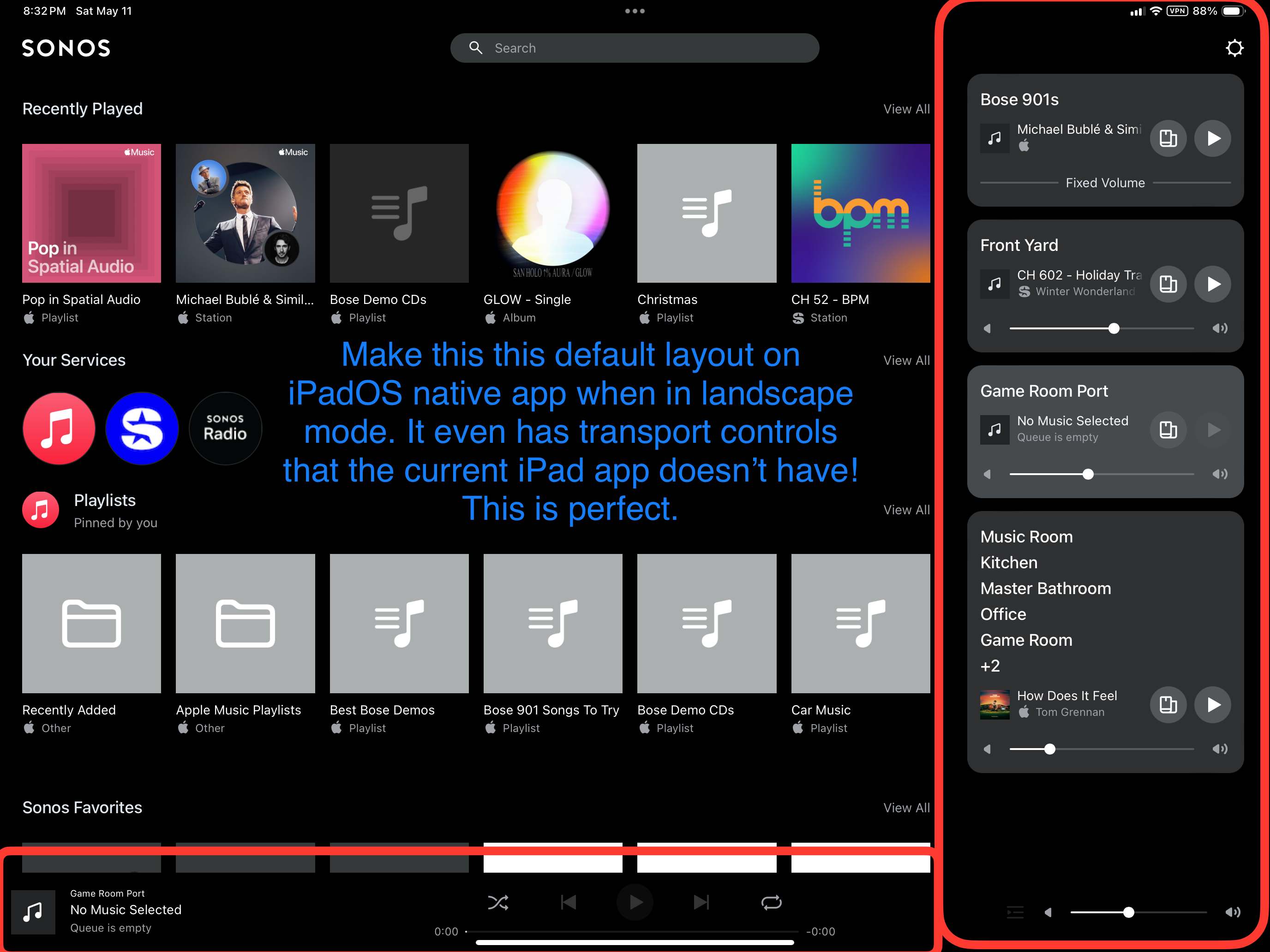
The iPadOS version should be in alignment with the iOS (iPhone) version, but take advantage of the larger screen of the iPad. For example, when the iPad is in landscape mode (as I have my wall mounted iPads) the left side should be the users music services / library, and the right should be the list of all of their Sonos devices / groups - just like the new web app. In fact I would use the new web app as my primary interface on iPad if it weren’t for the latency that is a fact of web apps not performing local control. The delay between adjusting the volume and it actually changing through the web app is a dealbreaker currently - as well as lack of group “presets” that the app supports. Native software will almost always be better. Let’s make the Sonos web app UI the standard UI on the native iPadOS app.

I understand it is both cheaper and easier to write the code once and run it everywhere, but that doesn’t provide the best software user experience. And it also means that more often than not you are limited from taking advantage of all of the features unique to each platform. For iOS, adding support for features like Widgets, Siri, Shortcuts and more would make Sonos standout and software leader for home audio.


I thought this would be an AMA similar to reddit and other platforms. Where are Kate, Diane and Tucker?

Will there be an introduction? Is the moderator online?


I understand those responsible for this screwup not wanting to face the actual users, but this non-event is incredibly disappointing.


It is now 11:15 and no link for the event. Is this even going ahead?


A one-way phone call.  Can somebody from Sonos please pick up the other receiver and talk to us?


If this is just a forum discussion, why is it timed? Why couldn't I supply my question beforehand and you then pick the most asked questions? This event is the same desaster as your release and I'm beginning to think that you people have no idea about anything... 


Is there a reason that the 16.1 version of the app has not been released as a separate option for people to use while functions like queuing are being coded into the new app?


I just want to say there has been allot of negativity surrounding the new app launch. I just want to say the app is fantastic. I've been using it everyday since it came out last week. I know there is some future additions coming in the next weeks and will just be patient with the future roll out. Thank you Diane, Kate, Tucker, and the rest of the Sonos development team for everything you do. 

This is a joke - correct? We should be patient while we wait to get back to where we were? 


What data did you draw on to justify this new design? Was there any information architecture analysis done? Was there any investigation at all, like user interviews, analytics, usage data, etc?

The marketing materials tout “no more tabs” as a selling point, but for me it’s one of the biggest UX regressions. The new home screen is worse than useless; it’s just a new barrier between me and the favorites screen, which is by far the most common place I’m trying to go in the app besides the now-playing screen.


anybody want to buy some sonos speakers, sound bar and base bin? I’m so disappointed! Especially after bragging about my new, accessible sound system for the last year. I’ll never purchase a Sonos product again!


Question/suggestion with regard to the web app…. 

I do like that you have introduced a web app as it makes it easier for me to control my system from more platforms (e.g. Linux). However, I don’t like that the system owner’s Sonos.com account is required to use the web app. I don’t want to give my Sonos.com account credentials to everyone in my household as a) it would essentially be giving them full admin control over the system if they use it with the mobile app and b) means there is greater chance of my Sonos.com account credentials being accidently leaked.

Therefore please add in the ability to use the web app without the system owner’s Sonos.com account credentials. I don’t know the best way to achieve this, but here are a couple of options you might want to consider

  1. Facilitate a way to enable the web app to connect to the Sonos system on the local network without signing into any Sonos.com account (like is possible with the mobile apps). Perhaps through a browser extension?
  2. Provide ability for system owner to create one or more additional non-admin accounts associated with the system which can be handed out to others who want to use the web app. This could also essentially facilitate user profiles (which could enable each user of a system to have their own individual Sonos favourites lists; lack of which is a current weakness).  

Pre-release, Sonos stated: “We've taken great care to ensure that this update only enhances your Sonos experience. Your products, features, and services will work as they always have, and all your settings will be saved."

How can we trust your word in the future if you haven't even apologized for what could charitably be characterized as an exaggeration?


So uh, where’s the link to the AMA?


Can we spend just a second talking about how local music support is gone? Can we expect this basic feature to be restored with the May update?


Where is the link?  How can we listen?