
IOS vs Andoid app design of the new app UI


Forum|alt.badge.img+2
  • Avid Contributor I
  • 37 replies

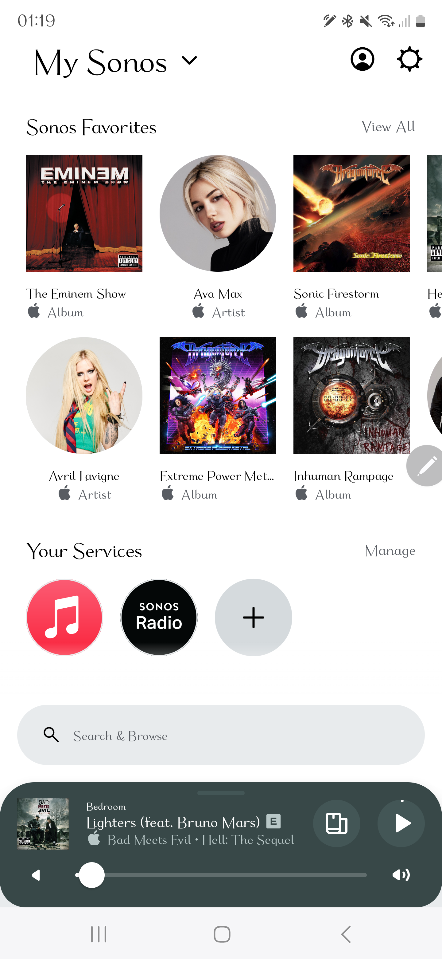
It looks to me like the new app was actually designed and built for IOS. Corners of surfaces/views are far to rounded, theres no navigation drawer, no toolbar, no bottom, sheet, snackbar, floating action button etc standard UI components that Android users are use to. Anyone else on Android feel this way?

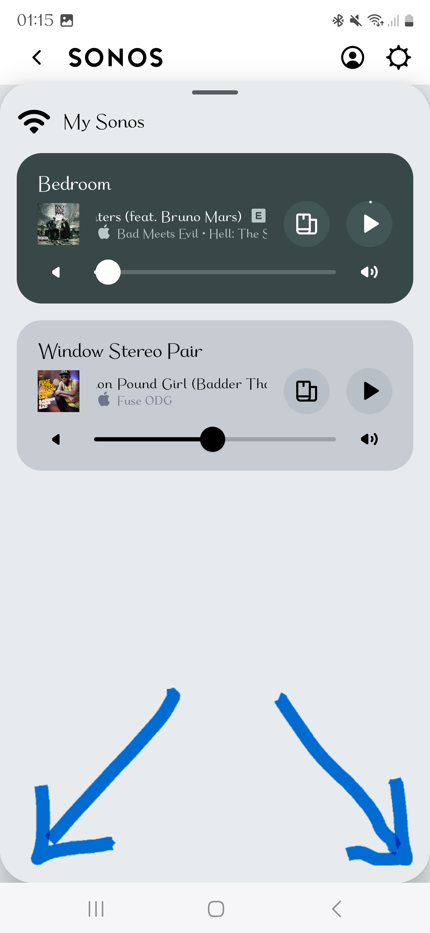
Also some of the design choices are weird, the mini player/now playing screen bottom corners are rounded they should be straightned out so they blend in to the navigation bar, and why the mix of circles and square images looks awful to me especially in grids.


Did you find what you were looking for?
This topic has been closed for further comments. You can use the search bar to find a similar topic, or create a new one by clicking Create Topic at the top of the page.

5 replies

Forum|alt.badge.img+2
  • Author
  • Avid Contributor I
  • 37 replies
  • May 28, 2024

Keep comments on topic, no mentioning of bugs here


  • Prodigy I
  • 212 replies
  • May 28, 2024

What the heck is a snack bar?  And, where does that serif font /typeface come from? 


Forum|alt.badge.img+2
  • Author
  • Avid Contributor I
  • 37 replies
  • May 28, 2024
Greenland wrote:

What the heck is a snack bar?  And, where does that serif font /typeface come from? 

Its a design component for Android, similar to a toast message but interactive although tbh its rarely used because its not as useful as the other stuff i mentioned, has anyone noticed the text alignment azwell, albums are left aligned were as artists are center aligned, items in a grid should all be aligned the same way.

look at these 2 screenshots one shows what i see (on android) when i long press on an artist or album, the other shows how sonos did it. Why does the layout need to take up that much space? this is used in multiple areas and its exactly the same it almost takes up the full screen. Is it the same on an ipad? surely its not. The other screenshot shows a better way to do it, thats called a bottom sheet.

and thats a system font btw


Bumper
  • 1767 replies
  • May 28, 2024

I’m  having a hard time following what you are saying as your serified font is distracting my brain 🤣 Also Apple Music on Android, didn’t know such a thing existed  TIL

if I get the gist of what you are saying, you think the bottom picture is not as good because it covers the screen? I agree with you but for me it’s because  the menu items on the other one  are  near the bottom and I can hit the function with my thumb one handed. While I guess this is the new context menu default in the app. I don’t think it’s an iOS thing, as other apps like Apple Music doesnt do it in iOS  


  • Lyricist II
  • 4 replies
  • June 28, 2024

Another difference is that, at least for me, the android app (on various devices) fails to show Recently Played and Sonos Favorites after a few seconds (initially displays but then shows light gray boxes).  Strangely, no problem like this with the ios app on an iPad, so this seems like an app issue, nothing wrong with my system/network.  Sounds like Sonos prioritized ios.


Cookie policy

We use cookies to enhance and personalize your experience. If you accept you agree to our full cookie policy. Learn more about our cookies.

 
Cookie settings