Hello,

I am very new to all this. I have a Sonos Arc, Era 300, and Sub. I have installed the Sonos app. 


My music streaming services are the following: Qobuz and Tidal.

I mostly use Qobuz. I only listen to HiRes albums. Nonetheless, my ignorance comes to the topic of how to play HiRes music with my Sonos system.


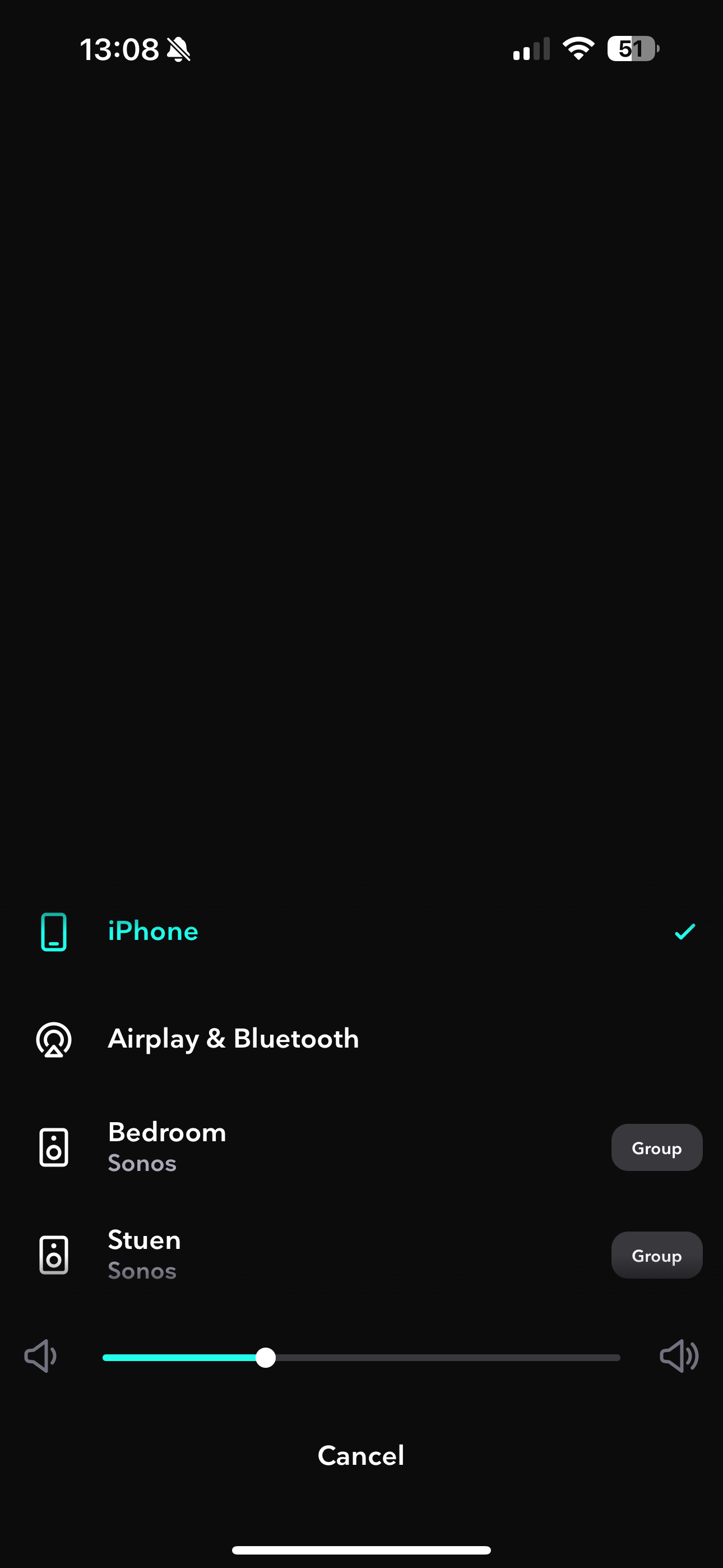
Thus, how to play HiRes with the Sonos? Do I just use Airplay when I am on the Qobuz or Tidal app, or alternatively select the Sonos system directly (which is called ‘Stuen’ in my case, please check the attached image)?


Or to play HiRes with the Sonos system, do I have to use the Sonos app and play directly from there? I am not sure which option makes sure that the system plays HiRes.  
 

For many tech users Apple is the gold standard for “easy”. Apple likes sparse screens because if there are few options visible it must be “easy”, right? Personally, I don’t like to be endlessly digging down before I can accomplishing anything. Displaying the bit rate and such would make the screen seem more “complicated” for some users and I think that SONOS is trying to attract “easy” types. I have no proof, but I’ll bet a lot of Apple expats or staff that went to the same classes as the Apple designers work for SONOS.

An interesting option, if the user digs down enough, would be to enable “complicated” screens for tech types. Or there could be a second “hard” controller. I think the chance of either scheme being available at some point is less than zero.

I am also a fan of more minimal screens and I think Sonos has it about right in the new app. As does Apple, as you say.

All I’m thinking is an option - like your ‘complicated’ suggestion but not complicated. The screen shot above is still pretty pared back even with track metadata…

One way to think of it is if I am paying for a high res service I want to see evidence i am getting it


I am also a fan of more minimal screens and I think Sonos has it about right in the new app. As does Apple, as you say.

All I’m thinking is an option - like your ‘complicated’ suggestion but not complicated. The screen shot above is still pretty pared back even with track metadata…

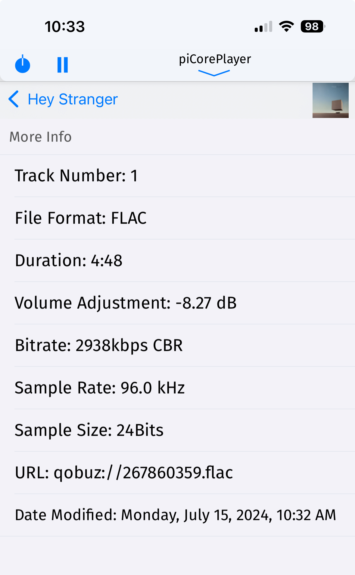
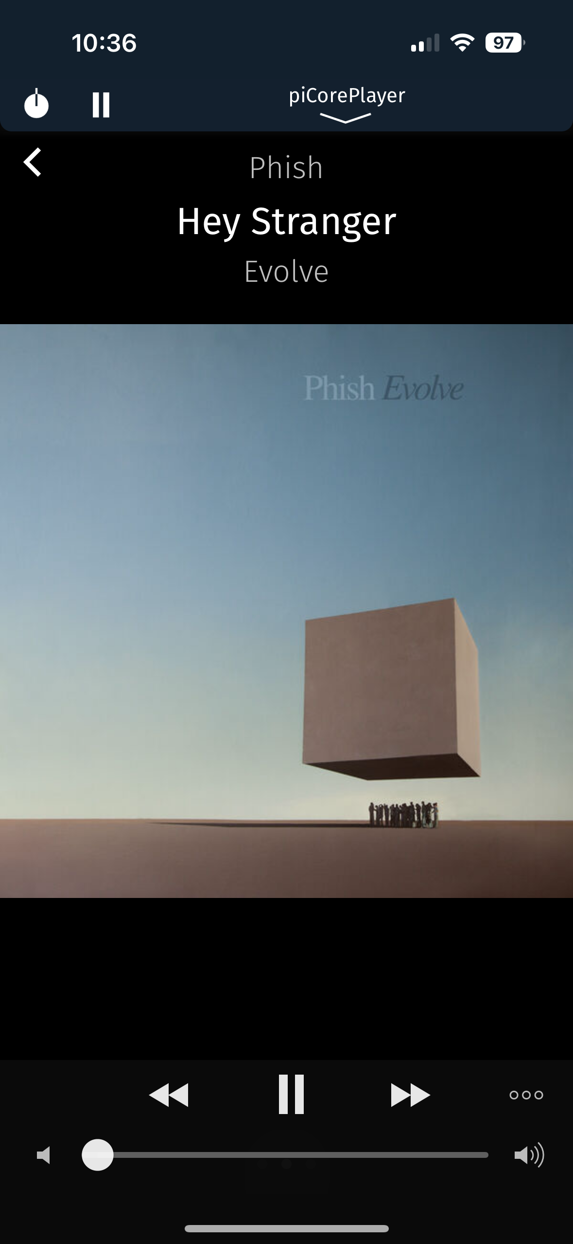
Yeah it could be as simple as the info is hidden in a context menu. Here’s how it’s done in an open source player

 Now playing view


Yes, that.