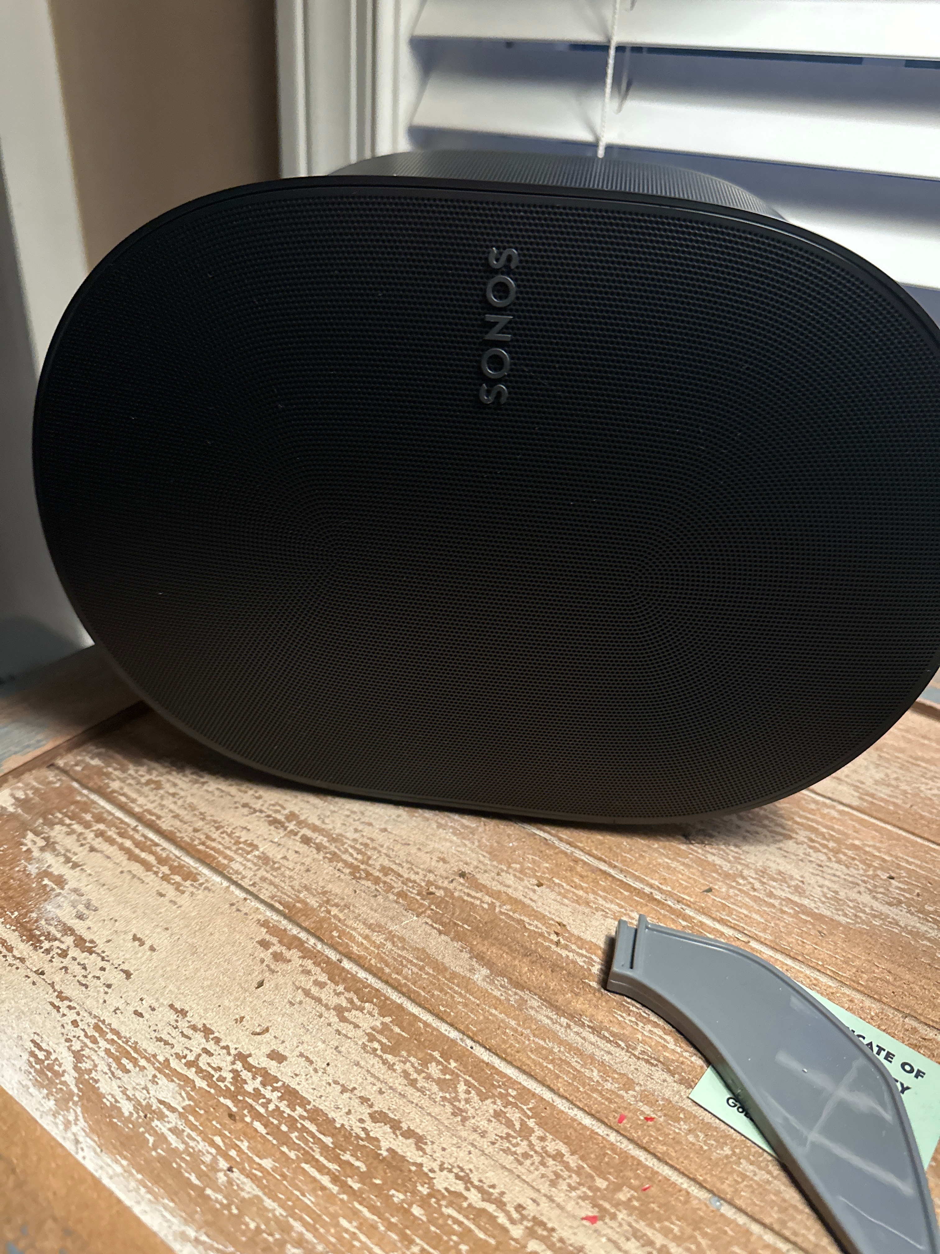
Sorry but the SONOS badge on the 300….cringe. Maybe if you could have the speaker vertical it would be ok. Seems this one the badge is disproportionate….guess I’m used to looking at my fives….whatya think? Meh, I will get over it.

Sorry but the SONOS badge on the 300….cringe. Maybe if you could have the speaker vertical it would be ok. Seems this one the badge is disproportionate….guess I’m used to looking at my fives….whatya think? Meh, I will get over it.
Enter your E-mail address. We'll send you an e-mail with instructions to reset your password.