This topic has been closed for further comments. You can use the search bar to find a similar topic, or create a new one by clicking Create Topic at the top of the page.
Yes, the ‘slide-screens’ are making appearances in quite a few updated iOS Apps - seems to be the new design, in place of tabs.
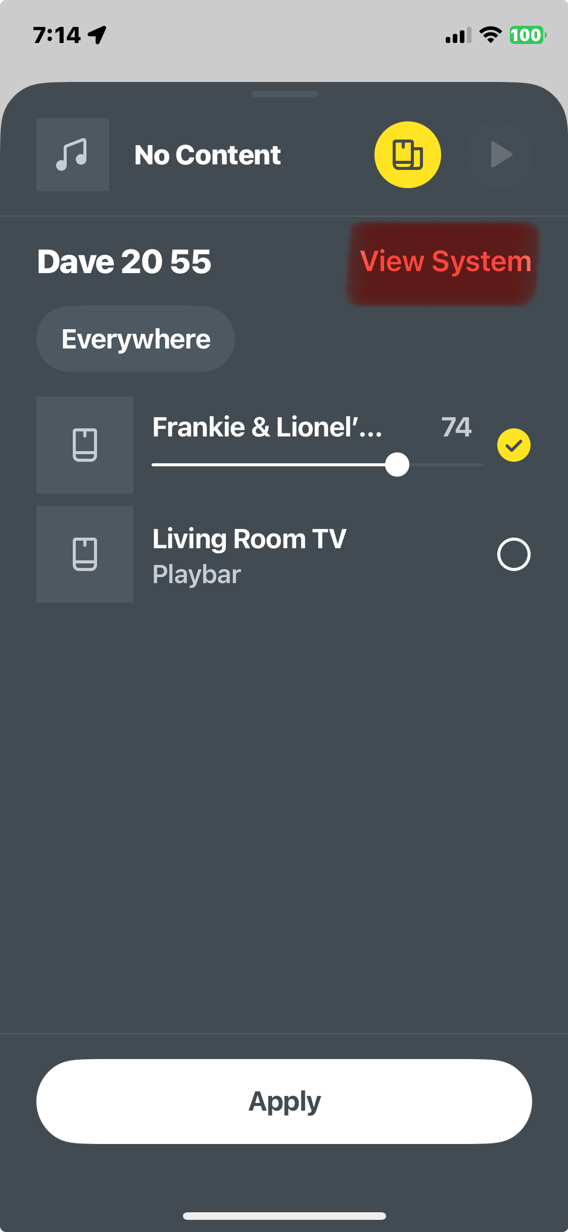
I’m okay with the new Sonos App, it works fine here with my setup. I prefer the phone App compared to the tablet App, but my ol’ peepers 👀 prefer the larger display these days. I would like to see some of the tablet screens/overlays fit better on screen in some areas, (eg. Now playing and queue playlist screens), as shown in the attached.
The App seems to be (better) designed for the smaller phone display.