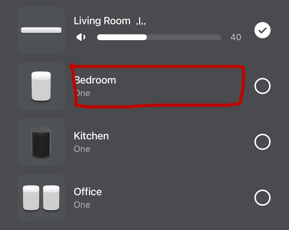
I wanted to share some feedback regarding the speaker selector and grouping panel in the app. I am using the latest version of the Sonos app on iOS (88.1.9).
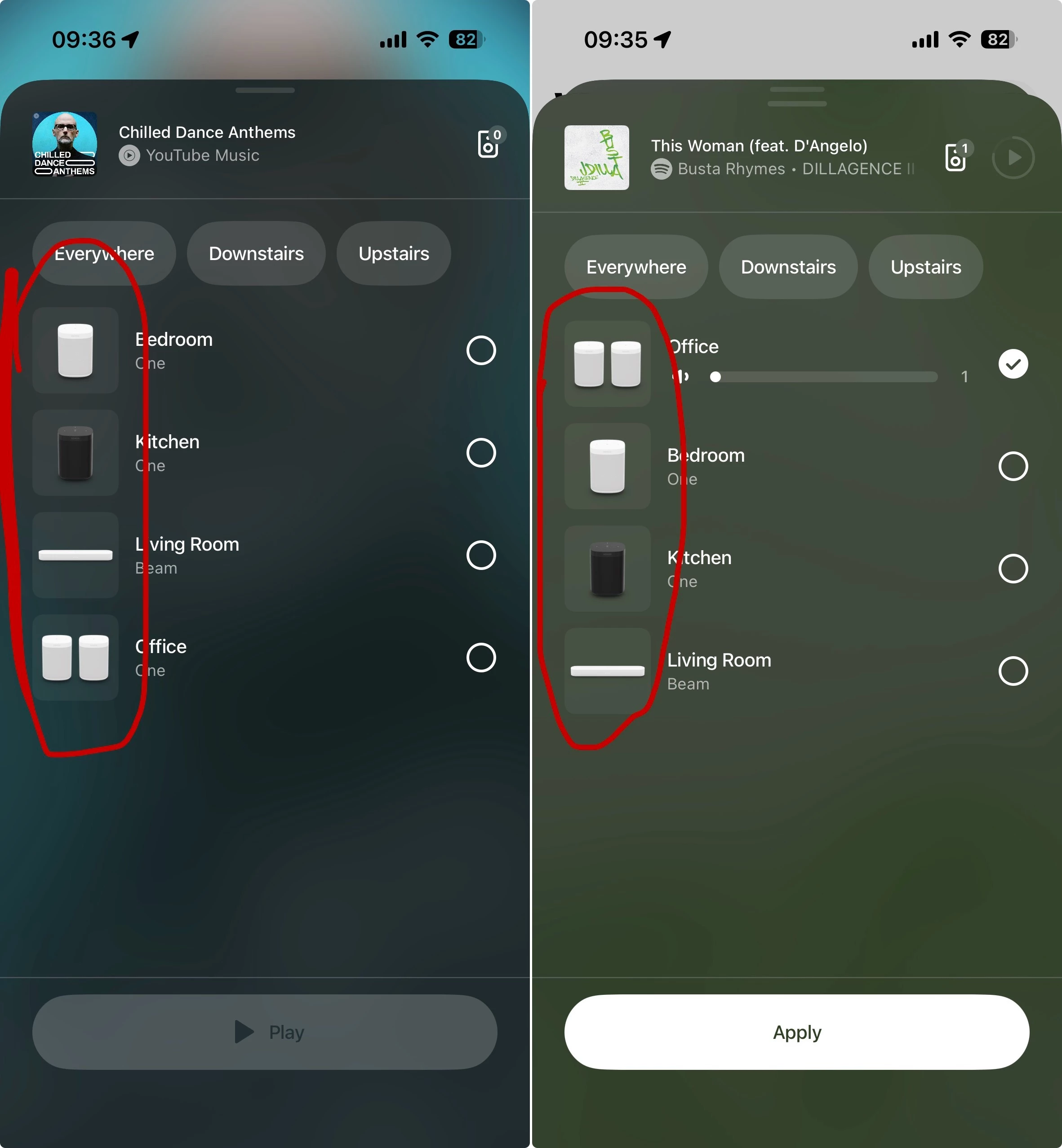
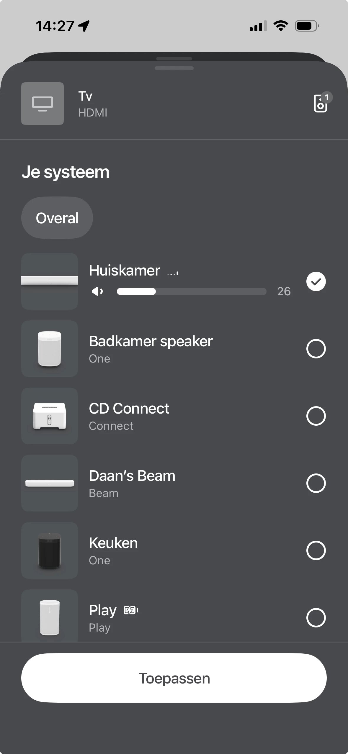
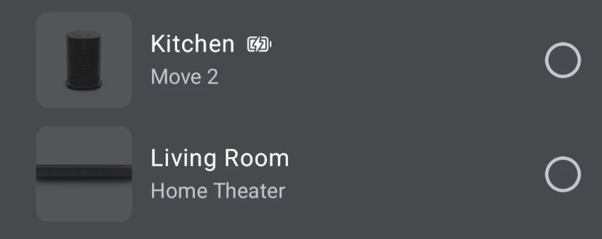
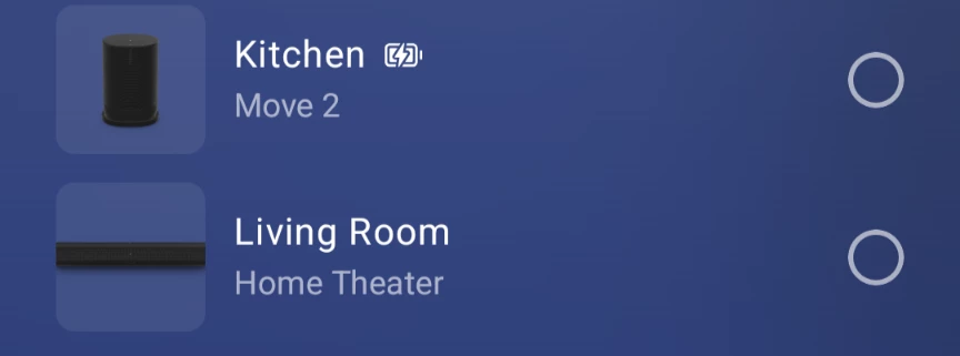
If you look at the screenshots attached below, I’ve highlighted the device pictures on the left side of the room list. Tapping on any of these speaker icons acts as a shortcut that immediately opens the settings menu for that specific device.
This has a couple of friction points:
-
Lack of visual indicators: There is no UI cue (like a gear icon) to suggest these images are interactive touch targets that lead to a completely different menu.
-
Accidental navigation: Because these icons sit directly next to the main room selection area, it's very easy to misclick and be taken into the Settings panel. And then backing out of this Settings panel puts me back on the Home Screen, rather than returning to where I was on the speaker selection panel. So when I'm trying start playback on a speaker, or group rooms, a slight mis-tap instantly pulls me out of the playback flow and into the device settings.
-
Context mismatch: The existence of this shortcut doesn't make sense to me. As I’m in the middle of selecting speakers for playback or adjusting the grouping, it’s unlikely that I’d want to jump into device settings at that exact moment.
It would be a great QOL improvement if the team could rethink this - perhaps either add a clear visual indicator that these icons lead to settings, or remove this shortcut entirely to prevent accidental taps during room selection.