Sonos app feedback: Issue with hidden settings shortcut when selecting speakers

  • September 5, 2026
  • 16 replies
  • 105 views

Forum|alt.badge.img+4

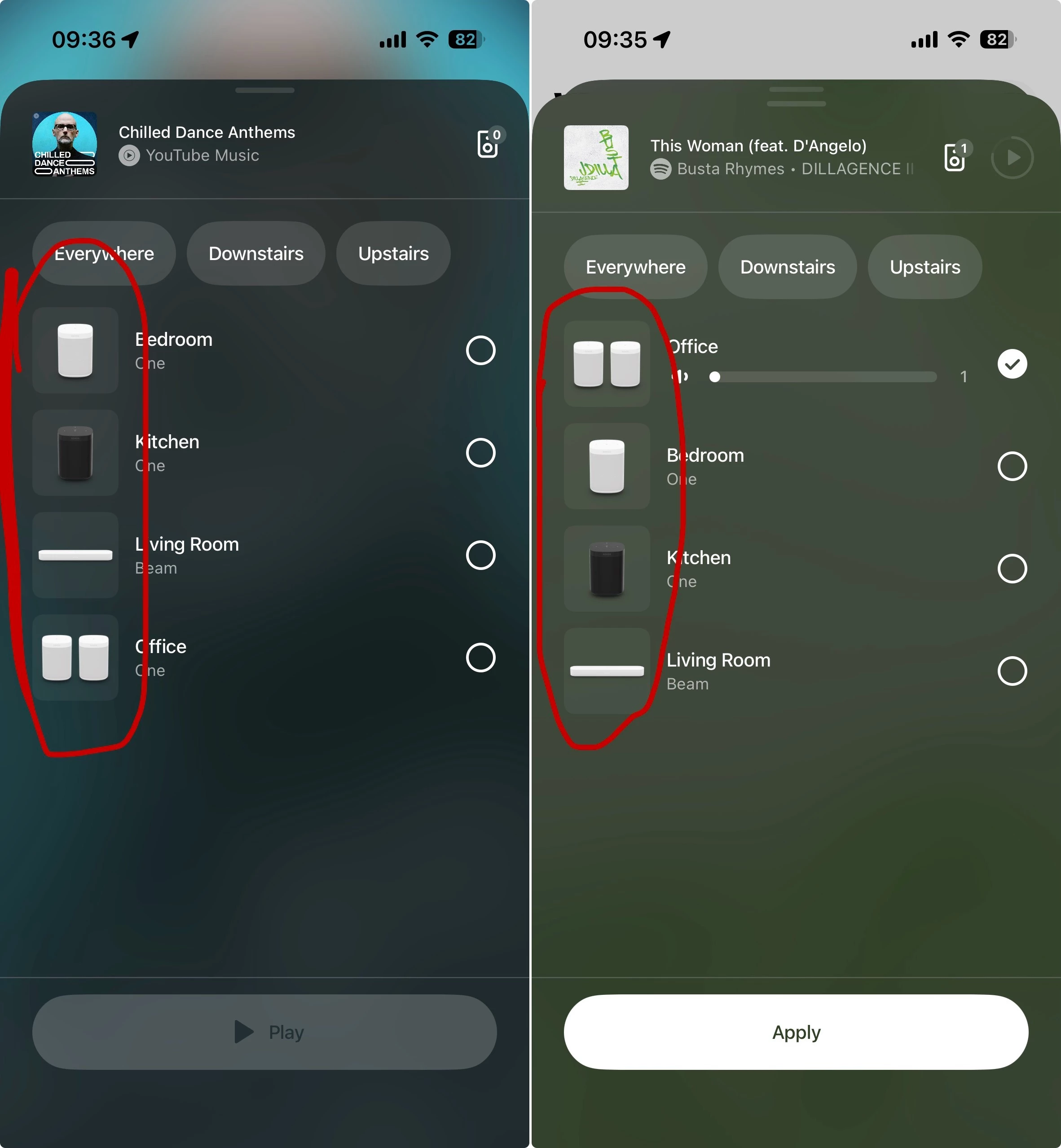
I wanted to share some feedback regarding the speaker selector and grouping panel in the app. I am using the latest version of the Sonos app on iOS (88.1.9).

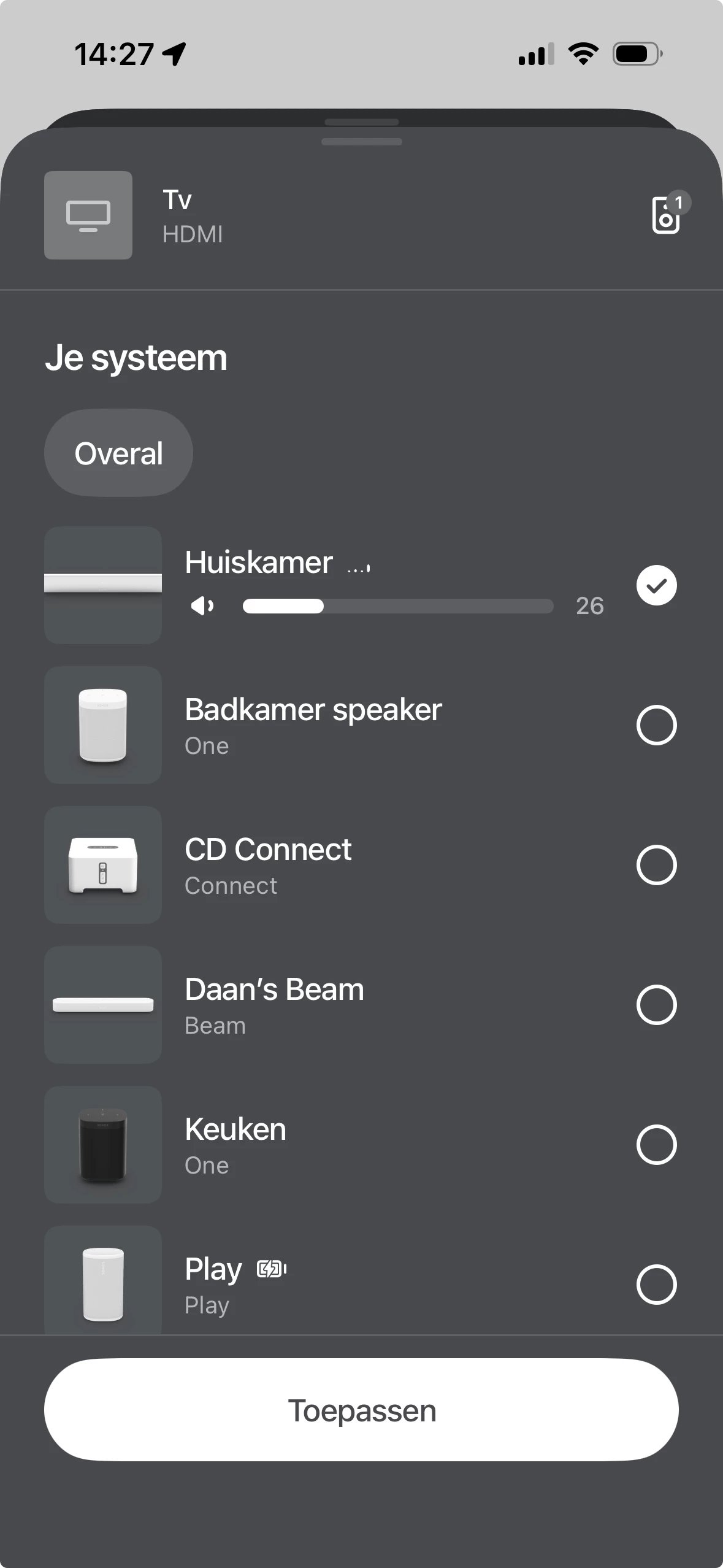
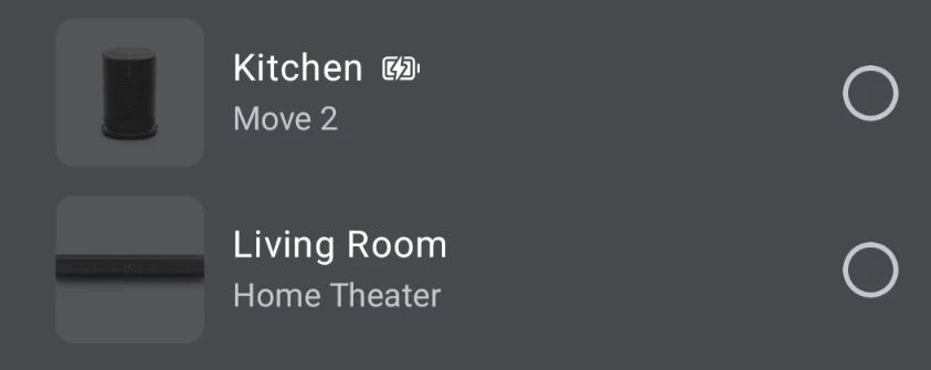
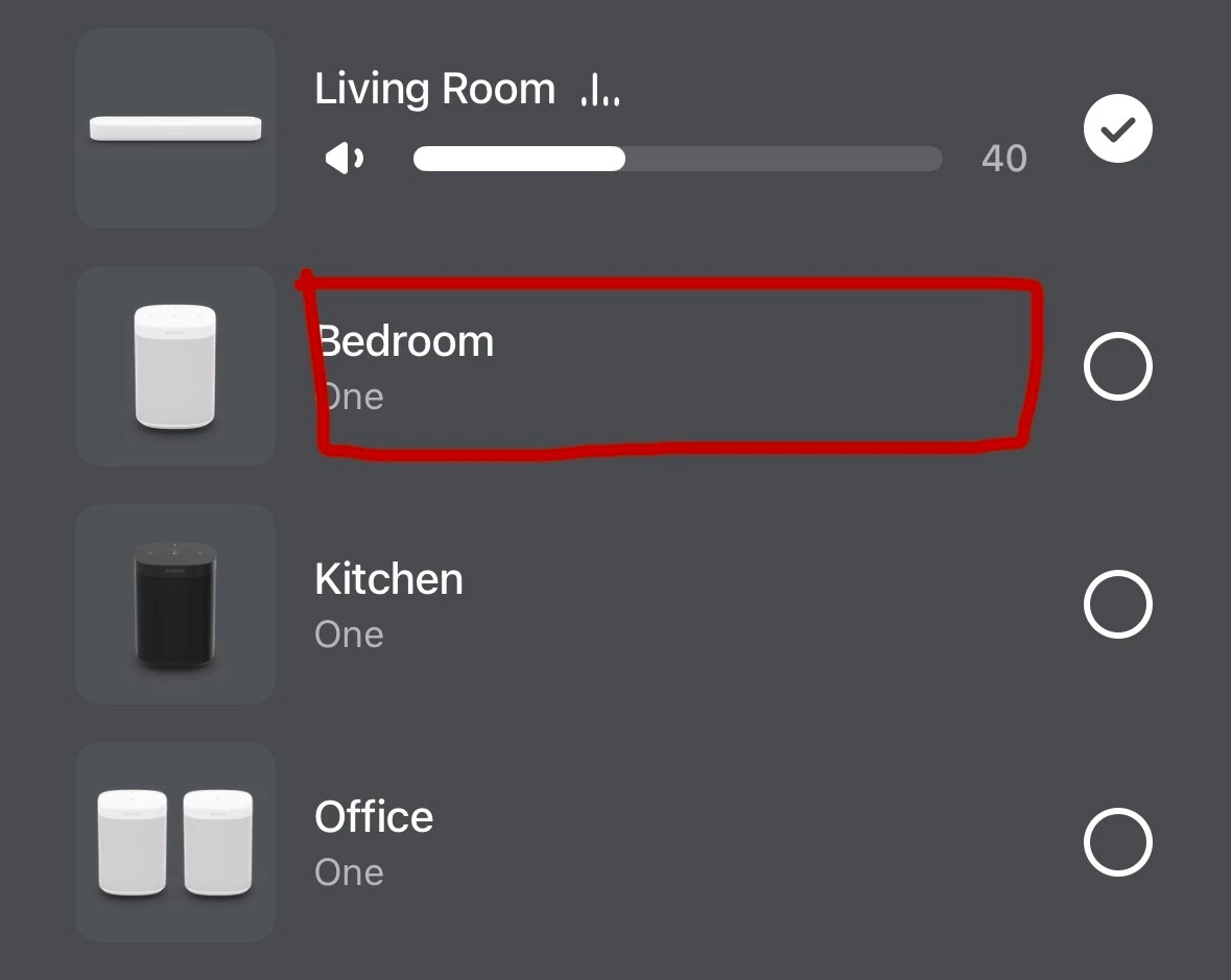
If you look at the screenshots attached below, I’ve highlighted the device pictures on the left side of the room list. Tapping on any of these speaker icons acts as a shortcut that immediately opens the settings menu for that specific device.

This has a couple of friction points:

  • Lack of visual indicators: There is no UI cue (like a gear icon) to suggest these images are interactive touch targets that lead to a completely different menu.

  • Accidental navigation: Because these icons sit directly next to the main room selection area, it's very easy to misclick and be taken into the Settings panel. And then backing out of this Settings panel puts me back on the Home Screen, rather than returning to where I was on the speaker selection panel. So when I'm trying start playback on a speaker, or group rooms, a slight mis-tap instantly pulls me out of the playback flow and into the device settings.

  • Context mismatch: The existence of this shortcut doesn't make sense to me. As I’m in the middle of selecting speakers for playback or adjusting the grouping, it’s unlikely that I’d want to jump into device settings at that exact moment.

It would be a great QOL improvement if the team could rethink this - perhaps either add a clear visual indicator that these icons lead to settings, or remove this shortcut entirely to prevent accidental taps during room selection.
 

16 replies

Stanley_4
  • Grand Maestro
  • September 5, 2026

Hadn't noticed that but it does seem odd to have it as a surprise action.


106rallye
Forum|alt.badge.img+18
  • September 5, 2026

This page shows when you are in the grouping menu. On my iPhone it is called “Your system”:

To me it is not farfetched to be able to get to the preferences for a speaker from the “Your system” page, but I agree a sign the pictures of a speaker are actually buttons would be nice.


Forum|alt.badge.img
  • Lyricist III
  • September 5, 2026

A visual indicator would be good, but I don’t agree that removing it instead would be a QOL improvement. 


  • September 5, 2026

This page shows when you are in the grouping menu. On my iPhone it is called “Your system”:


When using “Improved Navigation”, the grouping menu appears like the OP’s post. “Your System” is not there anymore.


User117655
Forum|alt.badge.img+10
  • Prodigy II
  • September 5, 2026

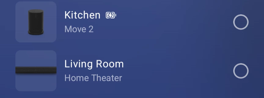
They do have a lighter source theme matched background already:

Kinda look like buttons to me already and the visual cue is functionally consistent with the system access point too.

Maybe not good from an accessibility point of view but, outside of OS settings, the whole app (together with most others I will add) is a bit lacking from that perspective anyway...  


Forum|alt.badge.img+4
  • Author
  • Enthusiast I
  • September 5, 2026

To me it is not farfetched to be able to get to the preferences for a speaker from the “Your system” page, but I agree a sign the pictures of a speaker are actually buttons would be nice.


I’m trying to think of a scenario where I’d want to hop out to the settings page when I’m midway through selecting a speaker to play to, or midway through grouping speakers, and I can’t.

Especially as once you’ve gone to the settings screen, you can’t then quickly jump back to where you were - it just takes you back to the Home screen when you tap back. So if I’ve navigated through one of the music services to find a particular song/album/playlist, or been searching for something, I have to start again.


Stanley_4
  • Grand Maestro
  • September 5, 2026

I was thinking EQ or Volume Limit settings but with the failure to return to the calling screen that isn't useful.


AjTrek1
  • September 5, 2026

I’m not understanding the Op’s issue.

When Grouping why would one tap the speaker/room icon? I’ve never had the issue the OP is suggesting needs to be fixed. 🤔 I guess my fingers don’t wander (yet) 😂

Logically (by design) you:

  • Tap the Radio Button on the right for those speakers/rooms you want to Group
  • When done tap Apply.
  • You are taken back to the Home Screen
  • In the Now Playing box see the Grouped speakers/rooms selected

  • September 5, 2026

I think the OP laid out their concern pretty clearly. Even if you knew and wanted to get to the speaker settings, the fact that you can’t get back to the same screen with the “<” at the top is concerning to me. If it did take you back (like < implies), I don’t think I’d have a problem with it.

  • Lack of visual indicators: There is no UI cue (like a gear icon) to suggest these images are interactive touch targets that lead to a completely different menu.

  • Accidental navigation: Because these icons sit directly next to the main room selection area, it's very easy to misclick and be taken into the Settings panel. And then backing out of this Settings panel puts me back on the Home Screen, rather than returning to where I was on the speaker selection panel. So when I'm trying start playback on a speaker, or group rooms, a slight mis-tap instantly pulls me out of the playback flow and into the device settings.

  • Context mismatch: The existence of this shortcut doesn't make sense to me. As I’m in the middle of selecting speakers for playback or adjusting the grouping, it’s unlikely that I’d want to jump into device settings at that exact moment.


  • September 5, 2026

When Grouping why would one tap the speaker/room icon? I’ve never had the issue the OP is suggesting needs to be fixed. 🤔 I guess my fingers don’t wander (yet) 😂

What you are suggesting, is that this feature shouldn’t exist. It’s not something you would use. So, you shouldn’t be able to tap the speaker icon and go to settings. I think that would satisfy the OPs concern too.


User117655
Forum|alt.badge.img+10
  • Prodigy II
  • September 5, 2026

Context maybe but personally I disagree with the other points, specifically:

  • Lack of visual indicators: There is no UI cue (like a gear icon) to suggest these images are interactive touch targets that lead to a completely different menu.

As I mentioned earlier background shading is consistent with many other button cues across the app (play/pause for ex.). Introducing another visual cue for that button/action type would be counter intuitive and seemingly against the existing app design kit.

Maybe it is the fact that the speaker icons on the buttons are pictorial rather than graphical that is causing the issue?

Personally though not a problem for me... except back should go back and not home 🤓


AjTrek1
  • September 5, 2026

When Grouping why would one tap the speaker/room icon? I’ve never had the issue the OP is suggesting needs to be fixed. 🤔 I guess my fingers don’t wander (yet) 😂

What you are suggesting, is that this feature shouldn’t exist. It’s not something you would use. So, you shouldn’t be able to tap the speaker icon and go to settings. I think that would satisfy the OPs concern too.

Let’s dial this back a bit. I’m not suggesting anything. Nor am I criticizing the OP’s ability to lay-out their concern (very well done).  I just don’t see the issue. However, that’s me.

You obviously have a different take on the subject and I respect that. This is a community of many different view points (at times). 😊


  • September 5, 2026

Is it a useful feature? Does anyone use it? Has anyone used it? Not easily discovered, but once you know it’s there, it’s obvious. BUT, not going back with “<” is the deal breaker for me.


  • September 5, 2026

You obviously have a different take on the subject and I respect that. This is a community of many different view points (at times). 😊

I agree with your assessment 😀  But, my take on the subject is the same as yours. I actually don’t think the speaker icons should be active at all.


Forum|alt.badge.img+4
  • Author
  • Enthusiast I
  • September 5, 2026

Logically (by design) you:

  • Tap the Radio Button on the right for those speakers/rooms you want to Group

You can also tap the name of a speaker, or anywhere in the blank space between the speaker name and the radio button, and that will also select the speaker.

Which makes it all the stranger to me that tapping the speaker image doesn’t also select the speaker, and instead takes you off to settings.


AjTrek1
  • September 5, 2026

Logically (by design) you:

  • Tap the Radio Button on the right for those speakers/rooms you want to Group

You can also tap the name of a speaker, or anywhere in the blank space between the speaker name and the radio button, and that will also select the speaker.

Which makes it all the stranger to me that tapping the speaker image doesn’t also select the speaker, and instead takes you off to settings.

However, tapping the name of the speaker a second time doesn’t release it from the group. I’ll just stick with the Radio Button 😊