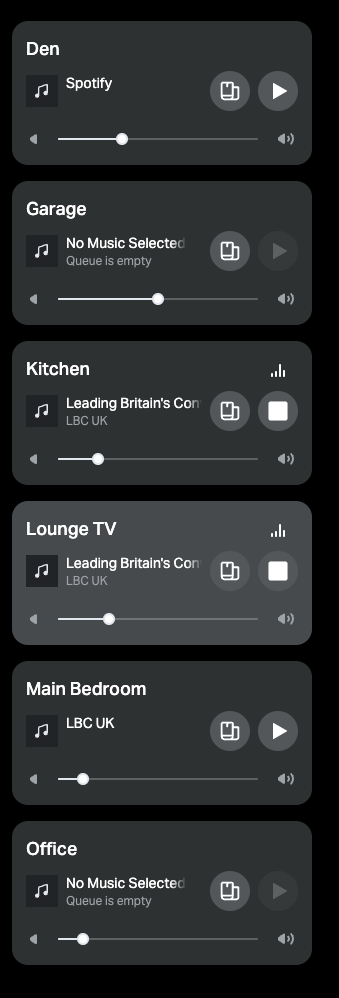
Can the active speaker be more obvious - the grey ‘highlighting’ isn’t highlighted enough.

Can the active speaker be more obvious - the grey ‘highlighting’ isn’t highlighted enough.

Enter your E-mail address. We'll send you an e-mail with instructions to reset your password.