Question

Now Playing screen showing gap in Sonos 27 update!

  • September 9, 2026
  • 8 replies
  • 100 views

Forum|alt.badge.img

Hi,

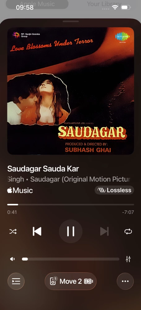
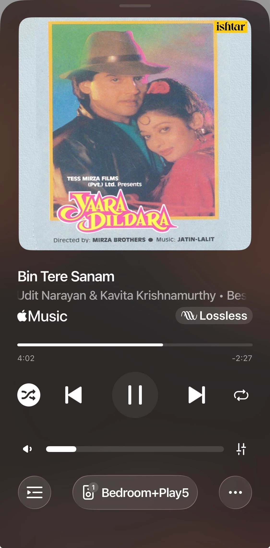
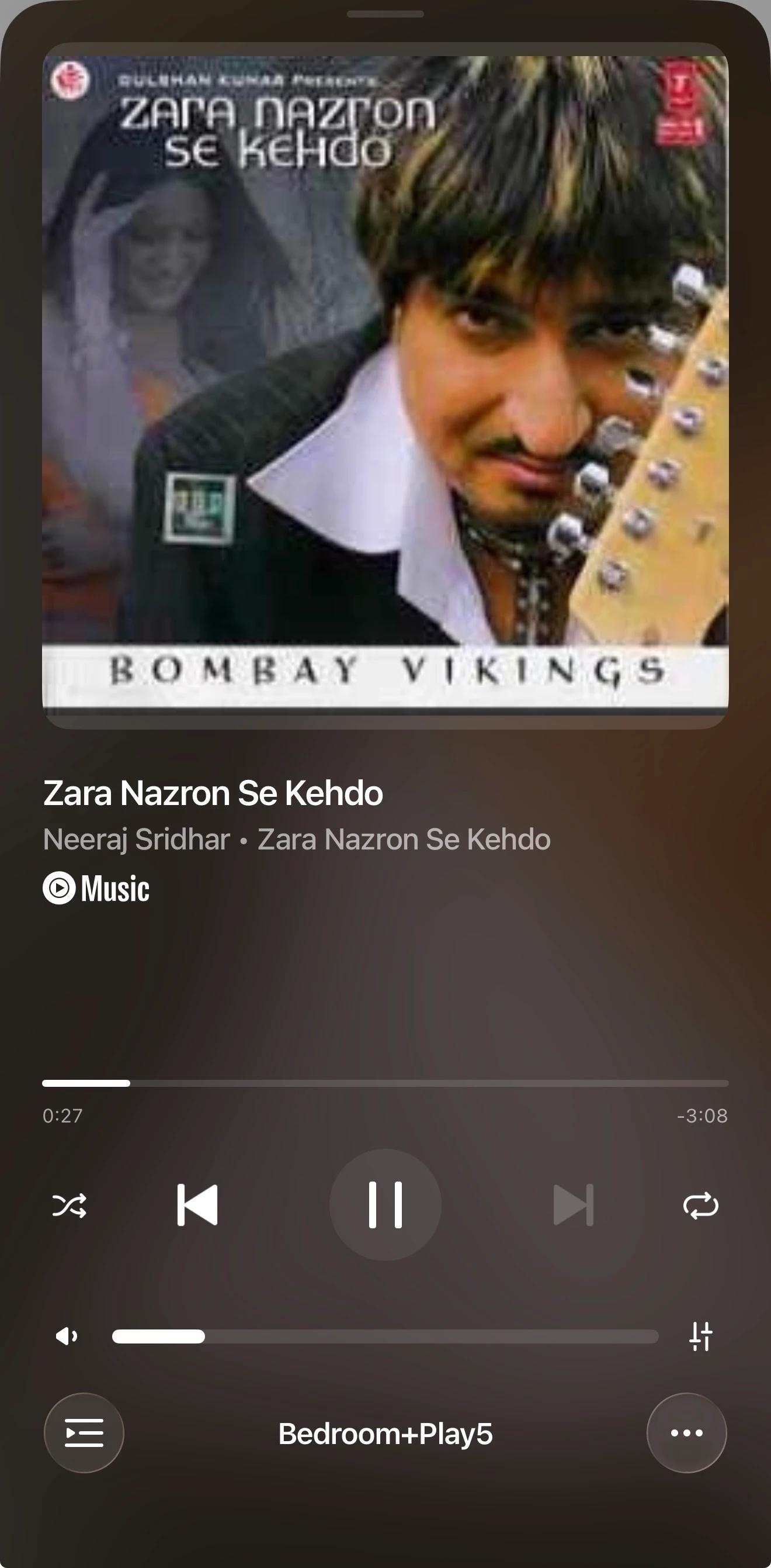
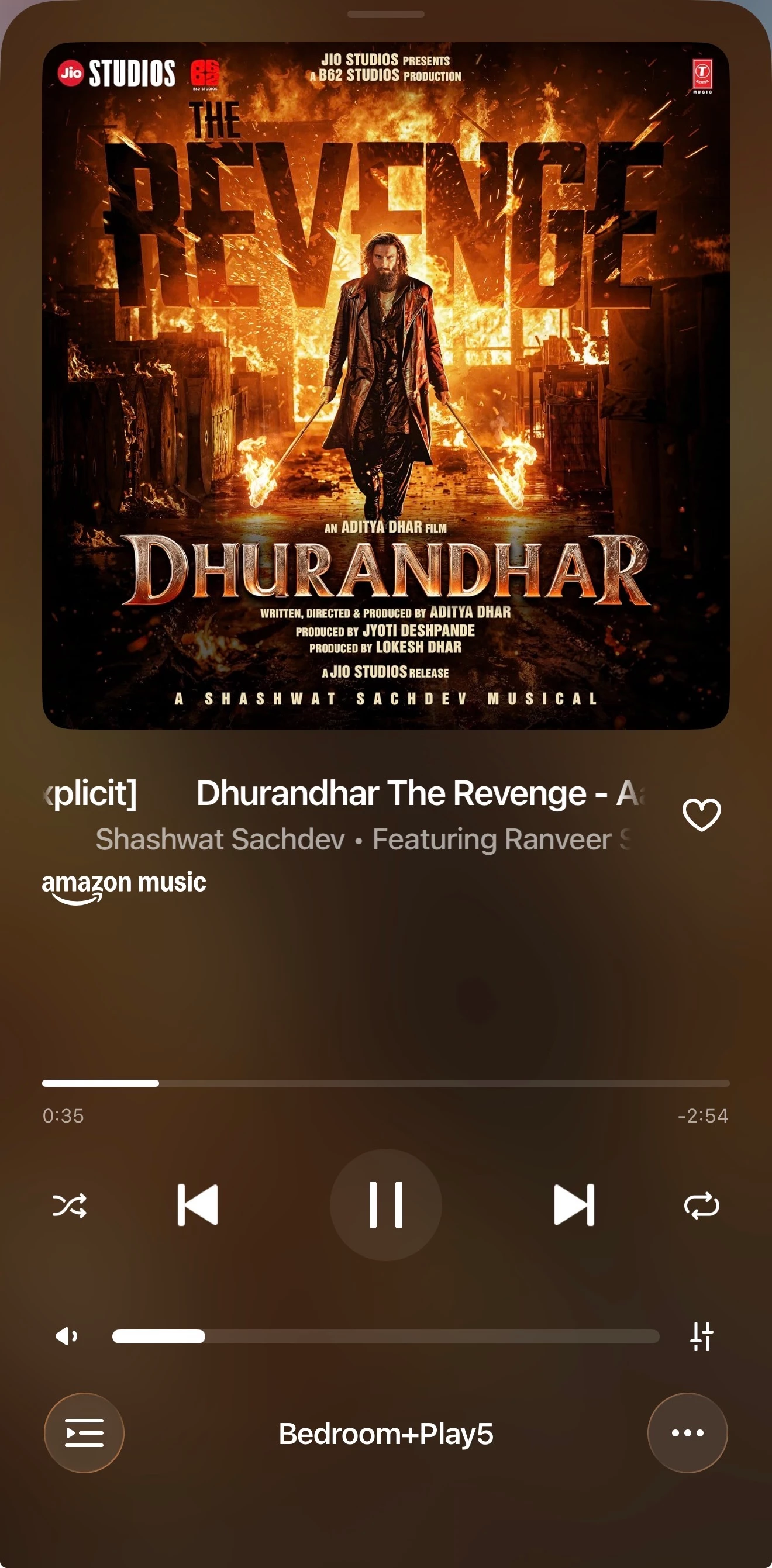
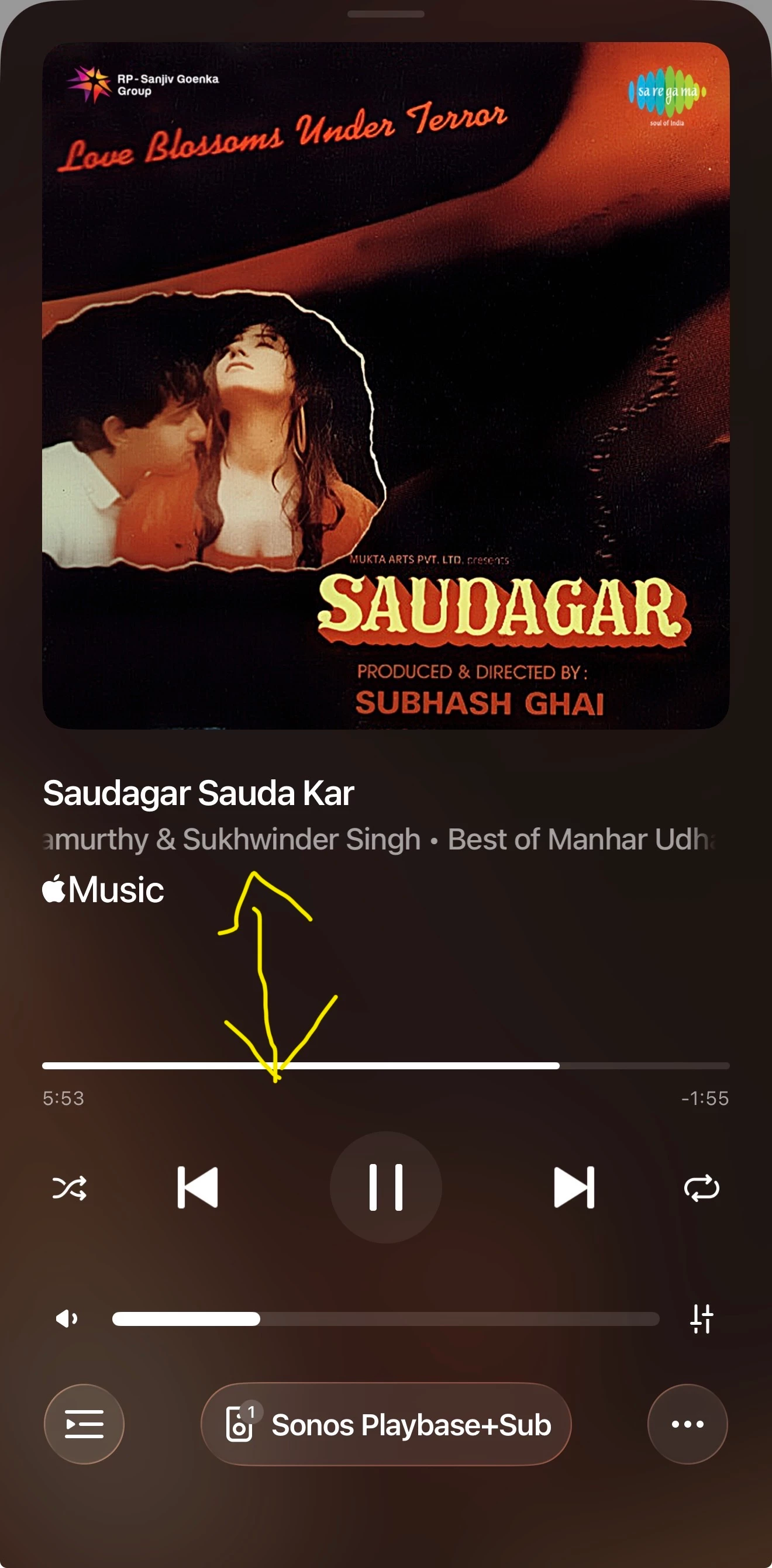
I can see there is big gap in Now Playing screen of latest Sonos 27 iOS app update. Refer image

Am i correct or there is some misunderstanding! Earlier this gap was not there for sure.


i am using iPhone 17 Pro max with following Sonos devices 

Playbase

Sub 4

Play 5

all devices updated with latest firmware


8 replies

AjTrek1
  • September 9, 2026

I’m not sure that I can recall a major difference in appearance; but that’s me. However, since you've mentioned that there is a difference:

  • Exactly how does it affect your enjoyment of Sonos?
  • Is something missing that was there before?
  • Do you want the space filled with something you believe would be beneficial?

Forum|alt.badge.img
  • Author
  • Contributor I
  • September 9, 2026

This is clearly cosmetic UI alignment issue, this needs to be fixed


Forum|alt.badge.img+18
  • Local Superstar
  • September 9, 2026

I’m not seeing the gap on iPhone (UK) playing Apple Music. Could this be a locale issue and/or change of default setting in Settings/Display on iPhone?


Forum|alt.badge.img+18
  • Local Superstar
  • September 9, 2026

i am using iPhone 17 Pro max with following Sonos devices 

Or specific to the max size screen.


Forum|alt.badge.img
  • Author
  • Contributor I
  • September 9, 2026

Tried changing Display zoom option to Large text on iPhone and it worked but changing back to default same issue.

Tried with Amazon Music, Youtube and its appearing in all no such conditions found.

Hope Sonos team looks into this. No operational issues due to this.


AjTrek1
  • September 9, 2026

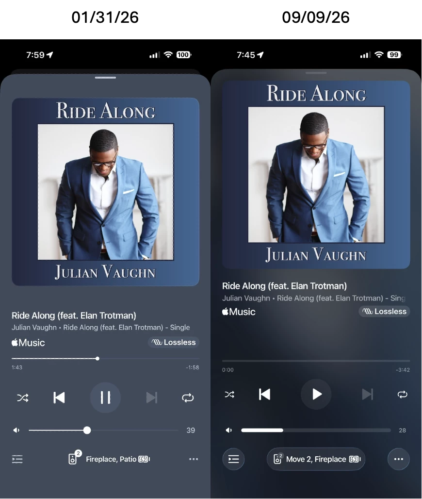
I’ll grant that the display has changed a bit as shown by the photos below. However, I’m still trying to determine your issue; other than a personal preference.

The loss of lettering on the right just above “Lossless” is only due to the timing of the scroll sync (right to left) while capturing the photo. The display change is most likely due to:

  • Moving the Album Art closer to the “pull down bar” at the top
  • Decreasing the blank space between the bottom of the Album Art and the Captions below it

IMO the screen shot on the right is a more relaxed view. I personally don’t see anything that Sonos needs to change/fix. 

Once again...why do you find the adjustments so bothersome? BTW…My iPhone is the same as yours.


Forum|alt.badge.img+18
  • Local Superstar
  • September 9, 2026

BTW…My iPhone is the same as yours.

So that confirms its limited to the max phone line (bigger screen)? I don't see issue on a non max phone.

Looks like how the album art is justified on screen, previous app was center, latest App is top. As Max screen is bigger there is more space below, as its top justifed?


AjTrek1
  • September 9, 2026

BTW…My iPhone is the same as yours.

So that confirms its limited to the max phone line (bigger screen)? I don't see issue on a non max phone.

Looks like how the album art is justified on screen, previous app was center, latest App is top. As Max screen is bigger there is more space below, as its top justifed?

Those are good points as well as my second bullet point.