Just installed the iPad version. Definitely do not like the app compared to the old one.

The new app feels way more busier, due to everything being thrown at you at once (which was their design intention). I’m not saying this approach can’t work though. I’m just saying that the way they designed it, it doesn’t feel right.

In terms of the look and feel, it feels less stylish to me and more cheap. Like it feels like I’m using the Amazon Alexa app (which I hate). The album covers are smaller and not as pronounced, compared to the previous apps recents area.

And the Now Playing screen on the iPad?! Like WTF? Why is there a gap around it showing the interface area behind it (ie Home area)? Why isn’t it full screen (and without rounded corners)? Makes zero design sense, as it’s super distracting, only adding to the busy feeling of the screen. Also see no option to make the app dark instead of light.

All said and done, this just makes me want to not use the app at all, unless there are substantial improvements made to it.

PS. I seem to be having occasional issues loading the app or returning to it, as everything in the app just pulses, as if it’s trying to reload the images / content. 

Hi @Nollind 

Thanks for your feedback! There are a few issues that need to be addressed - and will be soon - though I think it’s safe to assume that the general look of the new app will be here to stay. We have long received feedback on the “clunkiness” of the previous app UI, and this new version is an attempt to address this feedback bring the Sonos app more in line with other music apps.

Please note that although there isn’t yet an option in the new app, the Dark/Light mode of it should be matching your phone’s own settings - please try adjusting in the phone’s relevant setting.

PS. I seem to be having occasional issues loading the app or returning to it, as everything in the app just pulses, as if it’s trying to reload the images / content. 

A reboot of your phone and/or speakers may help to address this - if not, I recommend you get in touch with our technical support team who have tools at their disposal that will allow them to give you advice specific to your Sonos system and what it reports.

I hope this helps.


Terrible experience on Android. Lots of features that were available on previous version no longer available. System info no longer indicates if component connected via ethernet or WiFi (e.g. “WM:0”). Also no longer indicates what type of audio is playing (e.g. “Dolby Digital”). New search is terrible, much worse than “classic search”. New search not compatible with Pandora (doesn't provide any results within Pandora no matter what you search for) this has always been a problem, but at least with previous app version you could revert to classic search. New version also not compatible with Pandora modes (e.g artist only) while the old version was compatible with these features. Overall a major step backwards and huge disappointment, especially if you are a Pandora user.


...this new version is an attempt to address this feedback bring the Sonos app more in line with other music apps.

I’m completely perplexed by that statement.

Can you please provide details on what “music apps” Sonos tried to emulate with this new app, as I’ve never seen one like this before?

I’d happily use any other major music streaming platforms app (i.e. Apple Music, Amazon Music Unlimited, Tidal, Spotify, etc), instead of this new Sonos app.

In fact, I actually am. I switched yesterday to Spotify, just so that I no longer have to use the new Sonos app, and can just launch music within the Spotify app using Spotify Connect.


Hi @Nollind 

The app is now on one page, rather than being spread across multiple tabs, which I personally found quite annoying. Of course, there are now other things to be annoyed by, but these will be addressed soon.


I have downloaded the new app. I am a Spotify user. Have many Sonos speakers, excellent products and will always invest in them.


The new app is supposed to make the connection between Sonos and Spotify seamless. Hmmm, NOT. You are waiting for the track to start as the screen pulsates five times then starts as it's trying to pull the track from Spotify. Playing from Spotify app is immediate.

Will still go back to the Spotify app and play tracks immediately from Spotify to Sonos. Nothing accomplished with the new app guys. Nice try, try again lads. I shall wait for the next installment.

Concur. Spotify is working seamlessly using Spotify Connect.

I tried playing a song using the new Sonos app and it stopped playing the song midway through it.

If Spotify Supremium (or whatever they decide to call it) gets released in the next month or two, I’ll be happy to never use the Sonos app again.

One things for sure though. I’m no longer recommending them to anyone. They’ve lost my trust and they would have to do a hell of lot to win it back again. 


I only stream music from Pandora and loved the Modes options.  Where are Pandora modes now on the new app?


Hi @Nollind 

The app is now on one page, rather than being spread across multiple tabs, which I personally found quite annoying. Of course, there are now other things to be annoyed by, but these will be addressed soon.

Would you like to define the word 'soon'?  Your boss's secretary or PA replies to missives in a boilerplate message and talks about 'months'.   I suppose on an annual timescale, that could be seen as soon. 


I have always been a big fan of SONOS and have 7 products in use.
I use 3 (Android) smartphones, 2 (Android) tablets and the PC to control the SONOS system.
After the update to the new app from 7th of May, I am extremely disappointed.
This is by far the worst version SONOS has ever released.
The UI of the app is a disaster. Buggy and not finished.
How can you put such a release on the market?

If this is not improved very quickly, I will sell my SONOS system
and certainly not buy any more new products.

It is unbelievable that SONOS dares to release such garbage.

In detail, I have noticed the following:

    - Covers from the NAS are no longer displayed
    - Currently playing tracks (from the NAS) are no longer displayed
    - Search function in the music library is no longer available
    - Alarm clock is no longer available
    - The (old) TuneIn no longer works
    - Add to end of list is no longer available
    - Play afterwards is no longer available
    - Equalizer in the volume control is no longer available
    - The new UI is a disaster, unfinished, confusing and uncomfortable.

Looking forward for a new Version asap.


And the Now Playing screen on the iPad?! Like WTF? Why is there a gap around it showing the interface area behind it (ie Home area)? Why isn’t it full screen (and without rounded corners)? Makes zero design sense, as it’s super distracting, only adding to the busy feeling of the screen. Also see no option to make the app dark instead of light.


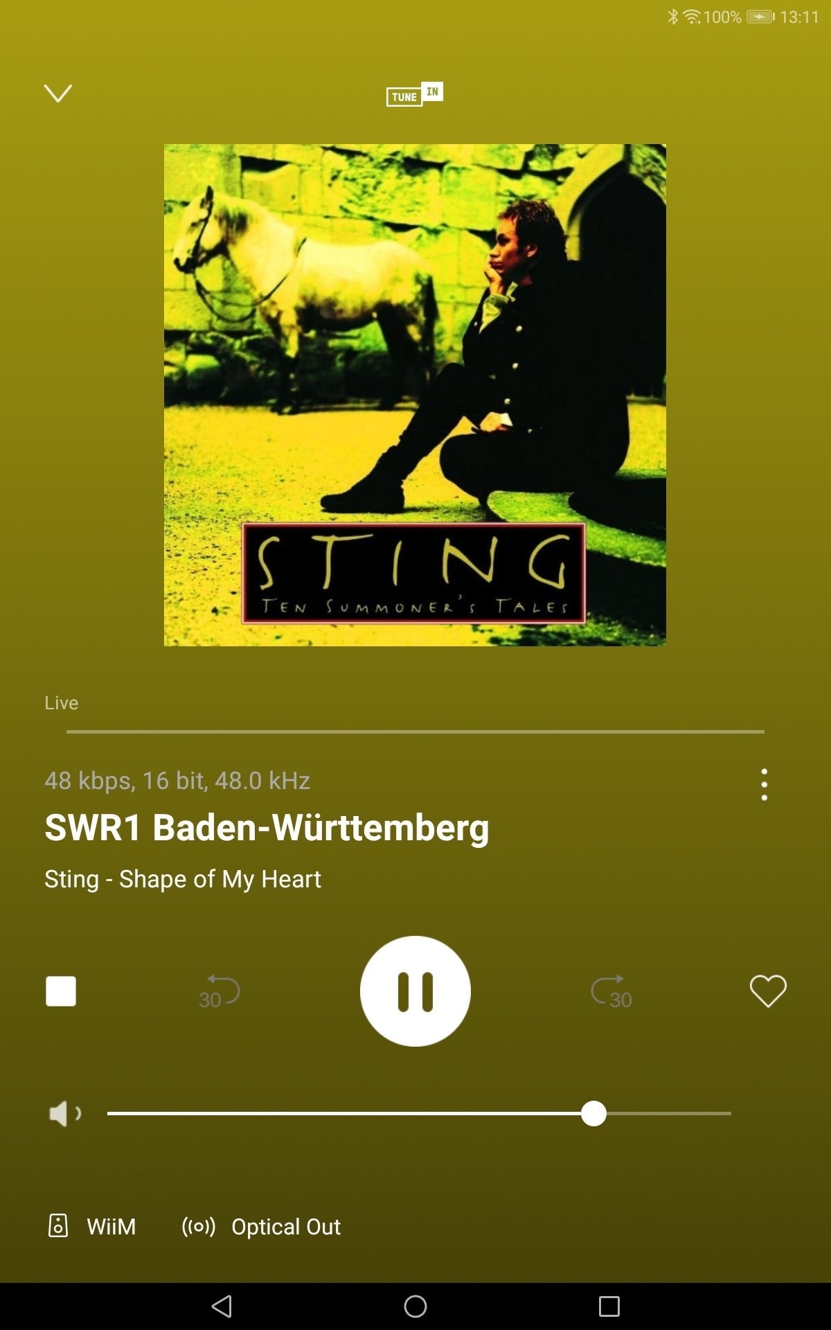
All the above applies to the Android app, also.   For comparison, here's the Wiim Now Playing screen (note the metadata also!)


I called SONOS today on the issues and the response was that they did not receive any complaint on the new app. WTF the internet is full of complaints. Under which stone do your helpdesk people live?


You said "We have long received feedback on the “clunkiness” of the previous app" I'm calling BS. Every software development team says this when they screwed something up. The developers should be fired. The manager that approved this shit show should be fired. After the update the Sonos app thinks I have rewired my system. It thinks I now have SPDIF. I haven't touched any hardware since this system was installed 3 months ago. I have mobility issues and do not have the ability to change or even touch any of the wires or cables in the system. So now what? I've spent thousands of dollars on an unusable system. Please provide a link to the previous app so this can be rolled back. This is totally unacceptable!!!! If I have to have a technician come to my home (remember I have mobility issues) is Sonos going to pay for that? Because what you've done is destroy a perfectly working system with this absurd excuse of an update. 


Okay - I get the library listed and the tracks play BUT there's no artwork (full colour on the old S2😁).

In fact, the whole interface reminds me of the html webpages my undergraduates were producing 20 years ago as coursework 🙄


And the Now Playing screen on the iPad?! Like WTF? Why is there a gap around it showing the interface area behind it (ie Home area)? Why isn’t it full screen (and without rounded corners)? Makes zero design sense, as it’s super distracting, only adding to the busy feeling of the screen. Also see no option to make the app dark instead of light.


All the above applies to the Android app, also.   For comparison, here's the Wiim Now Playing screen (note the metadata also!)

Indeed. Cory indicated that the companies goal was to make the Sonos app “more in line with other music apps.”

Yet most other music apps (especially their iPad versions) have a look & feel, as well as functionality, seemingly vastly superior to the new Sonos app. Even the Amazon Music Unlimited app, which a lot of people dislike and feel it should be improved, seems like a dream to use now in comparison to the Sonos app. So it’s hilarious how something worse makes you rethink and appreciate what you thought was bad before.

I actually dumped the Amazon Music Unlimited app to use Spotify’s Spotify Connect (so as to avoid using the Sonos app, as noted above) but I just realized that I can also AlexaCast to my speakers using the Amazon Music Unlimited app and it functions somewhat basically like Spotify Connect. It doesn’t show the track metadata info this way but at least it sounds better quality than Spotify, so I can at least switch back to Amazon Music Unlimited for its sound quality (and I luckily got a 30% discount for three months in the process when resubscribing).


Okay - I get the library listed and the tracks play BUT there's no artwork (full colour on the old S2😁).

In fact, the whole interface reminds me of the html webpages my undergraduates were producing 20 years ago as coursework 🙄

The thing I keep seeing people saying is that they can’t believe Sonos rushed out this new app, when it was obviously incomplete, but the sad thing is that is becoming the norm, more and more today, with a lot of companies. Their customer base are basically treated like beta and even alpha testers which is completely absurd. I’ve seen this with other company’s products, where they release a new version and 50% of the features will be cut. Yet the company will be raving about their newer features and won’t mention that they removed 50% of their older features. Like this just boggles my mind at their narrow-mindedness. 


Indeed. Cory indicated that the companies goal was to make the Sonos app “more in line with other music apps.”


When I installed the new App on my iPhone, my first thought is how similar this new Sonos App user interface is compared to Apple Music.


Indeed. Cory indicated that the companies goal was to make the Sonos app “more in line with other music apps.”

When I installed the new App on my iPhone, my first thought is how similar this new Sonos App user interface is compared to Apple Music.

In what way? If its functionality and look & feel were like Apple Music, I’d be overjoyed, as I love the minimalistic nature of the Apple Music app, as well it’s Now Playing screen (which I think is the best of all music apps). To me, it’s nothing like it but note that I’m using the iPad version of the new Sonos app though.

PS. I do dislike the sidebar on the iPad version of Apple Music app though and prefer the bottoms tabs like the iPhone version has still.


Indeed. Cory indicated that the companies goal was to make the Sonos app “more in line with other music apps.”

When I installed the new App on my iPhone, my first thought is how similar this new Sonos App user interface is compared to Apple Music.

In what way?

I’m using on iPhone (not iPad). The swipe up/down from the ‘playing’ section, scroll up/down and swipe left and right from the home screen to ‘select’ your music.

Also. similar to BBC Sounds, that I am also used to.

I previously preferred to use native Apps and AirPlay to old Sonos App, now the Sonos App feels more inline and intuitive with the Apps I am used to.


Where is the sleep timer? 

It seems like many functions Har disappeared. Are they somewhere else?

It seems like the app now just looks "cool" and simple. Fine on a PowerPoint! 


It just struck me.  All those Apple users stuck with the update have a simple solution - beg, steal or borrow/buy an Android phone, sideload the old S2 app.  Job done. 


I am Android user, hov can I get the old version,without jailbreak? The new version can only play and pause. Nothing else...


I am Android user, hov can I get the old version,without jailbreak? The new version can only play and pause. Nothing else...

Jailbreak isn’t an Android thing it’s  an old iOS thing, you can just side load the app with the apk download from APK Mirror etc. 


I am Android user, hov can I get the old version,without jailbreak? The new version can only play and pause. Nothing else...

Download old version from apkmirror website.  Sideload onto phone/tablet.   Search this site, there are detailed guides. 


It just struck me.  All those Apple users stuck with the update have a simple solution - beg, steal or borrow/buy an Android phone, sideload the old S2 app.  Job done. 

I forgot my old iPhone 6S had the old Sonos app installed on it and it seems to work fine as well. And no worries about it automatically updating, since it requires that you have iOS 16 to upgrade to it.


Love sonos love spotify! Together perfection


sonos interface to spotify horrific!  Dont try and mimic the spotfy interface let theirs connect directly to sonos …savant did that and have seen how great it is…


btw I cannot play a song at a time now with the interface or add the que only replace the que !  Your update took away basic functionality…