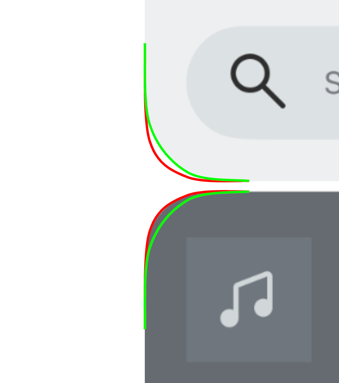
Amongst all the broader issues of stability and missing features, the rounded corners give away how rushed this app update was. While the padding/radius for the search bar within the top card looks okay… The radius for the outer corner of search and now playing cards don’t match. This sort of thing, across the app, makes everything feel even jankier.
Or is it just me?