Hi again
In general I like the user interface in the app and I also like the changes now in july.
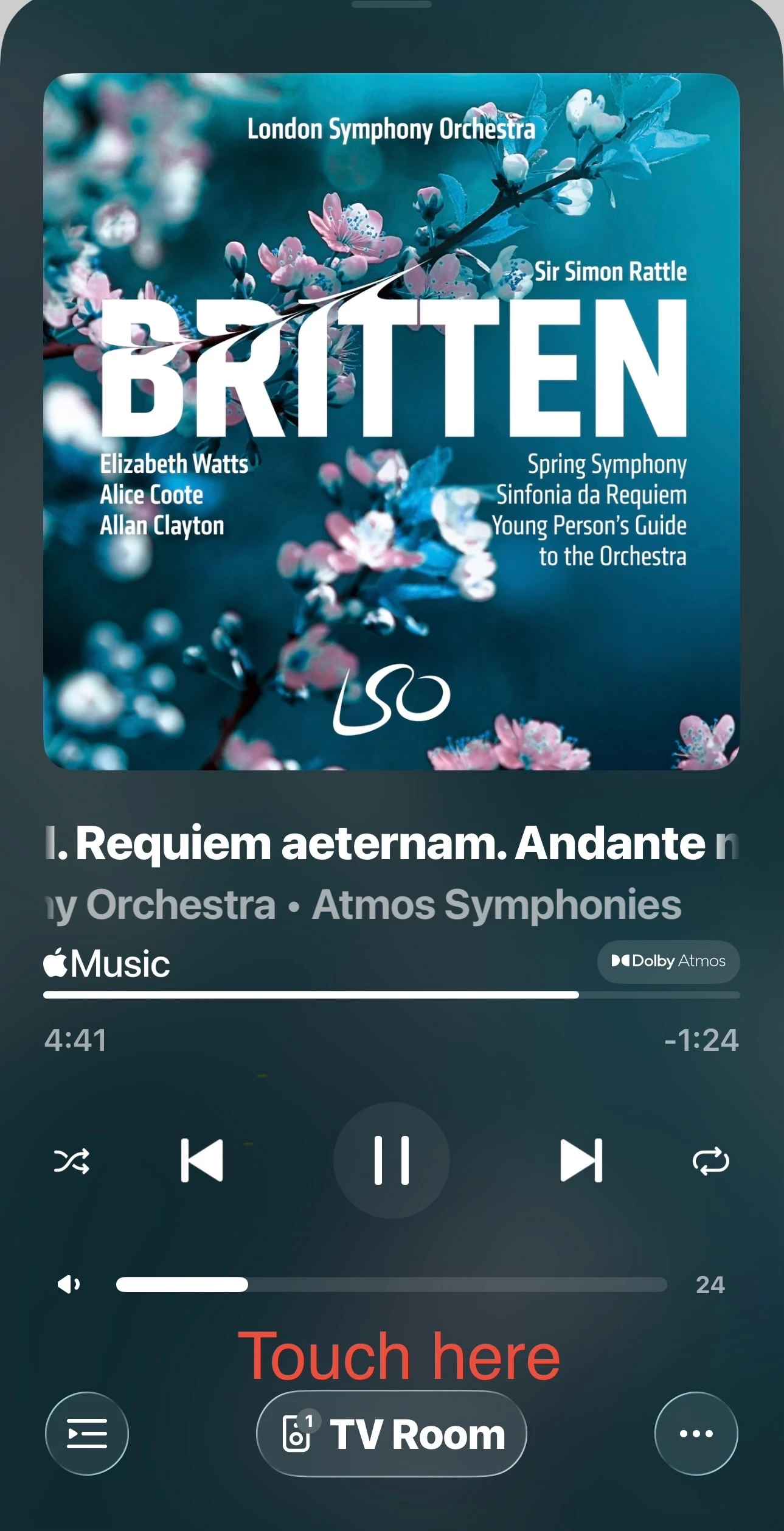
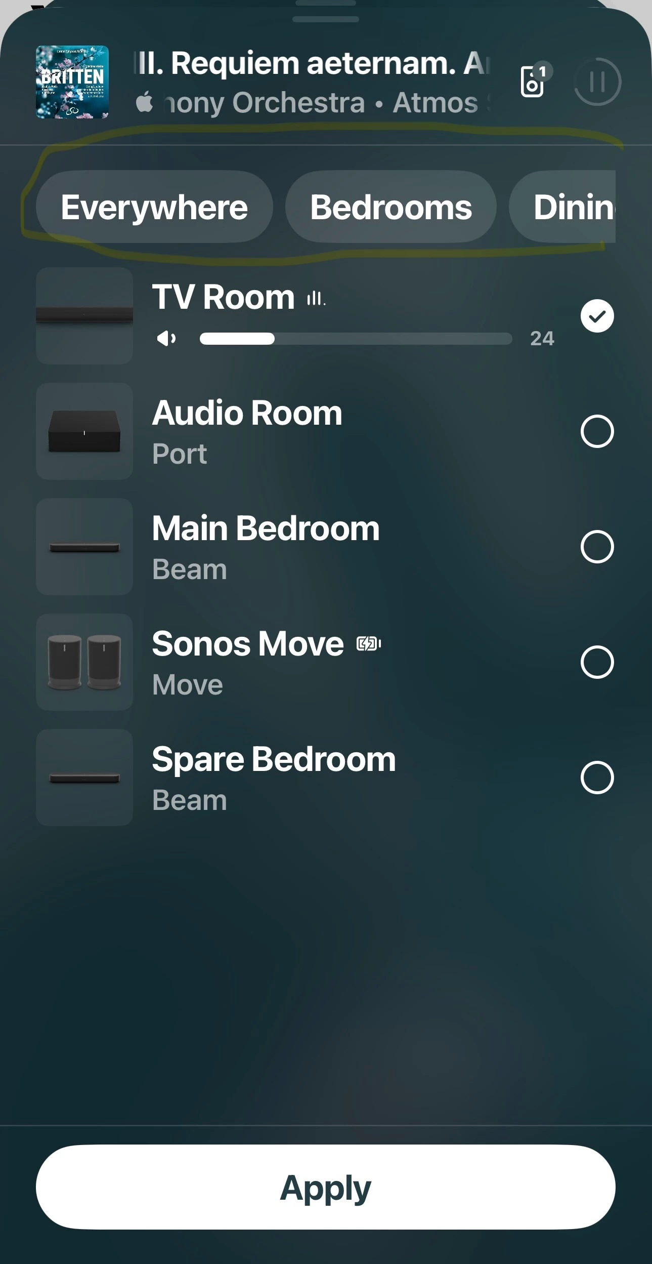
One thing with the GUI i don't like so much is the display og speaker groups in form in the "player". It's today as "buttons" on a single line on top of the speakers.
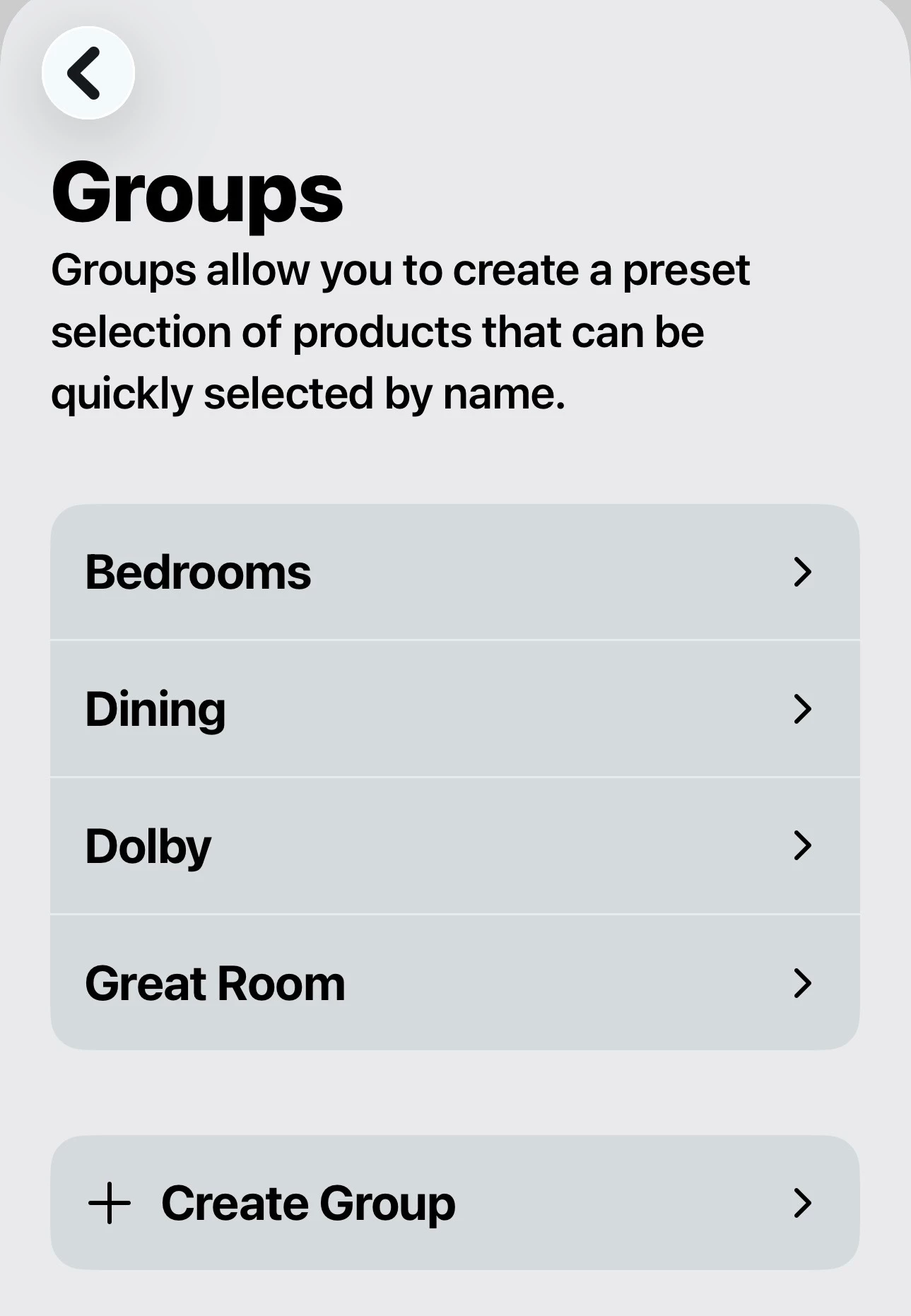
Even though I initially made 8-10 groups I rarely use them as scrolling to get the wanted group isn't natural use for me. I would like the groups listed somehow - then will selecting a group be easier and more on intiuition.
I don't have a clear solution how to improve it. It can be a list above/below speakers, it can be a tan for groups and a tab for speakers. Probably other better solutions - just look into how groups can be displayd best way 🙂
Thank you in advance
Amund