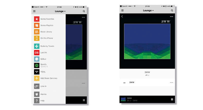
What were your designers and approvers thinking when you updated the app, creating such an AWFUL user experience? I am seriously considering switching to a different brand. FIX IT!!!!
There are a lot of thread regarding current controller version. It is hard to navigate. They made it too much like apple music and Spotify native app.


Sonos has said they have been taking feedback and are releasing an update.


I predict update next Tuesday - but if I'm wrong I still predict we will see update this month (some people have received emails that there is update coming and it won't work on some real old operating systems).
Thanks for the info, Chris. I dig my Sonos setup...I've got a good bit integrated into it. Hopefully they come to their senses. For example, looking at the different music services I have was a search effort. Why make it so hard? It's not even visually appealing to me...too much empty space on my iPad.
Sonos ux design is bad. You guys need to hire a new UX lead. It’s allways been bad no matter how many updates. Also with the latest update as of March 2nd, the spotify ap wont recognize the sonos speakers.
Also the problem is not on spotify’s end because I’m forced to airplay it to the same speakers through my apple tv. Wtf Sonos.
I Still think the previous version was much better in every way...


I Still think the previous version was much better in every way...

agreed The old app is still better despite the 100 or so updates I have done on the truly awful current app. I rarely had an uninterrupted evening of music without another damn update or some problems