The whole My Sonos feature is confusing. The playlists are confusing, and huge graphics which means hardly any playlists can be shown. Was SO hoping the Mac app would get an update, but no such luck. Wait for more reviews before upgrading..... or am I missing something?
After all this time, I guess I was just hoping for something 'wow' and ended up with 'meh'. Sad face (but still love the sound).
And the white buttons against v light grey is a poor choice.
I agree, it's a badly designed User Interface. I can't see me using the My Sonos function as it sadly requires much overuse of the fiddly "See All" button. The App also has a "Too White" colour scheme. The iPad version is even worse as it is basically the iPhone App with lots of blank space. The best iOS App was the original one, which was the same design as the old CR200 controller. It has been downhill all the way since then unfortunately.
It states to swipe up anywhere to view the navigation bar but if you swipe up on iPhone, the Apple control centre is displayed. You used to be able to swipe right when playing music to access other music sources, this is no longer available.
Please add Artist back to the album view per-song, mainly for various artist albums but also albums where there were a lot of colabs


Moderation Edit: Added title of the topic into the post, then moved the post to app update feedback thread.
Sadly I have to agree. More presses to get where I want to be and the My Sonos view is totally useless for me on the iPad because of the large icons and you always have to press something else to be able to see more than a few radio stations etc. I wish I’d not updated now.
Totally agree, this is the worst update ever, I can't figure out how to get 2 stations playing in different rooms. every time i try to switch room it wants to move the station with it.


Is there any way we can back out of this update until they get it working?


Also I'm not sight impaired, so drop the MASSIVE graphics and let me see more on the screen.


Did SONOS even approach any users to test this release, sorry but this is horrible!
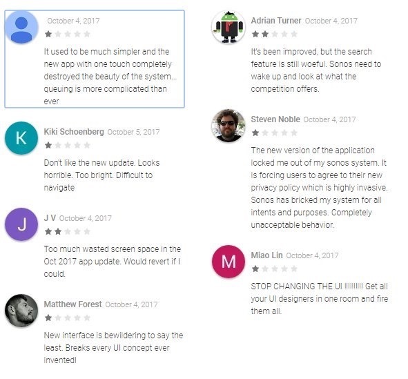
My long wait for support today indicates to me they have problems...... Someone posted this on twitter. Not sure where it's from....


I suppose I can get used to most thing, even if I don’t like them and no doubt I will get used to the new app. But I agree the app on the IPad.especially looks very amateurish and not at all slick or sophisticated.


Andrew
Completely unnecessary change. It's pretty, but...


Getting to the "favourites" list seems to be harder. You need to do a "My Sonos->Other / See All" (instead of "Music->Favourites" on desktop / previous iPad client). The split between "favourite albums" (albums) and "favourite others" (artists) is odd. As is the "first 8 favourite bands alphabetically then you need to hit see-all" listing. Given that the entire point of "favourites" menu is fast access to the stuff you listen to most, this seems odd. Desktop controller is thankfully unaffected for now.


And of course the year-old play/queue interaction bugs remain thankfully un-fixed, as the difference between "play all" (replace queue and play album) and "play now" (insert album into stopped queue at position 2 for "play album followed by tracks 2-end of yesterday's listening") is blindingly obvious.
It’s aweful , can we have the old version back.

My misses will never work this out if I struggle with it.
I’ve posted this elsewhere but will post it here as well because I’m so annoyed. Every time I start the app up it causes my NAS drive to spin up. It’s looking for the artwork for my library playlists every bloody time. I really want the old version back.
Yes, very terrible update. Need option to rollback or customize.
only updated on one mobile device and WILL NOT DO SO ON OTHERS
The new update is extremely frustrating. The interface is not intuitive and it takes 2-3 more clicks to perform the same functions. Please return to the previous UI until you have resolved these issues.
Please give us the old app back - this is not intuitive. Way too many clicks to do anything.


What is up with My Sonos and favorites...alphabetical order only, and only listing the first 8? And if I want to get to anything in my favorites beyond item 8, I have to hit “see all” EVERY...SINGLE...TIME?


I bet a UI study would find the top click is “See All” in this app, really?
I am so pissed off! I can't even figure out how to play more than one zone at a time. Actually, i dont think you can. no way to have more than one group at a time. so we lost a key benefit to investing in SONOS because the APP team needed to do something fresh... WTF? opposite of intuitive!!! How do you release something so shitty... you need a beta test group of customers. they would have begged you to shit can this disaster. my 10 year old looked at me and said, "what where they thinking." Goof balls! I am now seriously considering going all Apple.. and I have $1,500 worth of this product. Morons! And I am filtering my thoughts...


Totally agree. I went to bed last night thinking that I have probably had enough of this and wondering how much I could sell my Sonos gear for.


What is up with My Sonos and favorites...alphabetical order only, and only listing the first 8? And if I want to get to anything in my favorites beyond item 8, I have to hit “see all” EVERY...SINGLE...TIME?


I bet a UI study would find the top click is “See All” in this app, really?


I wonder:

1. What the stats are on whether people's favourites are predominantly made up of all playlists/artists/albums, or whether people generally have a few albums, a few playlists and a few artists in their favourites. Am I the only user with 30 artists in my favourites list? Could this be the first stage in Sonos increasing the favourites limit via categories?

2. Whether Sonos really understand that the use in the favourites option is "quick navigation to the things you like", not merely "listing the things you like".


However, the fact that artists are labelled "others" suggests the deadline-driven "f*** it, ship it" approach Sonos seem to have to software releases. Which would be OK if they were agile and constantly improving, but with their strict waterfall "releases once every three months" approach, they really should be prioritising quality and intuitive user experience.
I can't get anything to play on my system since the update. It just keeps saying it can't connect. Apple Music, Pandora, etc all won't play
They turned a simple easy to use UI into a more complicated mess. We switched to a whole house Sonos system because my wife could never come to grips with all of the remotes and inputs and zones of our previous A/V setup. What used to be accomplished with one or two taps now takes many more confusing steps. This is progress?
"It's new, you just need to get used to it." YEAH RIGHT! This update is horrible. How did it get the OK to be released? My Connect Amp keeps dropping off the Rooms Setting list. When it does appear after a power cycle, I can start playing music. But after a short while the Connect amp will drop off then Room Settings list and I lose control of it. The buttons do nothing on the Connect Amp at this time, no pause and no volume control. I have to power cycle it to get it to turn off. Can I roll back to the previous versions? Does Amazon run SONOS now?
I agree its terrible.. not intuitive and now all I get is “We’ve run into a problem. Try again.” when I try to browse my Apple Music Playlists. I thought Sonos was better than this 😠
I don't normally make comments anywhere on any forum, but I joined this one just to express my annoyance at the new version of this app. I work in IT, so I am used to change in software, but I have to agree with the criticisms here. It is a really, really poorly designed app. I have multiple rooms set up - 10 rooms/devices in fact. It is really confusing to group rooms together and select music for a specific room. There is nothing intuitive about it. Even after getting used to the new layout, it remains cumbersome and awkward. I find myself going back to the PC interface now, where I never bothered about that before. What have you guys done? I use the app everyday and you have made what was an easy interface into something I feel like i am wrestling with! Please fix this ASAP!
Sonos 8.0. Wow, I was beginning to think it was me. I know we are supposed to give app updates a chance to get used to but this is atrocious. I loved my favourites screen on the ipad but now you have to scroll down and then 'see all'. Frustrating to use and not intuitive.

Why can't we at least have a customisable option and have some control over this mess?

Come on Sonos, we don't deserve this and you can do better,


Simon