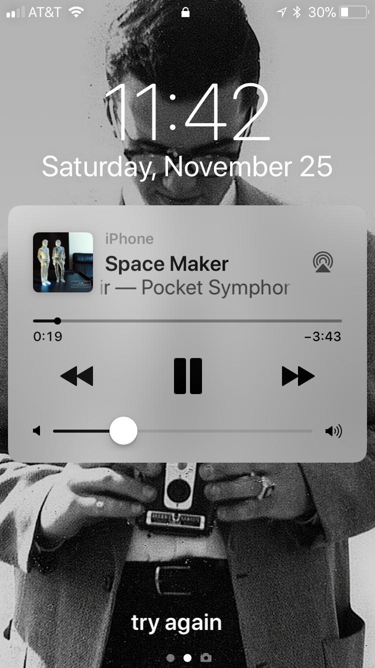
What happened to seeing what is playing on the lock screen on your iOS device? I know it still shows a small window, but it used to show the whole screen with a black background. The new one is cheesy looking. Go back to the old one like the android.
Page 1 / 1
Hello, User40845:
Would you mind sending us a screenshot to be sure we are talking about the same thing? If you are running iOS 11, you may be referring to the new style of the lock screen in general. Thanks in advance for the clarification.
I don't see a screenshot from the person who started this thread but I noticed the same thing after upgrading to iOS 11; the lock screen image which used to show the full album art with a large black border on it and "Sonos" in the border now shows a small image of the album art with larger play controls and "iPhone" rather than Sonos identified as the source. A screenshot from my phone is attached.
I think it was mentioned during the upgrade, had to get rid of this awesome feature to support airplay 2. I think.
Please bring back controller on the lock screen. Please!!!
Enter your E-mail address. We'll send you an e-mail with instructions to reset your password.