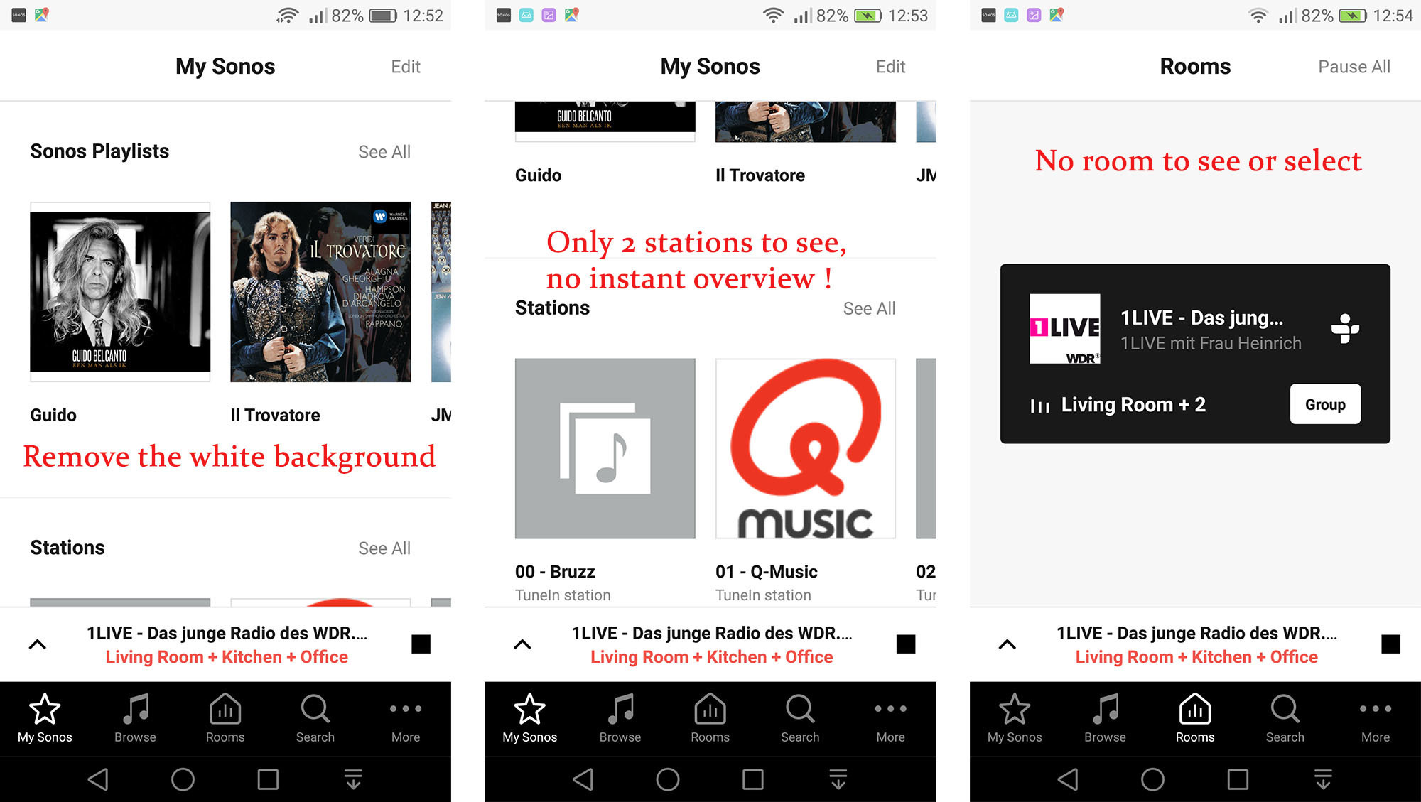
Upgraded yesterday and really dislike the new layout, you redisgned something that just didn’t really need it. Anyone else feel the same?
Page 1 / 1
I agree the new layout is a change and taking sometime to understand how to add and update. I really don’t like the implementation of the station layout. Since the layout won’t scroll all the stations without hitting show all, how about providing the ability to re arrange the stations. The current sort is alphabetical. This is not the my order of preference.
Couldn’t agree more. The new layout is not intuitive at all. I realize that anything new takes time to get use to but the old layout didn’t take any time at all and was very easy to use. They broke something that worked great
I agree. I do not like the white background skin. Bring back the previous look and feel or give people the option to have a night view like before. Remove those big buttons in the My Sonos tab. There is no overview, it looks troublet. I only see 1 1/2 station from the 20 I have in my list. Also the rooms tab is a complete failure. Click on the Rooms tab and I see no rooms. It is NOK!
I miss the quick links to skip tracks and volume. I know i can swipe up but why is this extra step needed.
We have one device which still has the old version and it feels great to go back and use it.
Thanks for the feedback guys. @Peter_270, just a note on your third image there, the reason you're only seeing one room is that you have the other two speakers grouped to that zone. That's what the Living Room + 2 is showing. To ungroup them, you'd press group and you can separate them out to their own blocks.
Hi guys, have been trying to use the new system since you updated it. I just cannot see where it is better, my rooms setting takes an age to update, (if it accepts the new request at all) my song section has two song registered: no artists. I don’t want to keep updating different lists just want the ones I already have sorted.
I know you tech guys always want to try and make things “better” but actually I reckon you had a really good intuitive product that worked soooo well......now , to me anyway, it’s seems to have gotten more complicated, and have lost the intuitive manner of SONOS that worked so well.
PC
I know you tech guys always want to try and make things “better” but actually I reckon you had a really good intuitive product that worked soooo well......now , to me anyway, it’s seems to have gotten more complicated, and have lost the intuitive manner of SONOS that worked so well.
PC
Definitely a giant step backwards! Nate
Please bring back the night view layout. White background skin hurt my eyes during the dark
Enter your E-mail address. We'll send you an e-mail with instructions to reset your password.