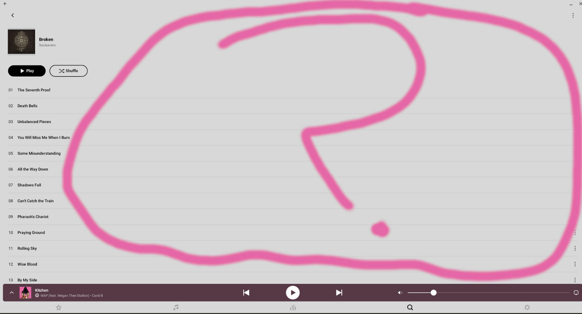
I have been a loyal Sonos customer for may years and love your products (I own a Play 3, Play 5, Connect G1 and G2s) but I have to complain about the new Sonos app. The one thing that I dislike about the new player is when I go to landscape mode on my phone (Samsung S10 plus), the interface stays in portrait mode. On my tablet (LG G Pad III), landscape works but instead of having the layout like in the S1 version, everything is centered and the artwork is super tiny, compared to the S1 interface, where the artwork is on the side and takes full advantage of the space given and info on the opposite side.
Landscape UI in new Sonos app.
This topic has been closed for further comments. You can use the search bar to find a similar topic, or create a new one by clicking Create Topic at the top of the page.
Enter your E-mail address. We'll send you an e-mail with instructions to reset your password.

