What’s is going on with this horrible red box that’s suddenly appeared?!
Is Sonos intentionally degrading their S1 app to piss off their already disenfranchised legacy-owning customers?!!
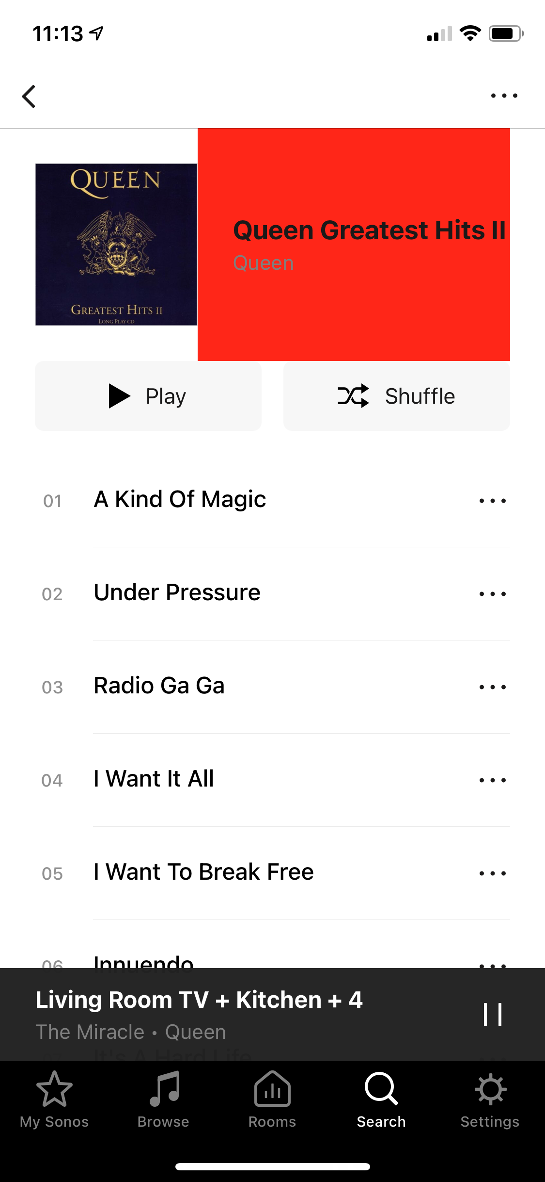
What’s is going on with this horrible red box that’s suddenly appeared?!
Is Sonos intentionally degrading their S1 app to piss off their already disenfranchised legacy-owning customers?!!
Hey
I’ve never seen anything like that before… Does it persist even when force closing and re-opening the app? Also, which music service is this on?
I can confirm 100% that this is not intentional nor are we “degrading” your experience.
Edit: clarification
Yes I expect that is the explanation. All the top business schools now teach ‘piss off your customers at every opportunity’ as best business practice.
My S1 app seems to be red box free, even for Queen Greatest Hits Vol II. Search results look entirely normal.
What is the music source illustrated?
You might try uninstalling the app, reinstall and ‘connect to existing system’
Looking at your screenshot I see a red rectangle that looks to me like a picture of a CD cover, like the one next to it. This does not seem to be the original cover for Queen - Greatest Hits II though. Maybe the original cover is missing from your music database or server and this is some kind of replacement?
Good to know this hasn’t appeared for anyone else! I will try reinstalling etc. And to have it confirmed this is not intentional!!
I can confirm there is no issue with my album artwork, always been fine prior to today. Will investigate further.…
in terms of general dissatisfaction, yes I must confess to being not too happy with Sonos these days, with the whole S1/S2 thing, and the way that’s being handled. It’s clear I’m far from the only one too, and yes I am sufficiently unhappy that it does feel a lot like Sonos are looking to make my experience on S1 an unhappy one at any opportunity. Like for example these regular prompts to upgrade which confuse everyone in our household and also regularly and continuously spoil the user experience.
I don’t think I should feel like I need to apologise for expressing this.
Yes I expect that is the explanation. All the top business schools now teach ‘piss off your customers at every opportunity’ as best business practice.
Would be good if Sonos attended one of these very good business schools!!
Hi
i think this is an “update” in version 11.2.7 i have got the ugly red box today , and a friend who updated today also see this red box , please can sonos confirm if this was intentional ? if so why as its really ugly and just seems unnecessary ?
Just to clarify: the "red box” appears when playing from your own library? The CD cover turns red when a song starts playing?
Hi
i think this is an “update” in version 11.2.7 i have got the ugly red box today , and a friend who updated today also see this red box , please can sonos confirm if this was intentional ? if so why as its really ugly and just seems unnecessary ?
I already confirmed further up in this thread that this isn’t intentional. Please tell me which music service you’re experiencing this on and which options in the app you’re choosing as we haven’t seen this behaviour before.
Hi , no
its when you browse music from the app , by album , or artist , in both music library and in napster , when you drill down in either albums or artists , and select a specific album this is where the red box appears , if you then select the album to play , the playing window is normal, with just the normal album art
ensure when you drill down to the album to play you only tap once on the album cover , so that it then shows the album and all its tracks
Good to know this hasn’t appeared for anyone else! I will try reinstalling etc. And to have it confirmed this is not intentional!!
I can confirm there is no issue with my album artwork, always been fine prior to today. Will investigate further.…
in terms of general dissatisfaction, yes I must confess to being not too happy with Sonos these days, with the whole S1/S2 thing, and the way that’s being handled. It’s clear I’m far from the only one too, and yes I am sufficiently unhappy that it does feel a lot like Sonos are looking to make my experience on S1 an unhappy one at any opportunity. Like for example these regular prompts to upgrade which confuse everyone in our household and also regularly and continuously spoil the user experience.
I don’t think I should feel like I need to apologise for expressing this.
It might help if you attempted to try and understand the situation before assuming that Sonos is just out to annoy their own customers. I definitely agree that the prompts to upgrade would be annoying and I can’t imagine many S1 customers don’t know about S2 by now. However, the app updates are there for security patches, so that your Sonos system isn’t a door way for hackers to get into your home network. It’s not about trying to spoil the user experience, obviously, and surely something Sonos would rather not have to bother with on either S1 or S2.
Thanks for the information folks, we’ve been able to reproduce this and have raised it with our development team. They’ll take a closer look into it and work on a fix as soon as possible, though we have no further information to provide at this time. Once again, thanks for bringing this to our attention
thanks for your assistance and response , and glad it’s a bug and not a new feature !!!
Yes thanks for confirming it’s being fixed.
As has been described above - it’s in lots of places when browsing My Sonos or search results. The current playing screen is fine.
I’ve got the same problem, getting it on browsing my own library and on Plex.
Glad to hear support have been able to reproduce it as I was very worried this was an intentional new design element after latest S1 update.
Hey folks,
Thanks for your patience on this! We’re rolling out an update to the S1 iOS app today that should rectify this problem. Make sure you update to the latest build as of writing (build 57.5-88080) and you won’t see the red box on your browse view any more.
What’s is going on with this horrible red box that’s suddenly appeared?!
Is Sonos intentionally degrading their S1 app to piss off their already disenfranchised legacy-owning customers?!!
That’s good news! Thanks James.
Clearly I am also relieved to see that Sonos are continuing to look after us S1 laggards! :-)
Enter your E-mail address. We'll send you an e-mail with instructions to reset your password.