Would be great on the desktop controller if we could click on the now playing artist / album / track artwork to make it full screen.
At the moment you just get a slightly larger pointless thumbnail on the mini player, it would be great if this could go fullscreen.
I understand that the image is square in shape so wouldn’t be able to stretch to fit to a rectangular screen, but a larger image against a solid colour backround (white or black) would give the desktop app a great look when music is playing. Just like the mobile app but landscape for a desktop screen.
Surely a possibility in 2022?
Page 1 / 1
Double-click on the mini-controller window to make it bigger (or smaller).
I doubt we’ll see much new functional development on the Desktop Controller. It’s appeared to be in maintenance mode for quite some while now.
Double-click on the mini-controller window to make it bigger (or smaller).
I doubt we’ll see much new functional development on the Desktop Controller. It’s appeared to be in maintenance mode for quite some while now.
Yeah i’ve mentioned clicking on the controller in my OP.
Not really much use when you’re looking for a fullscreen solution.
You mentioned clicking on the Now Playing art, which toggles the extra window on/off. I’m talking about double-clicking on the second window itself. You can also click the “+” button.
As for a full-screen display “surely being a possibility in 2022”, it would only appeal to a tiny fraction of those using the Desktop Controller, who already are a small fraction of Sonos users. Hardly a good use of scarce engineering resources. If it came to it, Sonos would probably satisfy a lot more people by providing a TV-based Now Playing display via the HDMI from all the Sonos home theatre players.
If i click on the now playing artwork, the artwork gets a little bigger (mini player) if i then click the + button it gets a little bigger still. The point i was making is that there is that the mini player is kind of pointless in a time when all UIs that play music now have a ‘now playing’ full screen feature.
Don’t see why sonos can’t implement a full screen ‘now playing’ on both TV and Desktop. I wouldn’t imagine it would be that difficult or time consuming these days.
Of course.
“It’s only a few lines of code.”
The Sonos Windows and Mac desktop apps feel like red headed step children. They could use some serious love as they feel stuck in the year 2000 compared with the mobile S2 apps. I use them when Im at my computer but I never really love the experience.
Since Sonos said a long time ago that they are not getting any further development, it does seem logical that you may feel them being “stuck”.
For what it’s worth, I use the Mac desktop controller daily.
Incorrect link.
For what it’s worth, I use the Mac desktop controller daily.
And I use the Windows controller daily too. However I rarely open the mini-controller window. It takes up useful desktop space.
I certainly have no interest in a fullscreen version of Now Playing. If I’m sitting at my PC it’s to do stuff on it.
My Windows app (see profile) includes a full-screen option. Just click on the album art.
I certainly have no interest in a fullscreen version of Now Playing.
Nor of paying for one.
If it came to it, Sonos would probably satisfy a lot more people by providing a TV-based Now Playing display via the HDMI from all the Sonos home theatre players.
I would absolutely be up for this and would use it often. Surely more effort and probably a headache to maintain, but a TV app controller (or just read only) would be even better. I might even pay for that.
My Windows app (see profile) includes a full-screen option. Just click on the album art.
I have your windows Phonos app and thanks for the recent update, but the layout of the album art on the full left handside of the screen and nothing on the right hand side looks terrible.
If you centred the artwork in the middle of the screen and a little smaller with a white or black background it would be a lot better.
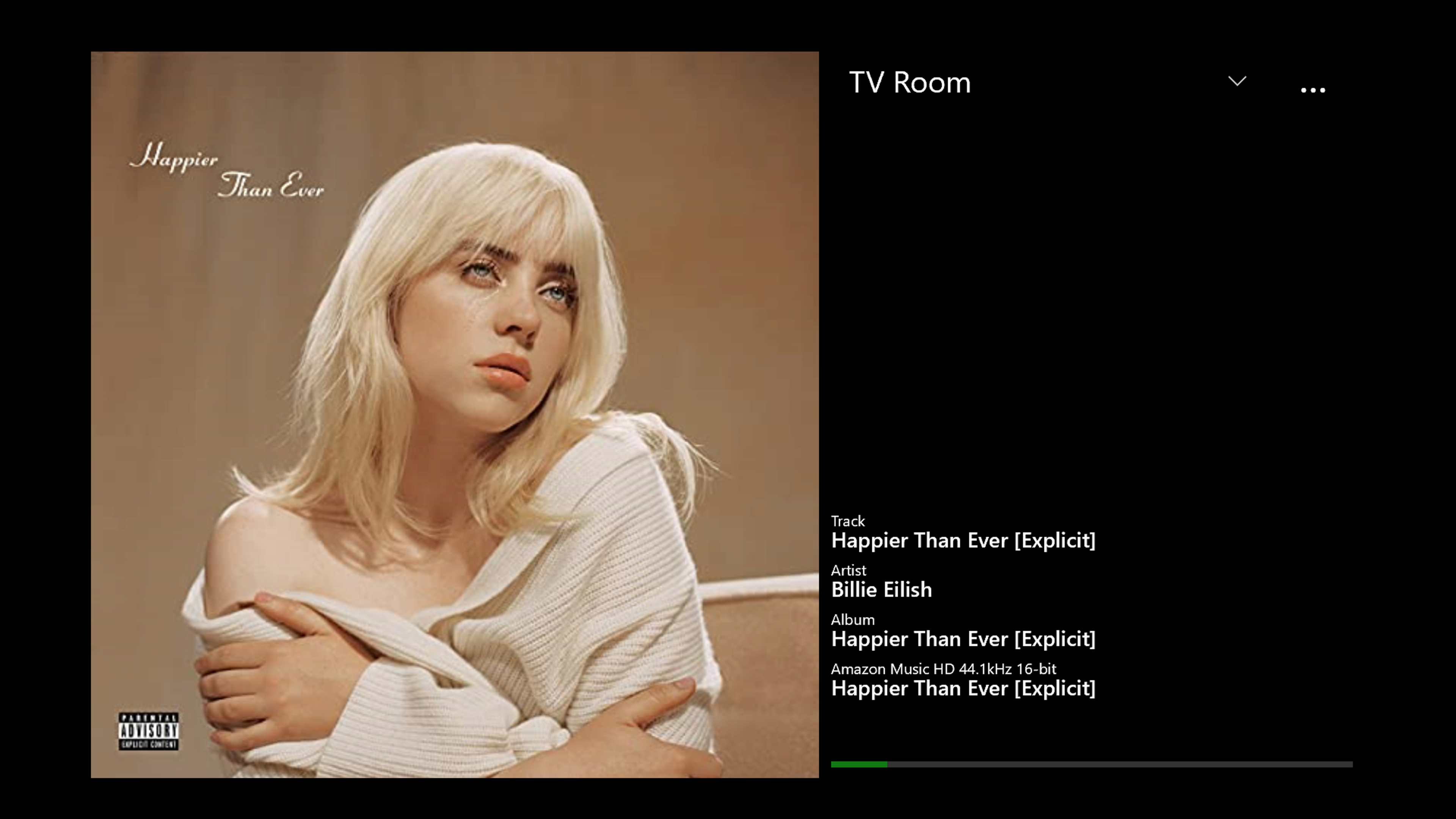
UX is always debatable. The background color is configurable in the app. Here is how it looks on my TV, via my Xbox:
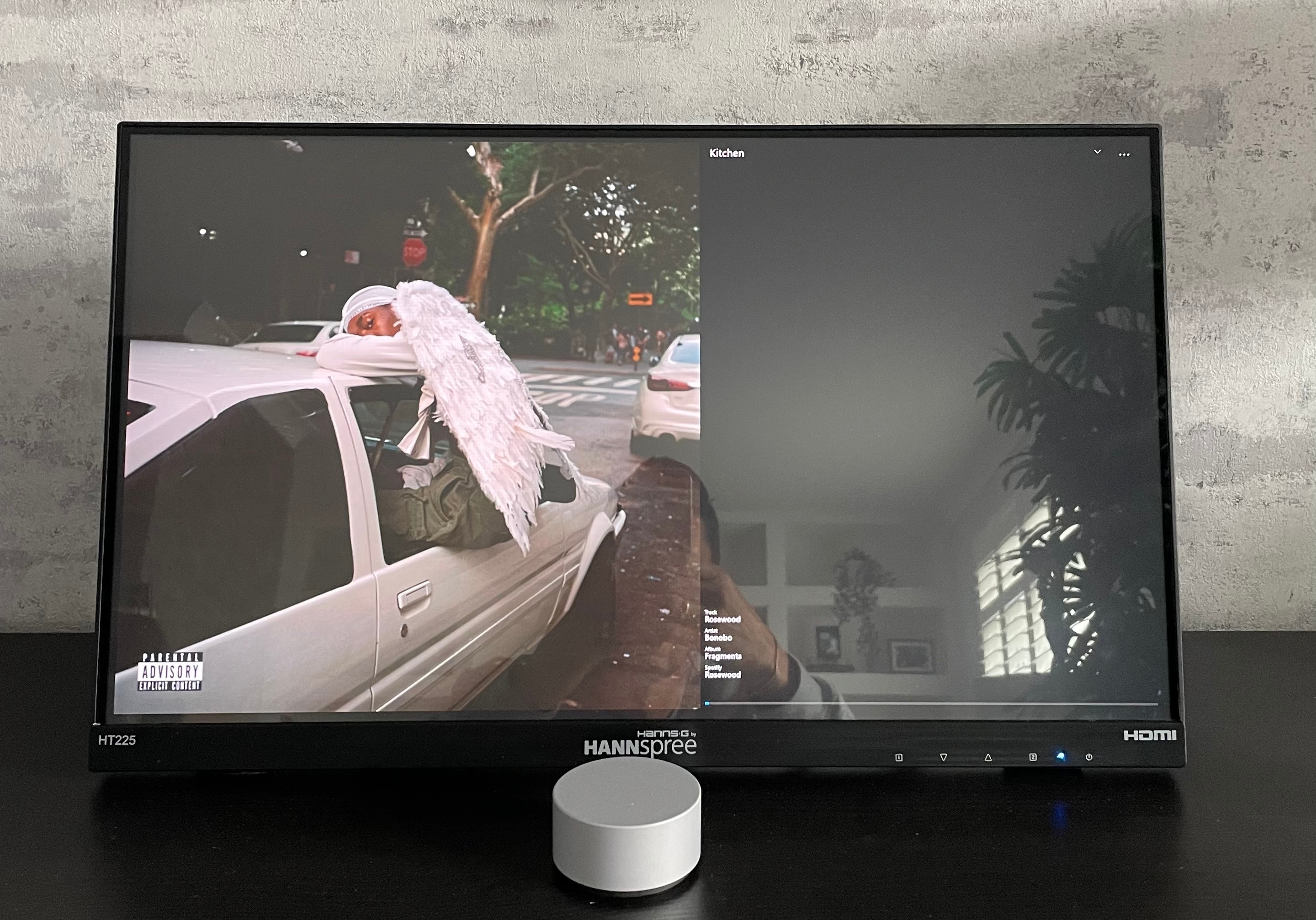
Doesn’t look quite so good on windows on a touchscreen monitor.
Wow that’s a seriously high res or dpi, I see you point. I’ll see if I can scale the text though not sure how I can repro that.
This is now fixed. The text section is now scaled to fill the available space, and looks much better on high res screens.
Doesn’t look quite so good on windows on a touchscreen monitor.
This is now fixed in version 5.2, the text is scaled to fit the available space.