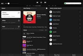
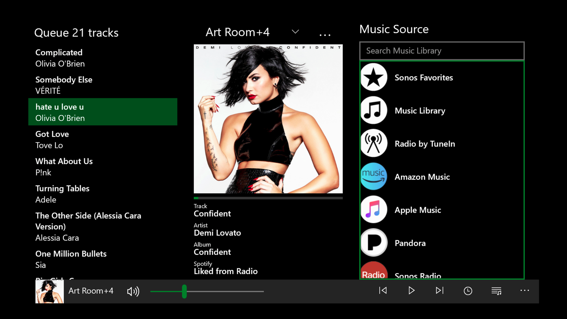
I’d like to see the ability to switch to a more basic controller interface. One where you can simply select the room and music on one screen. I never look at the screen, don’t care about the skins and all of the rest of the stuff. I made my playlists already so I know what’s on there. All I want to be able to do is pick a room(s), select a stream and set the volume. This would just be the ability to switch between a basic remote and a full controller.
Hi
Thanks for your post - an interesting idea. I’ve marked this thread as a feature request, and it will be seen by the relevant team(s).
Have you tried voice control?
BTW, I believe Sonos will be introducing its own voice control this year or next. No more dependencies on Amazon and Google...
The requirements sound a lot like what you see on the desktop controller for Sonos. While I like the idea a lot, my phone screen is just too small for all these details, though a tablet would be good I think. And of course, if you only have one or two rooms, it would be much less detailed and easier to use overall.
Oh, you mean the old 3-pane tablet controller.
https://www.wired.com/images_blogs/gadgetlab/2010/09/iPad-Screenshot-1.jpeg
Can’t see that making a comeback somehow.
The requirements sound a lot like what you see on the desktop controller for Sonos. While I like the idea a lot, my phone screen is just too small for all these details, though a tablet would be good I think. And of course, if you only have one or two rooms, it would be much less detailed and easier to use overall.
Yes, but I think you could simplify it even more using a more vertical presentation: Search (optional), Volume, Play/Pause and Fwd/Back at top, Now Playing (no artwork), Rooms (rotary menu with circle to choose for multiple), and Same for Source without need to multi choose. That would be a great alternative to the My Sonos star look or as the default screen when you open the app up. I really like that UI concept and that whole approach-Simple 80% rule and then dive in for the other 20% usage. I know there are some constraints now with the home screen on Apple devices but would really love something like that on the swipe left menu functionality as well.
One other function request is that when I open an app and I choose a room(s) I would love Sonos to know that is the room(s) I want to play music on and not the one that is currently selected. I really would love it to actively move to that room(s). I don’t know how many times I will do that, start to play music and it plays on the incorrect room and not the room(s) I was setting up.
Oh, you mean the old tablet controller.
https://www.wired.com/images_blogs/gadgetlab/2010/09/iPad-Screenshot-1.jpeg
Can’t see that making a comeback somehow.
Shame - the current version is crazy on a large tablet
What like this?
Enter your E-mail address. We'll send you an e-mail with instructions to reset your password.