Ah come on Sonos, alarms used to be so easy. It used to be click ‘More’, click alarms. Now in 10.4 it’s click ‘Settings’, click ‘System’, scroll around a bit, click ‘Alarms’. Why? Sometimes it feels like Sonos is constantly changing stuff for the sake of change, not to improve the functionality.
Page 3 / 6
Pissed off at having to google where to set the alarm - this is not a 'system' function. SONOS fail. Fix ASAP pls.
As enveryone said, the alarm is an every day function for us. Even set twice per day when we have to get up at différent times.
I would love to have it as accessible as My Sonos, and or through an Android widget and see the next alarm on the lock screen notification...
This update made the Sonos system unusable for one of our primary use case (at least in bedrooms)
Thanks for the future update !!!
I would love to have it as accessible as My Sonos, and or through an Android widget and see the next alarm on the lock screen notification...
This update made the Sonos system unusable for one of our primary use case (at least in bedrooms)
Thanks for the future update !!!
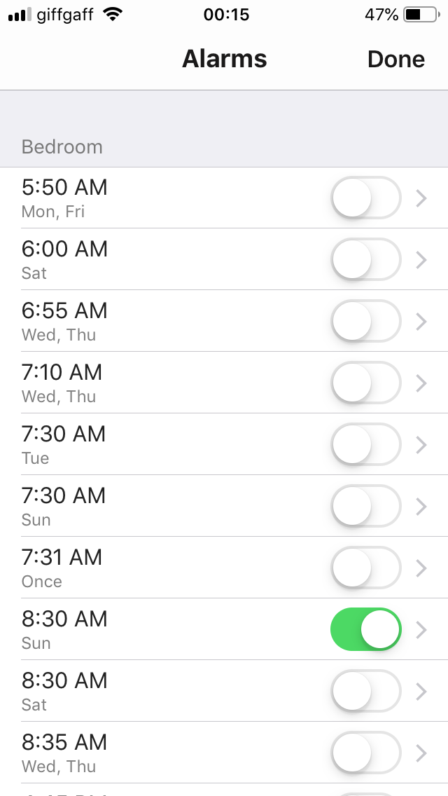
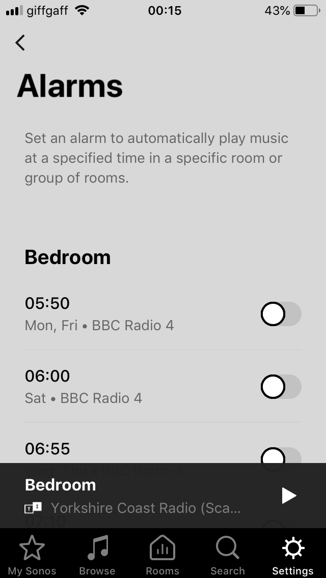
Just to demonstrate the difference between the design of the old and new screens, I’ve attached before/after FULL SCREEN images from my phone.
BEFORE: (clean lines, attractive to look at, great use of available screen space, 10 alarms visible on one screen, nice large on/off buttons to aid selection, green button ‘on’ colour provides a nice and attractive visual aid to show at a glance which are switched off/on).
AFTER: (I’ll leave you to judge for yourself but I dislike this new version of the same screen intensely, and my dislike is increasing each time that I use it).
What I’ve also noticed is that (on my admittedly older iPad) the redesigned ‘Settings’ screens have become much more sluggish than the old. e.g. When I select ‘Alarms’ from the previous screen it takes almost 2 seconds before the Alarms screen actually appears. And just as long (if not longer) between selecting an alarm to actually see the Alarm details. I’m sometimes pressing the screen twice thinking that my first press hasn’t been registered. This is ok for accessing Settings which don’t change very often, but I access and use Alarms every day. The new screens certainly seem to be more resource hungry for some reason.
I’m very sorry Sonos designers/coders. I know that you must have put a lot of time and effort into the new ‘Settings’ redesign, but I’m afraid that I just see it as a big backwards step. From my perspective I can’t see what gains it brings, it looks ugly, performs sluggishly (at least on my older iPad) and gives me, as an end user, a poor and frustrating user experience. Please think again.
The alarm issue needs fixing and quickly! What happened to user testing?
I've posted separately under Troubleshooting, but I've just had one of my regular wake up alarms fail to go off. Not even the chime. I've never had this happen to me before and I've been using alarms for years. It's easy to jump to conclusions...
I just responded to your troubleshooting thread. Please don't jump to conclusions, the UI changes are unrelated to alarms that don't work alarms are stored on the players, not on the apps.
Hi Ryan - sorry I’ll try not jump to conclusions. I don’t want to set a hare running for you/Sonos. it just seemed a bit co-incidental.
In my defence I mentioned in an earlier post that the Alarm buttons in the new GUI were a bit ‘sticky’ but this didn’t really articulate clearly what I meant. I had the scenario when switching an alarm that the button got stuck half way between on and off for a while. So (purely from an end-user perspective) I guess that I was thinking this might have somehow confused the system or corrupted something.
That sounds a lot more like an issue in your local wifi environment, as the button push on the controller would be communicating with and getting a response from the software on your speaker(s). You may want to check the wifi interference FAQ, and see if there's something there that might be causing an issue in your local LAN. Which actually would be an excellent reason why the alarm might fail, too. If the speaker can't reach the indicated location, it falls back to the chime.
Don't want to take this thread off at a tangent (my fault for posting here about the failed alarm). Thanks very much for this suggestion. I'll take a look.
Been using Sonos since the earlies days, all the way back to having a separate physical controller. Many of us use alarms, 'cause, well, we don't want a cheap battery operated alarm clock when we've invested $$$ in a fantastic music system.
Anyone willing to THINK about how people use alarms realizes that they are absolutely positively not a set-it-and-forget-it feature. An early meeting = an early alarm, etcetera. And when does a user change alarm settings? Yup, just before bedtime … when poking around deep in the menu structure is NOT APPRECIATED.
Burying the alarm control demonstrates an approach to UI design with little empathy for the users. I'm sorry to say, this approach has been evident for the past couple of years.
I realize this post is harsh, but this particular deeply flawed change with the alarm controls needs to garner enough attention to get fixed.
My Sonos, rooms and alarms are my three most commonly used functions. I’d like alarms as a button on the front/home page. Also agree with Howard S regarding the horrible changes to the alarm UI. Why not provide users with the option to move functionality buttons around the app - a bit like iOS? Let us decide if we set alarms once and are happy to leave them buried, or if we use them daily (my case) and would like them on the front page
Can't say I've EVER used alarms on Sonos, didn't even know there were any, and I suspect I'm FAR from alone. Hard to imagine alarms are a widely used feature of Sonos, especially considering there's no battery backup for power outages.
OTOH, I use timers all the time in the kitchen, on the paired Ones, always via Alexa voice control, never via the app.
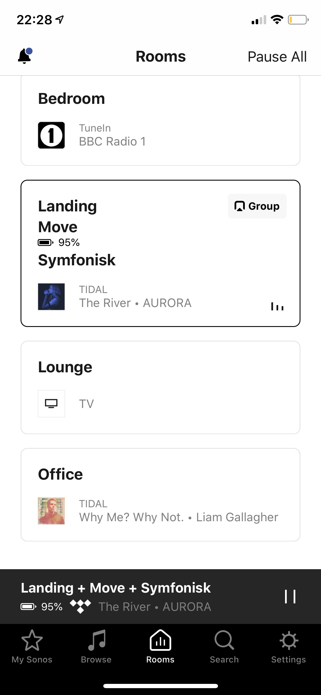
On the 10.4.1 Android app there is now a bell symbol top left of the rooms screen which takes you directly to alarms.
I also want to point out the cognitive strain of putting alarms so many taps deep. When you're tired and ready to sleep, it can take more thought to figure out where to find this. Every night, I like to check and make sure my alarm is on. These hoops make me much more confused, and I genuinely make a mistake of tapping on my room in settings every time.
Have you tried updating your controller to 10.4.1?
We're testing this out with some Sonos controllers, but it's not available on all systems updated to 10.4.1 at this time. Some people will see it show up on their controllers over time as well. Based on use and performance, it may be added to all controllers in the future.
Can you clarify this please, Ryan.
When you say “testing... on some controllers” do you mean for some devices - eg IOS or Android - or are you giving a version on IOS to “some people” but not others?
Does that mean you are somehow releasing multiple versions of 10.4.1? How are you selecting who gets which?
Are some people, in effect, being used as beta testers, which is especially implied by your final sentence?
It’s not uncommon in software to be able to A/B test some things, depending on a server setting that checks an account status. You’ll find such a thing in almost every “free” game out there, so that the profitability of certain things can be tested. I’d imagine that Sonos can do the same thing, by turning on a specific feature for a subset of its users, to see how it performs, before throwing it open to a greater number of people. That way, if it doesn’t work as intended, there are fewer people impacted, but if it works as intended, it still gets tested by a small group, without having to go through a longer “beta” process.
I would imagine that’s what is going on here.
Happy to report both Android and IOS devices in my system have the new shortcut into the alarms page.
Credit to the developers for quickly implementing this 'navigation to alarms page', fix .
Noticed this on my iPhone last night. I love the settings UI so please do not change the look and I'm a big fan of the alarms on the 'Rooms' page.
Not available on my 10.4.1 for Android...
Please speed up the deployment and think about a widget or a lock-screen notification with next alarm time.
Thanks
Please speed up the deployment and think about a widget or a lock-screen notification with next alarm time.
Thanks
I second this. Had to search for my alarms first. Glad that there seems an update coming for this. The rooms page seems like a good place to put it, looking forwards to that update.
Just arrived for me on iOS. Works for me. Brilliant! Thank you so much to all on the Sonos development team for coming up with a potential solution. Hoping that it gets adopted. If so, I can go to sleep each night after checking my alarms so much happier! Now if you could make the new Alarms and Edit Alarm screens a little more compact to reduce scrolling, and the sliders a tad larger to avoid false hits, and I’ll be more than satisfied!
Hi SONOS Community,
I use the alarm function frequently. The latest SONOS app (v. 10.4.1) "hides" the alarm under Settings>System>Alarms.
That's buried a little deep, plus it doesn't make intuitive sense categorized there.
Is anyone else bothered by this? I'd like to request that the Alarm function be moved up at least one level in the next app version, and possibly be re-categorized as a feature or utility.
Thanks,
NBK
I have Android app 10.4.1 but I don't have the alarm shortcut. Please implement it for everyone asap because I dislike sonos very much now, every time I have to start digging in settings to change an alarm. Which is daily. I thought you'd hire professionals to design your UI.
Enter your E-mail address. We'll send you an e-mail with instructions to reset your password.