Hi everyone! Some of you may have seen my post on Reddit yesterday, but I wanted to invite feedback from this group directly on the same topic. Here’s what I posted over there:
For the last couple of months our engineers and designers have been working to improve usability of the app and I wanted to start a conversation here about what we’re up to, and invite your thoughts, long before any changes start showing up – even in our beta channel.
As you know, all too well, over the past year we’ve spent a lot of time digging out from the obvious performance and reliability issues in the “new” app. We’ve made progress but of course that work continues. Recently though we’ve also been asking a different question: even when the app works, does using it make intuitive sense?
To help validate our belief that we had real work to do here, we’ve been in customers’ homes watching them use Sonos. We’ve sat with people while they try to queue up music to a room down the hall. We’ve watched them search for a favorite artist. We’ve read the forums and threads here closely. We’ve run structured usability sessions and informal ones.
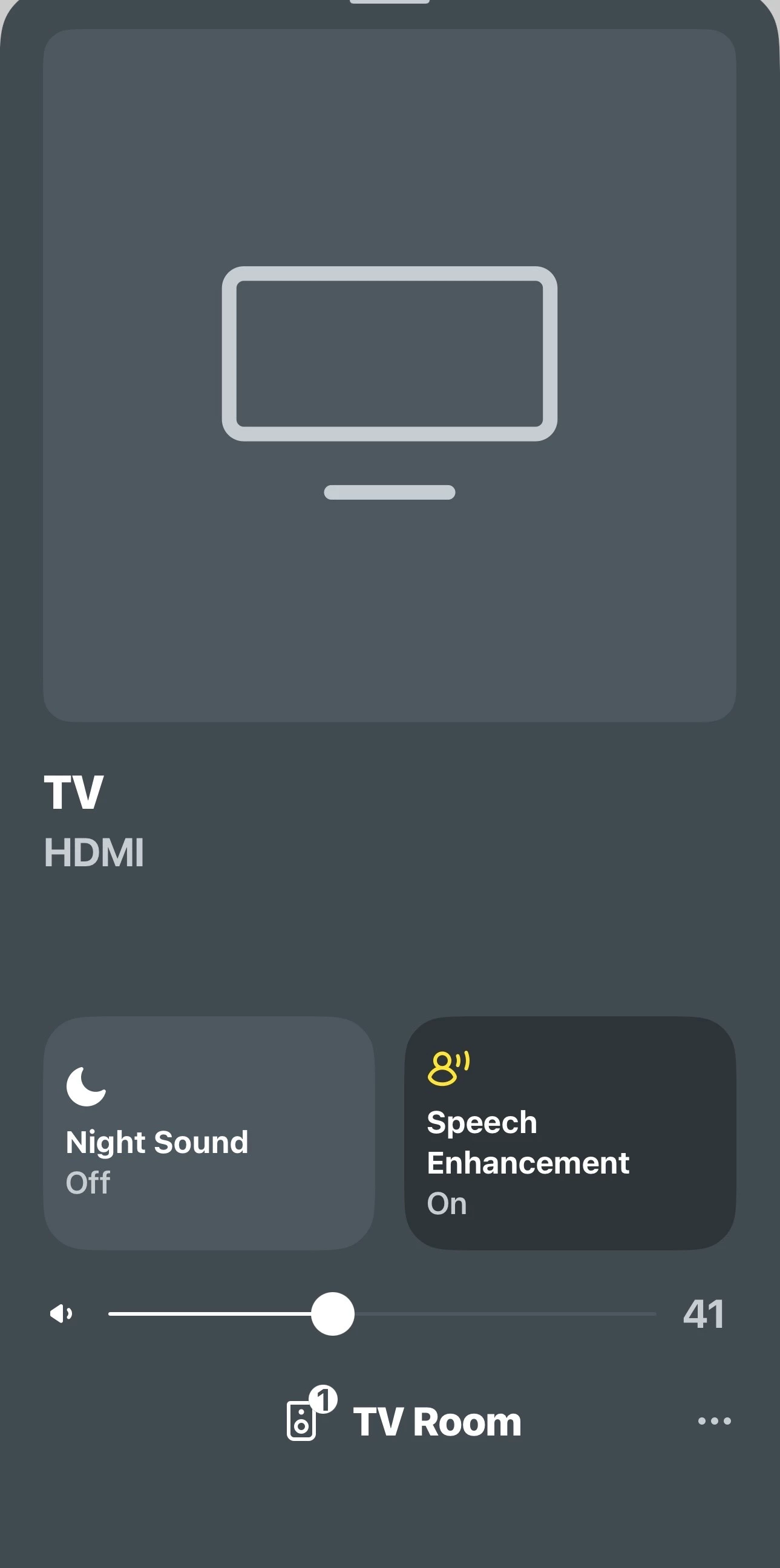
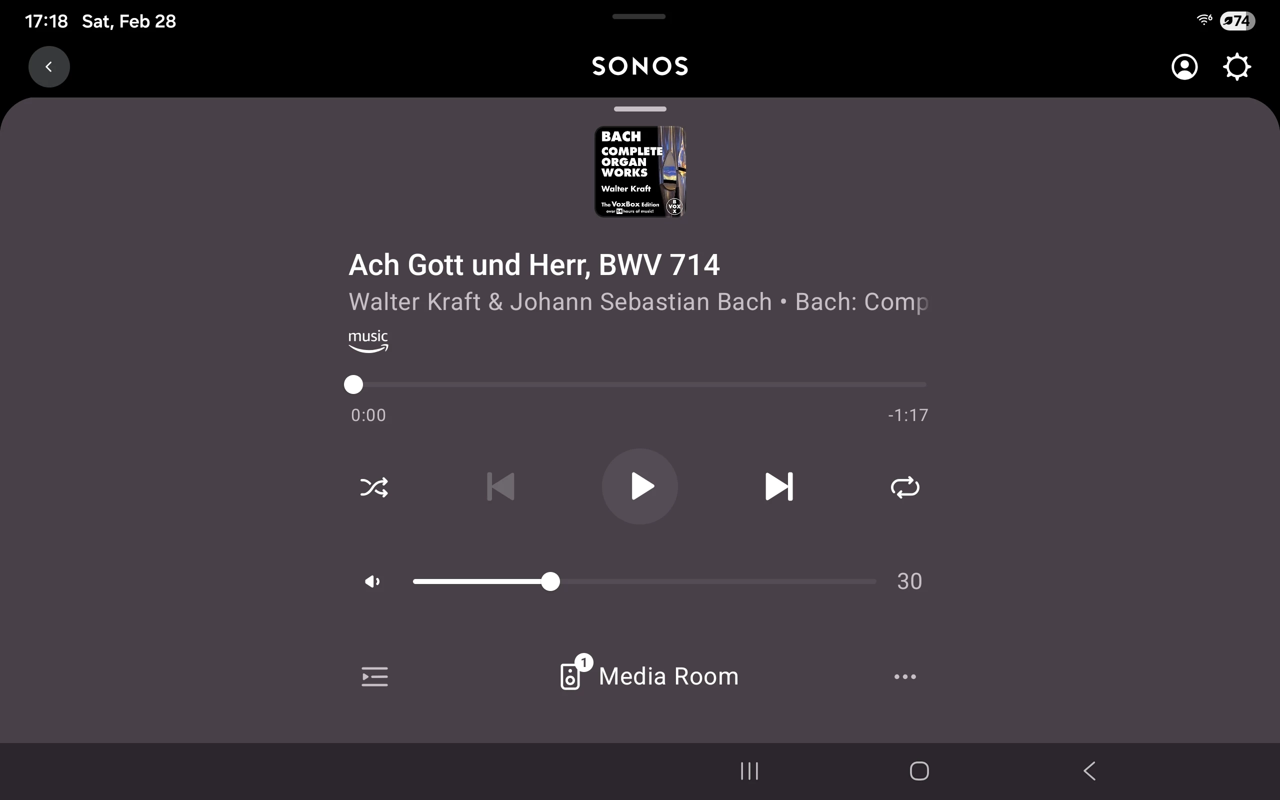
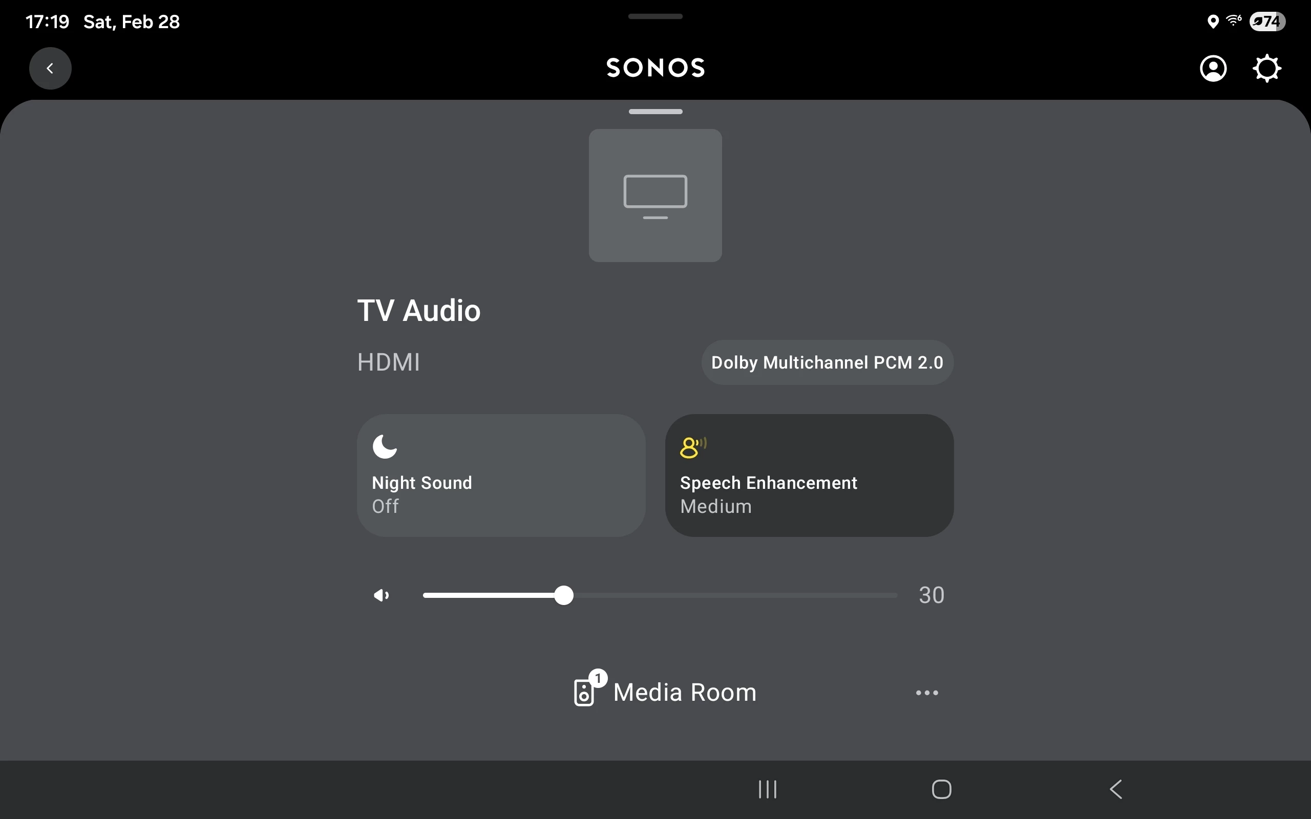
Surprising no one, we keep hearing that the core navigation patterns in the app are simply unfamiliar in ways that aren’t helpful. Swipe up gestures. Content cards on top of content cards. Key controls that reveal themselves only after someone tells you where they are. These are design choices that don’t show up in the other music apps people use every day and that mismatch alone creates friction. Even when the app is technically working.
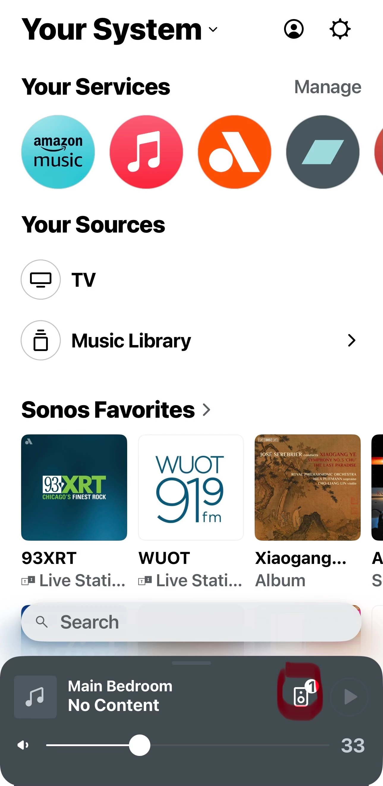
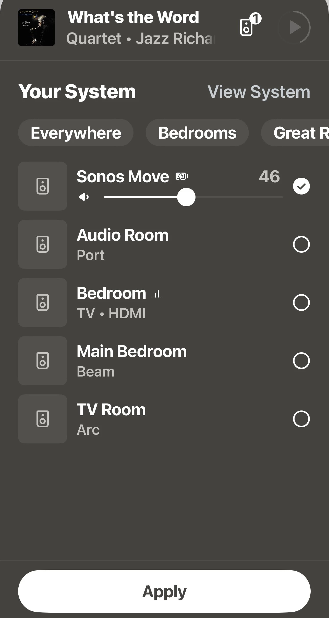
So we’ve been working on a more conventional approach to navigation. Restoring tabbed navigation between key screens. Making search and browse much more straightforward and visible. Eliminating the need to discover hidden gestures. In short, leaning into patterns people already understand rather than asking them to learn ours.
In usability testing, the revised approach is performing really well. People get to their desired end state much faster and with much less confusion. They report feeling more confident about where they are and how to get where they want to go.
Even so, we are not going to flip a switch and surprise everyone with these changes. This will start as an opt in experience within our beta community. When that process yields an exciting result, it will roll out gradually to a bigger audience. Throughout it all, the details will almost surely evolve based on what we learn from the people who choose to try it. I expect this to be a months-long process of refinement rather than a single release moment.
Before any of that starts, I’d really value hearing from the community here.
When you think about navigating the app today, what feels most off to you? Are there things you like?
Where do you feel friction? And where is ease particularly important?
What do you wish behaved more like the other favorite apps you use?We’re committed to getting this right patiently and methodically, until it feels like something you don’t have to think about.
Thanks, as always, for the candid feedback.