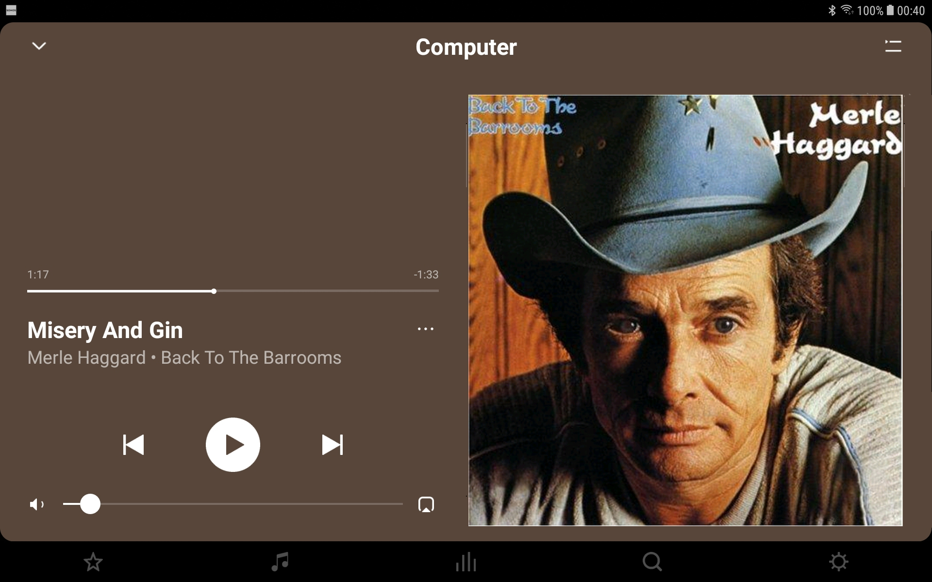
Hi, why such a small media image on the landscape view of the controller still?  See attached.  Wondering if there is an enhancement on the horizon to improve this?  I would prefer this media image to be 25% of this screen.  As it is, it adds very little to the display.  Do you agree?
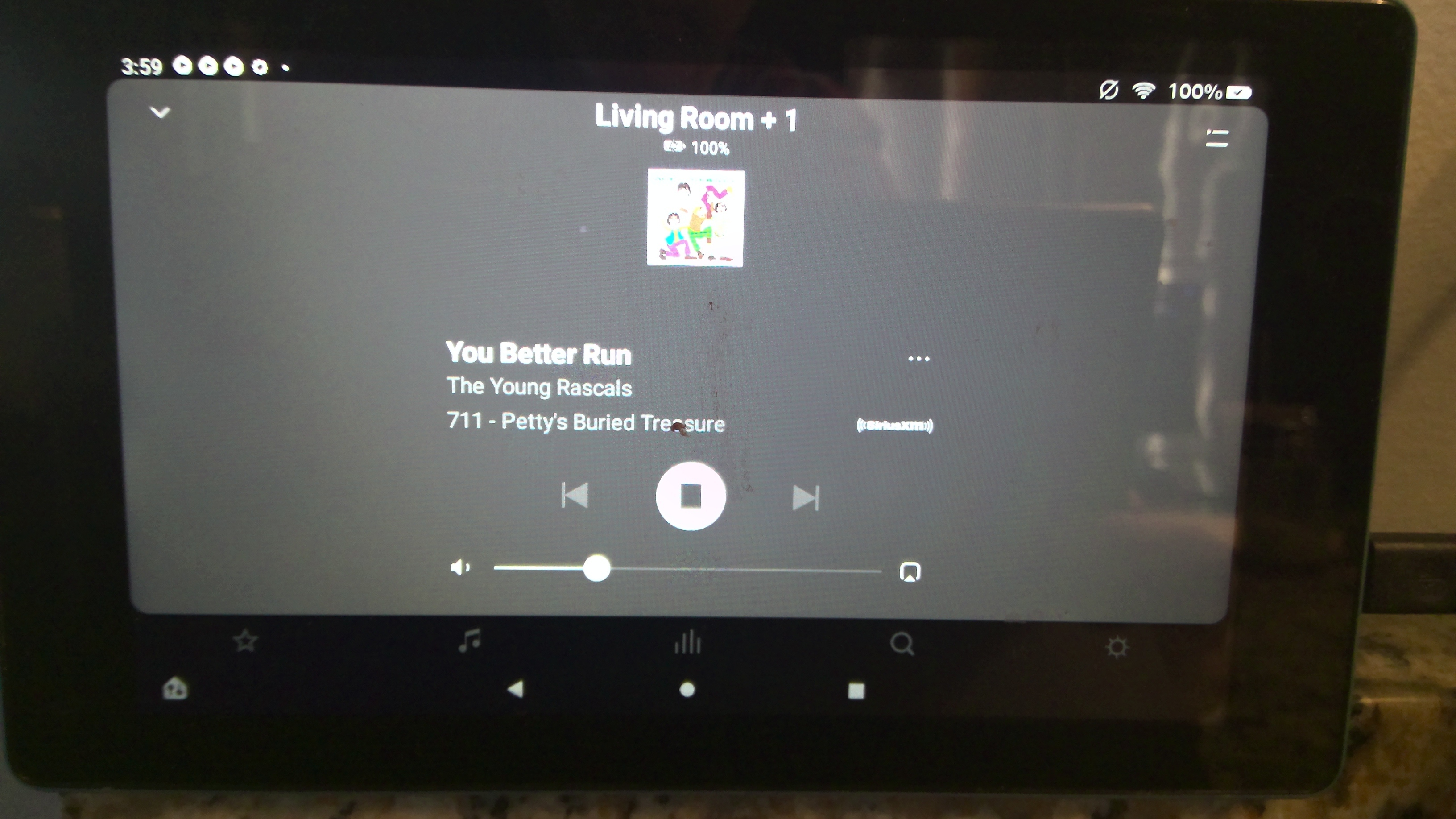


Hopeless isn't it!


What size is the image being delivered by the streaming service? I see slightly larger ones when streaming from Amazon or my local library.

It would be nice to see a much larger image (if available from the music source) shown. Maybe add a view, similar to when the Queue is open with the controls pushed to the side, the small image above the controls removed and a large image shown in the new sidebar? Suggestion below.

Even restore an option I seem to recall from the CR-100 where you could tap the image and it would pop-up full screen?

f


Album Art one side (50%), auto-scrolling (synchronised) song Lyrics the other (50%) ...and playback controls below those two, just large enough for ‘sausage-finger’ manipulation and I would then be quite happy.😁


The design of the Sonos android controller was pulled into line with small screens like mobile phones a number of years ago now - IIRC, 4.x was the last full featured display that worked well on larger tablets - it looked very similar to the current PC display and (IMHO) made much better use of the screen real estate. I bought a 10” tablet as a Sonos controller, but shortly after they moved to 5.x, which looked silly on such a large screen.

Personally, I doubt that they’ll change it, but wish you the best of luck ;-)