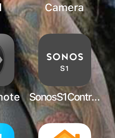
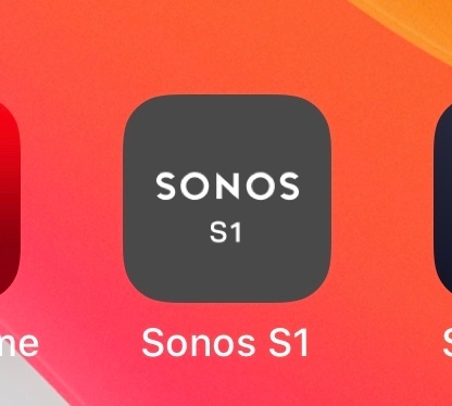
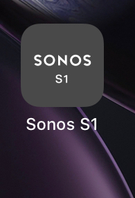
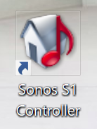
I know this is a minor thing, but I’m bugged by the long name under the new S1 icon on iOS. One of the things I love most about Sonos products is the clean look, so the new ...’s on my home screen are a peeve. If it says S1 on the icon, no need to say it underneath as well. Anyone else?
No doubt, is this the best you can do Sonos? Let’s crap on the people who don’t upgrade? Honestly, why am I not surprised at all?
Agreed! Please sort this Sonos! Its ugly!
Not sure how it is on iOS, but on android, it’s possible to minimize the icon size so the text in an icon are not readable. In that case, the text underneath the icon is pretty critical. For that reason, and because a lot of folks have split systems, the underneath text does need to say S1. However, there’s no need for ‘Controller’. ‘Controller’ isn’t on the S2 app so this more like a mistake than anything else.
A minor issue,yes, but hopefully something Sonos will fix. However, the idea that it’s intentionally done to give those with S1 systems a poor experience is just utter nonsense.
Good info. Nothing about home screen icons on iOS is customizable by the user. I can see needing to differentiate between the two apps, but there has to be better a solution. And meanwhile those with all S2 equipment get an app that just says “SONOS” like the old one did.
I’m pretty sure they made it intentionally that way, not to make it an ugly experience, but to combat all the previous complaints that mentioned they didn’t realize that they upgraded and then have issues with their system.
Right now the labeling is very useful to avoid any confusion.
Im sure they will clean up once everyone (or most) is used to the two different apps.
Agree, it looks horrible in iOS..please fix or replace Sonos APP name for S1 !!
I went ahead and fixed mine, no point in waiting for Sonos to do it. I’m currently jailbroken, so this is very easy to do with a jailbreak tweak called “Icon Renamer” by Ryan Petrich. Hold down until the icons are in “jiggle” mode, then tap the icon and rename.
Very poor job, Sonos! Take an extra 5 minutes in QA and get it right.
However, the idea that it’s intentionally done to give those with S1 systems a poor experience is just utter nonsense.
I don’t think they intentionally do it to give us a poor experience, they just give us a poor experience. Of course if we had just paid more money to replace our perfectly good equipment with new equipment, Sonos wouldn’t have had to be bothered with creating a separate app for us cheapskates.
Ha—I am so pleased there are others who feel the same way (but maybe saddened for society as a whole that we exist LOL). Anyway, I believe the new S2 app is yellow rather than gray, so that helps with visual differentiation. I don’t mind the new icon saying “S1” all THAT much, but the label below it blows. Might as well have a TM on the end Like our jailbroken criminal friend has done above, seems like the label could just say “Sonos S1” and leave “Controller” out completely. Please Sonos!!!!!!!!
Yes, I vote “Sonos S1” for the App name!!
Not only is the icon name irritating, but I also really hate the colour - the grey looks like a washed out black, and as such looks like an app that’s in the middle of updating! I hate the icon so much I split my system into an S1 and an S2 System just so I don’t have to use it much and can move it onto a different screen (so I guess they know what they’re doing with the annoying app lol)
Having said that the washed out yellow irritates me too. Choose a colour - don’t choose a colour and then put a 20% transparent white layer over it!
Rant. Over.
I assume this was done to ensure that the new app comes up first for people that have both apps right now.
Makes sense.
Agree 100%
i Love the clean look of everything with sonos
But now with this new S1 app icon look is awful
black background vanishing color and name looks awful on iPhone devices.
please change it to S1 name and old black dark shiny look.
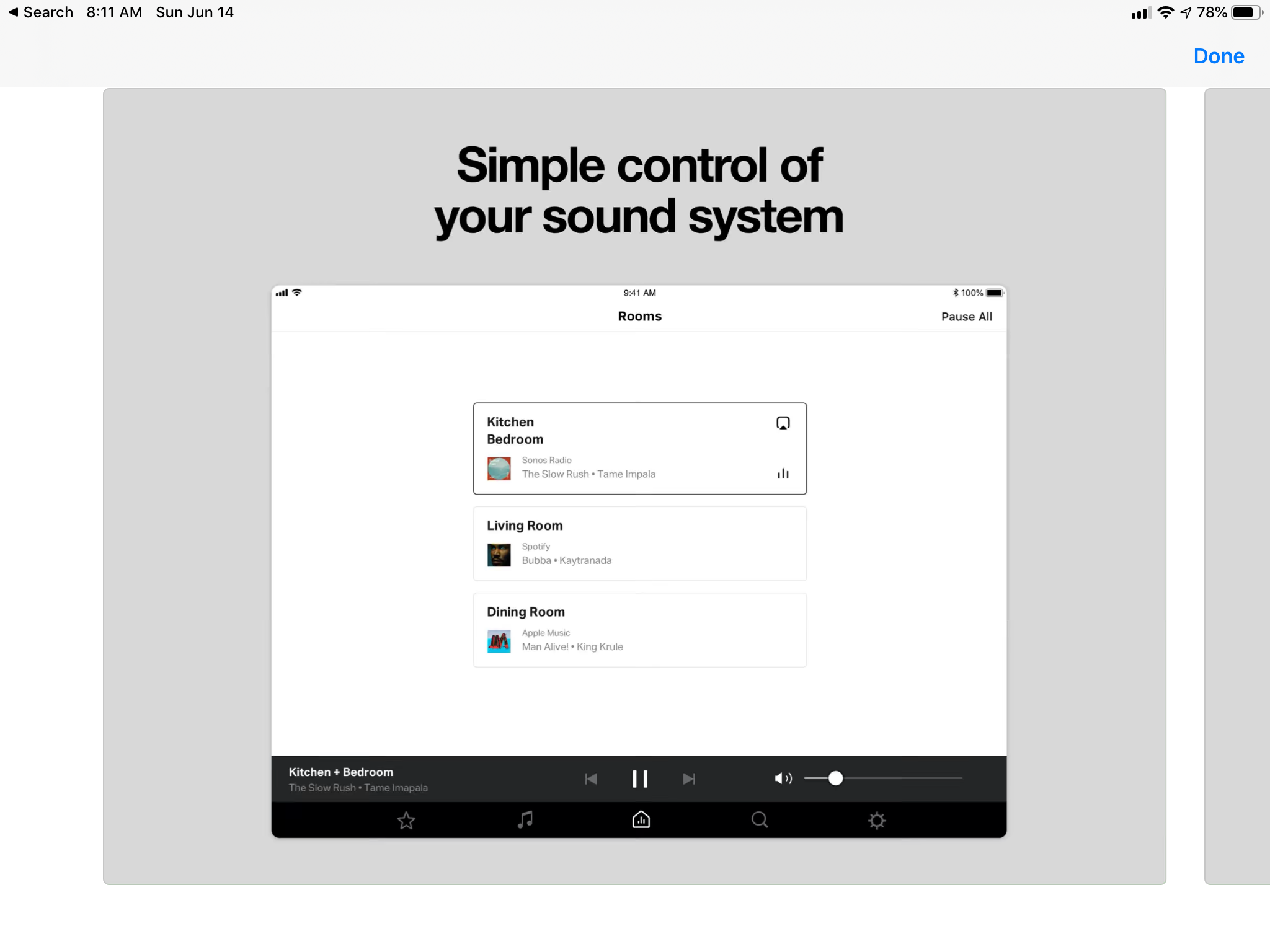
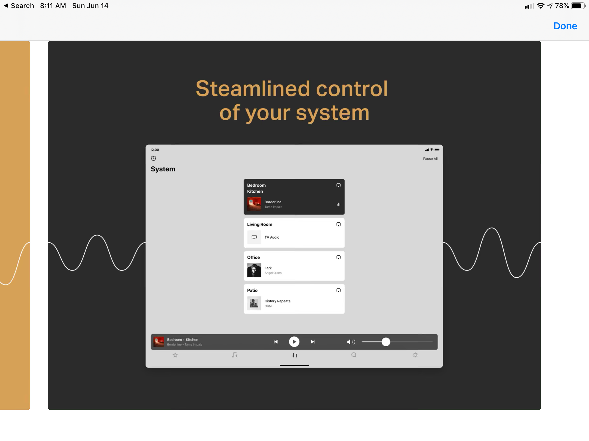
The other annoying thing is the new “rooms” icon in the S2 app. It used to be a house with equalizer bars. Now it’s just the equalizer bars which doesn’t make sense.
Also I’ve seen some users asking what the S2 app is as “mine just says Sonos” as they put it so why not make the app icons consistent by renaming the S2 app as ‘Sonos S2’?
I also think it has devalued the brand and looks lost on my screen. Not keen. I have also lost the lock screen control on ios
Lock screen controls will not appear in the following scenarios:
- A non-Sonos AirPlay capable device is present.
- Disable the AirPlay feature on all non-Sonos AirPlay endpoints to allow lock screen controls to appear when using Sonos.
- Another app on the device is playing music or video.
- While connected to a Bluetooth audio device.
- VoiceOver is enabled.
- Headphones are connected to the iOS device.
Hooray they fixed it! Thanks Sonos!
I love the way the ‘icon’ Is such a simple way of getting the Same text across in a pictoral way. The fact it’s written exactly the same below kind of defeats the point. Surely Sonos have some kind of emblem or an S or something or just S1 as an icon? Very strange choice of ‘design’ maybe they don’t have a full team working due to COVID and they just let the janitor take a crack at the icon design?
Yeah, it doesn’t look right having the text repeated. And it goes against Apple’s Human Interface Guidelines:
“Use words only when they’re essential or part of a logo. An app’s name appears below its icon on the Home screen. Don’t include nonessential words that repeat the name or tell people what to do with your app, like "Watch" or "Play." If your design includes any text, emphasize words that relate to the actual content your app offers.”
The trouble is that the Sonos logo is the word “Sonos”. Perhaps the word/logo Sonos could be part of the icon, and the text below could be “S1 Controller”. Still not ideal. Sonos need a graphic logo. I think they used to have one.
Cheers, Peter.
Ah nice, I feel less of a pedant now seeing it is part of apples guidelines. I’m sure they can come up with something.
I won’t be seeing it for much longer anyway. I’m ditching for a dumb Bluetooth speaker as soon as funds allow as I’ve had enough of the Sonos ‘rules’, the Spotify playlists that Can’t play in reverse order and not being able to stream the sound from whatever else is playing on the wall mounted ipad in our kitchen.
Still looks bleak and ugly. Looks like an FU to those who aren’t upgrading. I’ve been a customer forever with a dozen or so components that will take a while to upgrade, do my system will remain mixed and S1 for a while. This is crap in my opinion. Does the S2 look as dismal?
Use the PC app. Although it comes with the same lame icon, at least you can change it. I chose to go old-school, this icon is still in their binaries:
Enter your E-mail address. We'll send you an e-mail with instructions to reset your password.