Hi
The new app’s icons are so large and not user friendly. Just comparing with the old app:
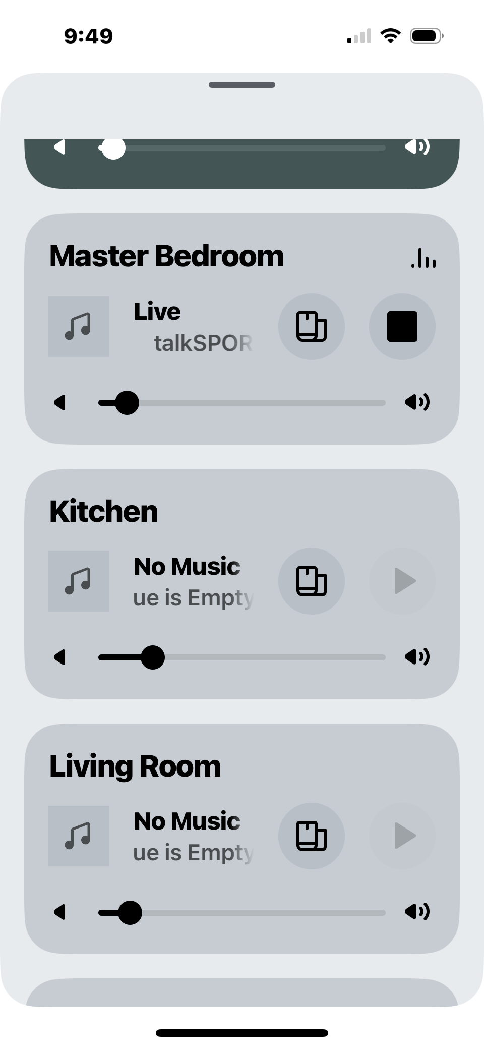
- The join and stop/pause buttons so large in the new app. It makes it virtually impossible to display a whole track name longer than 10 characters. I think these icons could be made smaller and rearranged to reduce the height of the card for each room.
- I’m not sure I need full volume sliders to control volume for a room I’m not in. Surely this could be replaced with a volume button which pops out a slider or something? Or users could change the selected room if they want to change the volume there.
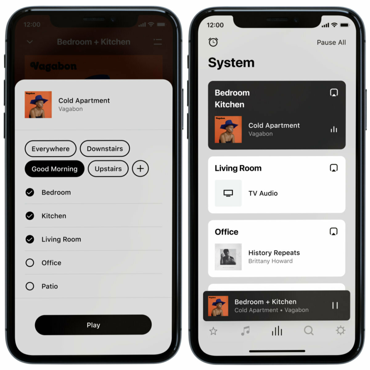
- The “Pause All” button has been removed. Can we get this added back please?
- The Alarms button has moved to settings and is requires navigating through about 2 menu options before reaching it. Could we move it back to the “Rooms” page please? I’m not sure why Alarms has been placed in Settings in the first place, as it’s not a setting, it’s a functionality/feature.
- To exit the “Now Playing” view, you must swipe down. It is not possible to close the view with just a tap. This is not accessible as users with hand jitters or movement impairments often find it harder to complete swipe movements than taps. Compared with the Apple Music iOS app, a similar “card” style for Now Playing is present, but users can exit the view by tapping the top of the card. Tapping isn’t possible in the Sonos app.
- If viewing a playlist or a list of some sort, and wanting to change which room is selected, there are significantly more steps to do this than before. Previously, users could press “Rooms” from the bottom menu, select the room, and tap the “Music” icon back to go back to the browsing view, right from where they left off. Now in the new app, you must tap the “group” icon at the bottom, deselect the current room, select the new room, tap “apply”, and swipe down to get back to the list view. Or, you have to navigate all the way back to the Home page, tap my system in the top left, change the room here, and then re-navigate to my list.
Please could you address these issues with intuitively and accessibility as soon as possible. Thank you