
Haven’t used the Sonos app that much in the past but recently started to (macOS on a MacBook Pro with two external monitors (one vertical and one ultra wide) and iOS on iPad Pro and iPhone 12 Pro Max).

First, would be great if the app would adhere to current system dark/light mode (as the major of other apps do today). I.e. just switch depending on time of day (when the rest of the system switches to or from dark mode)

Second, maybe Sonos should put som UI/UX people on the overall interface? Everything is in like 8-10pt font size… really? Looks like something from 2008. Just in general the UI needs an overhaul to be on par with todays design standards. Why do I have to have three columns in the desktop version? How about two columns, one, 1/3, with current and available speakers, in queue etc. Column two, 2/3, with entire list and maybe large album covers on top and big accessible controls. What’s with all this “tiny tiny”… Of course this is the DTP version, where there is a lot of unused real estate… medium size and below is something different entirely. But just overall, the app really doesn’t feel up to date and really thought thru.

The only reason I’m using the sonos app (rather than casting from Apple Music or Spotify) is because the Sonos is the only place where I can have multiple services and have the music keep playing even if I leave the house.

The development of the desktop controller App has been on hold for quite a while with new features concentrated within the Android and iOS Apps. In fact the system setup and most administrative  functions are no longer available in the desktop App. So it seems that it’s just in maintenance mode and further development of the Desktop App (in its current format) seems unlikely and this is most probably because the majority of customers appear to have a preference for mobile control.

I agree that a ‘dark mode’ option would be a nice to have feature across the controllers, so fingers-x’d🤞
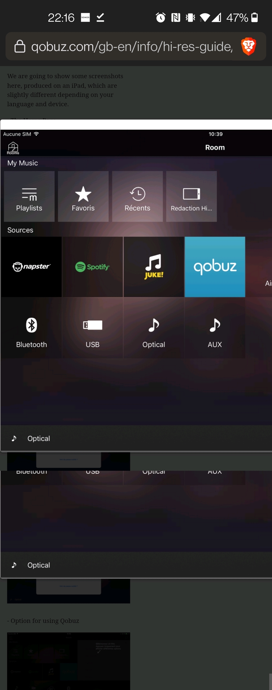
for that often-requested user-interface.👍


Alright, it would be sad to see the DTP version go away (even if it still needs a design overhaul). I love having it as an extra desktop on my secondary screen, being able to control the music in the office or at home.

Regarding dark mode, it can’t stress enough the importance of having a “use OS current theme” option. I spend from 8-16 hours a day in front of a computer, either doing design work och writing code for various projects. The only application I don’t won’t to switch between light/dark mode is programming, I have every other application (that allows it) to follow my systems current mode. It’s gotten to the point where I’ll actively select one application over another if one of them has the “system mode” option. I don’t want to have to switch between light/dark mode 2x/day, when it can (and should) just mirror the existing OS theme setting. The option itself is not something hard to implement, and the color scheme wouldn’t take that long to implement either. Can’t really see what the hold up.


The hold up is there is zero attention being paid to the desktop versions of the controllers, except for bug fixes, at this point.
 

Given their current policy, whether or not it takes long to implement or not doesn’t enter in to the decision tree, it’s much more simple than that. 


Hey folks,


Just wanted to let you all know that as of last night Dark Mode is available in the S2 app :slight_smile: There may be some delay in users seeing this update. If you’re not seeing it just yet, you may need to force-quit and reopen the app.

To enable or disable Dark Mode, open the mobile S2 Sonos app and navigate to Settings → App Preferences → Appearance.

Please note, your app and system must be on at least S2 version 13.3 to access this feature.


Excellent new feature, it has greatly improved the overall appearance of the iPad/iPhone controller Apps here. The new look is so much easier on the ‘old Peepers’ 👀.


The Yamaha musicCast app has a way better UI than the Sonos app , if you choose a background for the room the theme carries on throughout the app