There’s a few small UX things in the new app that have been bothering me where I think the solution would be relatively easy to implement, at least on iOS, so I figured I’d share them somewhere, even if they’ve been discussed to death already.
What I like about my suggestions is that they’re easy wins because they only require very small changes, without any new UI designs. They all involve simple tweaks to interactions or using existing UI components.
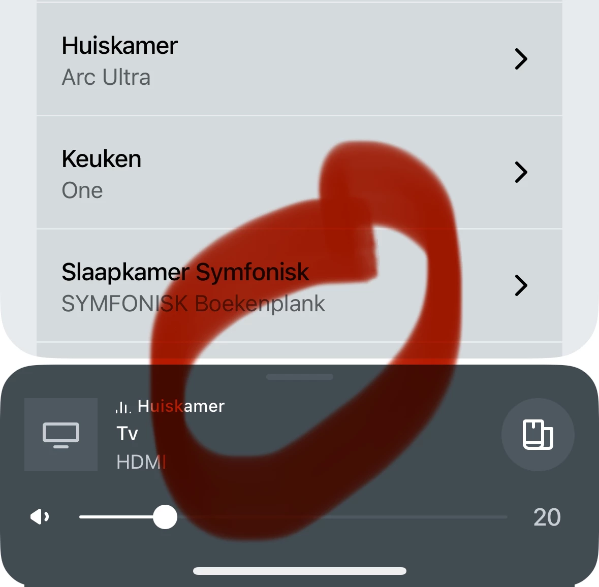
1. The Back Button
Problem
When navigating settings or services the navigation happens inside a tree view inside a card that pops over the app. As is standard on iOS the user can go back up a level in the tree by pressing the back button or by swiping left-to-right. So on iOS I am conditioned to think I can swipe left-to-right if I see a back button.
The problem with the Sonos app is that the top level of the tree shows a back button that can be used to dismiss the card, but I can’t swipe left-to-right. This always leads me to swipe a few times because nothing is happening, until I realise I’m at the top level and need to swipe top-to-bottom, or press the back button.
Solution
The solution here is to either:
- Remove the back button from the top level, or
- Allow swiping left-to-right to dismiss the card, or
- Change the back button on the top level to a down arrow.
As an aside, the cards used for services and settings feel very janky, unlike the card used for the mini player, which is very smooth. When a card is swiped down it just disappears, rather than sliding off screen as one would expect.
Additionally, when they are brought up the screens behind them blank out before the card slides in. Intuitively the card should slide over the top of the screen behind it. These behaviours break the card metaphor and make navigating with gestures feel bad.
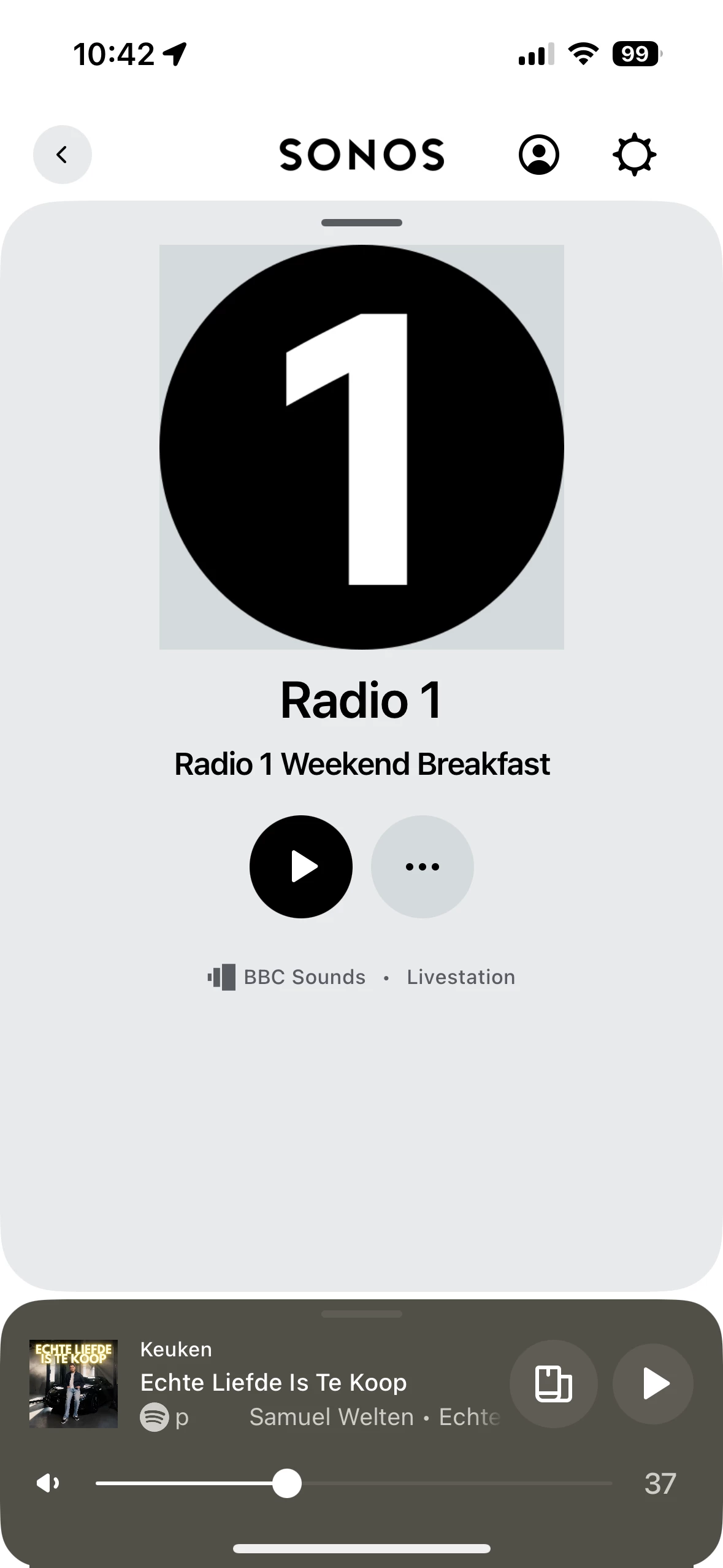
2. The Mini Player
Problem
A common UX complaint about the app is that it’s hard to figure out how to see every room on the system and what it’s playing. The answer is to swipe up the mini player, but this is not discoverable because tapping the mini player brings up the full player instead.
This is inconsistent with the behaviour that would be expected based on how other apps like Apple Music and Spotify work, where tapping and swiping the mini player do the same thing.
Solution
The solution, I believe, is to make it so that tapping or swiping the mini player always brings up the list of rooms. The way to bring up the full player should be to tap the album art or a dedicated ‘expand’ button. I believe this provides a better UX because the behaviour is more predictable.
3. The Mute Button
Problem
This one is an extremely common problem, judging by Reddit threads. If a single room in a group is muted, this cannot be seen from the mini or full player, so it’s hard to tell why the speaker is not playing anything.
The volume status of each room can be seen and controlled by tapping the volume knob, but it’s pretty obvious that people find the Group button a more intuitive way to see what’s happening on all their speakers, and the mute button isn’t shown here.
The grouping UI will show that the room is muted by greying-out the volume bar, but the problem is that there’s no way to unmute from that screen. There is no mute button, and increasing the volume doesn’t unmute the speaker. This makes it appear like there is a problem, and that the speaker can’t be unmuted, leaving many users confused.
Solution
The solution is to add the same icon/mute button from the mini player to the volume sliders in the grouping interface.
Additionally adjusting the volume of a muted speaker could unmute the speaker, and not just in the grouping interface. This behaviour would be consistent with the physical controls, where pressing a volume button will unmute a speaker.