I’ve been using Sonos for 16 years (one of their first users.) I’ve purchased close to 50 Sonos devices.


I’ve been complaining about the UI for 15 years. It’s horrible. Performing simple actions like opening the equalizer requires 5 minutes of discovery every time you want to use it.


Why don’t the navigation icons at the bottom of the app have labels.


Why does the screen for selecting rooms/devices have the title “System”.  Why is the icon in the navigation bar for this function totally unrelated to the function. Why is the setting for Alarms on the screen for selecting rooms.


Why are there three separate icons  (search, favorites and browse) in the NavBar for selecting Music.


Why are the playback controls hidden in the collapsed now playing screen.


Setting up a new AMP…...What kind of imbecile would require a user to input a code into the app when installing a new device that’s written in illegible characters (requires a magnifying glass) on the back of the device, and only let the user know that it’s needed after the unit has already been installed at the back of a rack, under a sofa, or on the bottom shelf of a bookshelf.


“How do you want to use Amp”   - It’s not “as stereo speakers”  ….. it’s “with stereo speakers.”  AMP is an amp. It’s not a speaker (or speakers.)


In addition, to being a Sonos user, I work as a product manager.  It makes me want to puke every time I use the Sonos app.


This has to be the worst UI I’ve ever seen on an app for a well established Comapany

I appreciate [not] the handy 20 - 30 second wake up time. Makes it a real aggravation to mute your Sonos to take a phone call, or worse hear what your spouse is saying.

Sucks enough I’m using old Play 1s on my desk but muted, grouped with the room I’m listening to so I can actually pause at need.

Your points are really good ones, Sonos could really use some usability testing by folks that are not Sonos users. You wonder how many get returned by frustrated customers.


I’ve been using Sonos for 16 years (one of their first users.) I’ve purchased close to 50 Sonos devices.


I’ve been complaining about the UI for 15 years. It’s horrible. Performing simple actions like opening the equalizer requires 5 minutes of discovery every time you want to use it.

Unless (on the mobile S2 app) you tap the volume bar and then the equaliser icon and get there in 1 second.


Why don’t the navigation icons at the bottom of the app have labels.

Because space is at a premium on a mobile.  There would have to be a different compromise somewhere else.  Speaking personally, I don’t even need to think any more about what each icon represents


Why does the screen for selecting rooms/devices have the title “System”.

Because it shows all the speakers in your system, which ones are currently grouped, and what each is playing?  What would you call it that would be clearly better?  And does it really matter that much?

  Why is the icon in the navigation bar for this function totally unrelated to the function.

Fair point, but not a problem once you know what it is


Why is the setting for Alarms on the screen for selecting rooms.

Because you need to choose a room for the alarm?  Dunno, I don’t use alarms


Why are there three separate icons  (search, favorites and browse) in the NavBar for selecting Music.

So you would prefer to tap a ‘”select music” icon and then pick which one of the three options you want to use?  


Why are the playback controls hidden in the collapsed now playing screen.

There is a case for saying it would be better to keep these visible.  But play/pause is visible, and a single tap expands it back.  Keeping the controls would hide more of the rest of the screen.  Is it such a clearly inferior design?


Setting up a new AMP…...What kind of imbecile would require a user to input a code into the app when installing a new device that’s written in illegible characters (requires a magnifying glass) on the back of the device, and only let the user know that it’s needed after the unit has already been installed at the back of a rack, under a sofa, or on the bottom shelf of a bookshelf.

I haven’t been through this process so I can’t comment.  It doesn’t seem to me to have anything to do with UI design though;


“How do you want to use Amp”   - It’s not “as stereo speakers”  ….. it’s “with stereo speakers.”  AMP is an amp. It’s not a speaker (or speakers.)

OK


In addition, to being a Sonos user, I work as a product manager.  It makes me want to puke every time I use the Sonos app.

Sorry, but I hope you never become the product manager in charge of the Sonos UI.


This has to be the worst UI I’ve ever seen on an app for a well established Comapany

Let’s agree to disagree.


Performing simple actions like opening the equalizer requires 5 minutes of discovery every time you want to use it.


Tap Volume, tap EQ icon, how can that be improved?


Why is the setting for Alarms on the screen for selecting rooms.

This used to be hidden away in settings, and shortcut was added to rooms menu for quick access.

Let’s say you didn’t have Sonos, you had an old fashioned ‘windup’ alarm clock in the bedroom. If you wanted to set this alarm clock, you would have to physically go to the bedroom first, then set the alarm. My guess, the flow through the Sonos App is replicating this process.


I appreciate [not] the handy 20 - 30 second wake up time. Makes it a real aggravation to mute your Sonos to take a phone call, or worse hear what your spouse is saying.

Sucks enough I’m using old Play 1s on my desk but muted, grouped with the room I’m listening to so I can actually pause at need.

I thought that it was just me… The wake up time has been getting slower and slower, to the extent that we now just walk across the room and press the button, rather than wait for the mobile software to react.


What ‘20-30 sec wake up time’ are you referring to?


From a fully closed state, if I launch the Sonos App it takes between 7 & 8 seconds to load a 15 room system (that’s an iPhone XR or iPad Pro (3rd gen) controller) - if the Sonos App has been backgrounded, or minimised, for a while, then it’s a couple of seconds to wait in that case, if that, for the focus to be reclaimed.. and my controllers are now both a few years old. 

20-30 seconds sounds to me like there is perhaps an issue with the controller device itself, or perhaps the network. I would just try closing all apps fully and just count (normally) and see how long it takes to launch?

… and I thought my old iOS controllers were getting slow?🤷‍♂️


I don’t see that, I just forced closed Sonos App on iPhone 12 mini, and see all rooms in a couple of seconds. About my system will show the Sonos device (IP address) associated with the App, what device is that when it takes 20 seconds? Maybe its an older/slower Sonos device?


Performing simple actions like opening the equalizer requires 5 minutes of discovery every time you want to use it.


Tap Volume, tap EQ icon, how can that be improved?


Is that a serious question?  What is the point of hiding the EQ icon. Even if the user remembers how to unhide the icon, it still requires an extra step (tap the volume control) in order to display the icon. Why would anyone possibly design the UI that way. Even if experienced users remember how to do this, why would you want to introduce that kind of totally unnecessary friction for new users. Also why are other playback controls (crossfade) hidden elsewhere behind a “more” ellipsis in a line (the music/album title) that is completely unrelated to playback control. A minimal amount of UAT would immediately reveal these problems.

Honestly, whoever is responsible for this must have studied at the blind darts school of UX design.


I’ve had a Sonos system for 15 years. Somehow I’ve managed to move with the times, graduating from CR100 all the way to the mobile apps. The changes in the latter tend to be incremental so the learning process is usually a case of “what does this new button do?”. I can’t say I’ve ever been aware of the app having an emetic effect.


I’ve had a Sonos system for 15 years. Somehow I’ve managed to move with the times, graduating from CR100 all the way to the mobile apps. The changes in the latter tend to be incremental so the learning process is usually a case of “what does this new button do?”.


CR100 was kludgy but decent for a startup in that day and age. CR 200 looked cool but was garbage. There should not be a learning process. The functionality is neither new nor complex.


> I can’t say I’ve ever been aware of the app having an emetic effect.


Presumably you’re feigning obtuseness and actually know my comment was hyperbolic.


my comment was hyperbolic.

And as such -- along with comments about “imbeciles” -- served to undermine your argument.

If you really felt so revolted, why on earth do you continue to use the system? 

By the way, have you tried using the myriad of native apps from the various music streaming providers? Compared with the Sonos controller those really can provoke a whole new level of frustration.


Performing simple actions like opening the equalizer requires 5 minutes of discovery every time you want to use it.


Tap Volume, tap EQ icon, how can that be improved?


Is that a serious question?  What is the point of hiding the EQ icon. Even if the user remembers how to unhide the icon, it still requires an extra step (tap the volume control) in order to display the icon. Why would anyone possibly design the UI that way. Even if experienced users remember how to do this, why would you want to introduce that kind of totally unnecessary friction for new users. Also why are other playback controls (crossfade) hidden elsewhere behind a “more” ellipsis in a line (the music/album title) that is completely unrelated to playback control. A minimal amount of UAT would immediately reveal these problems.

Honestly, whoever is responsible for this must have studied at the blind darts school of UX design.


Your fury, rudeness and dogmatism over things that seem to me to be grey areas or of little consequence are really quite entertaining.  And your inconsistency.  You complain about having to do two taps instead of one for one thing, yet want to split the process of selecting music so that it has two stages.  Or do you think, Favourites, Browse and Search can all be handled on a single ‘select music’ screen.  If so, please provide a design, as that would be quite an achievement.

You seem to want to crowd the screen with labels for buttons that everybody knows the purpose of, full controls in collapsed screens (which consequently don’t collapse much) permanent icon for EQ settings….  Well that is your view and you are entitled to it.  I prefer an uncluttered look.  And although i have never been a product manager I think you know no more than the rest of us about UI design.


Presumably you’re feigning obtuseness and actually know my comment was hyperbolic.

If ‘feigning obtuseness’ is a way of describing being ironic, then perhaps @ratty was feigning obtuseness.


Started a new topic on my startup issues.


my comment was hyperbolic.

And as such -- along with comments about “imbeciles” -- served to undermine your argument.

If you really felt so revolted, why on earth do you continue to use the system?


  1. Great hardware
  2. Great architecture
  3. Solid underlying software logic.

Which is why the horrible UI is so frustrating.


BTW - the comment about “imbeciles” was not hyperbolic.


I must say I do not share most of your observations. I do find I sometimes have to look twice at the icons, so they maybe could be more clear.

Wanting a direct path to EQ settings seems strange. Are those not “set and forget”?


I find it a bit like learning to drive, initially it’s quite difficult to grasp, but after doing it often, it then becomes second nature and done without even thinking about it. I use the Sonos GUI often, I don’t even have to think about where things are. I personally find it easy/simple to operate and logical. Things are where I know they will be.

It’s when things are changed/moved, that I start to have issues, having to start all over again.. I think we should just leave things as they stand.


After you have done something 10 times, you remember, its second nature. Re driving a car, if you know how to drive, and you get into a rental car in a different country with a steering wheel on left if you are used to it on the right, and no clutch, handbrake is a button rather than lever, lights in a different position, etc it doesn’t take long to figure it out and enjoy the ride.


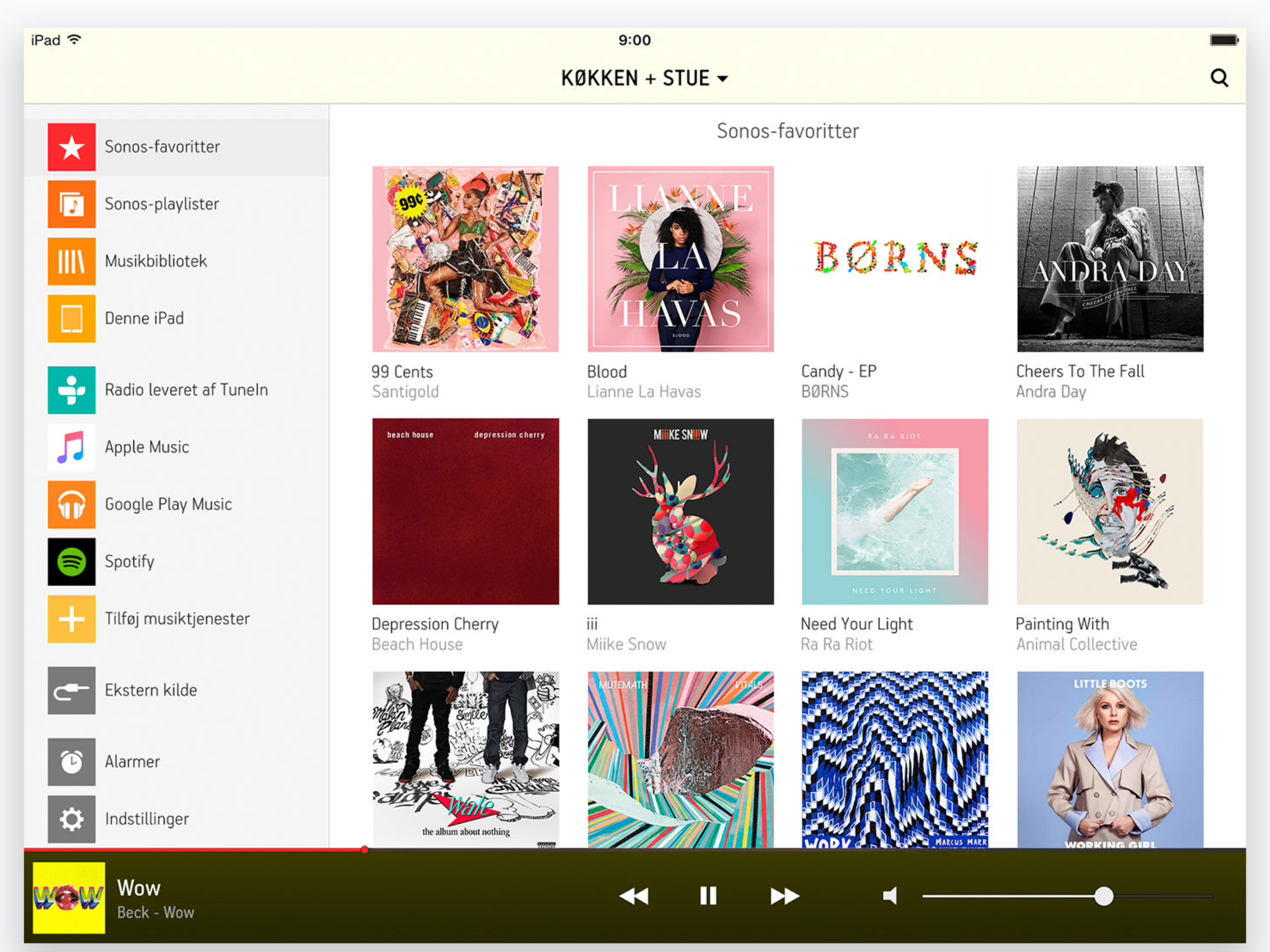
In my opinion, this version was the best and most manageable Sonos controller.

Also note how perfectly it fits the iPad screen,


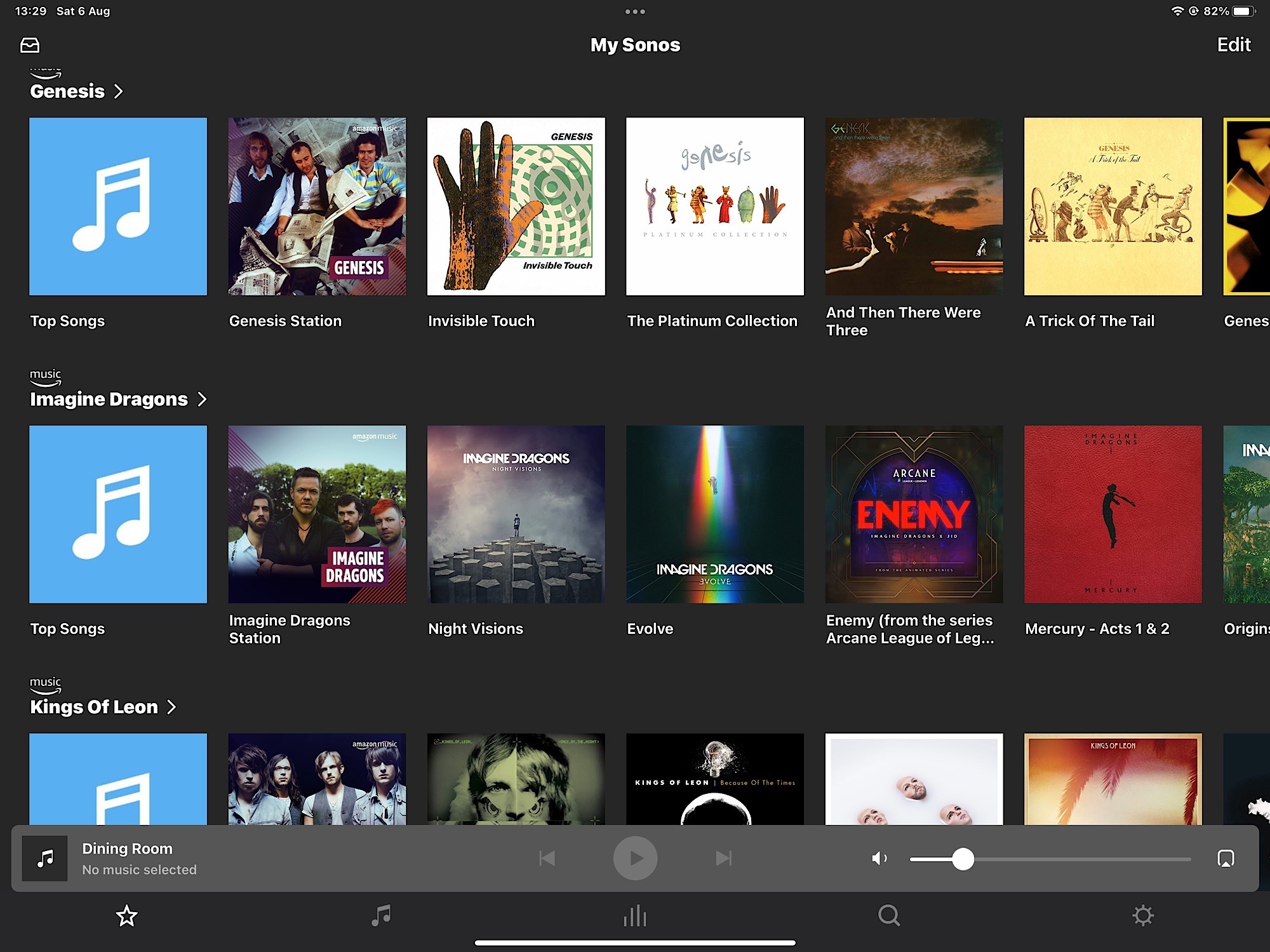
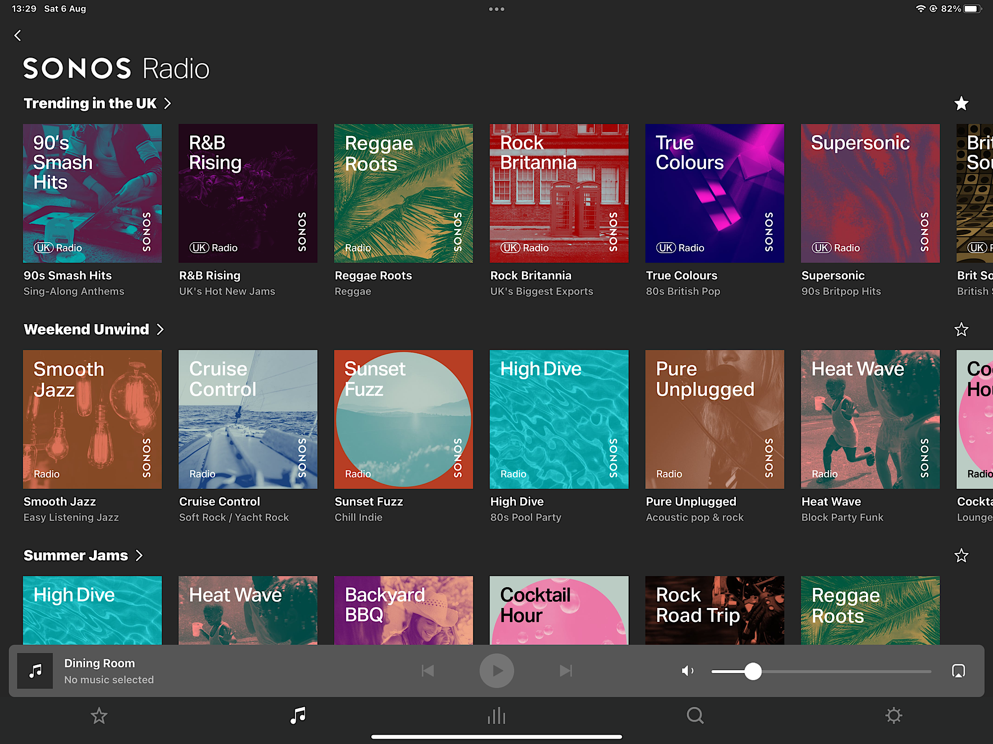
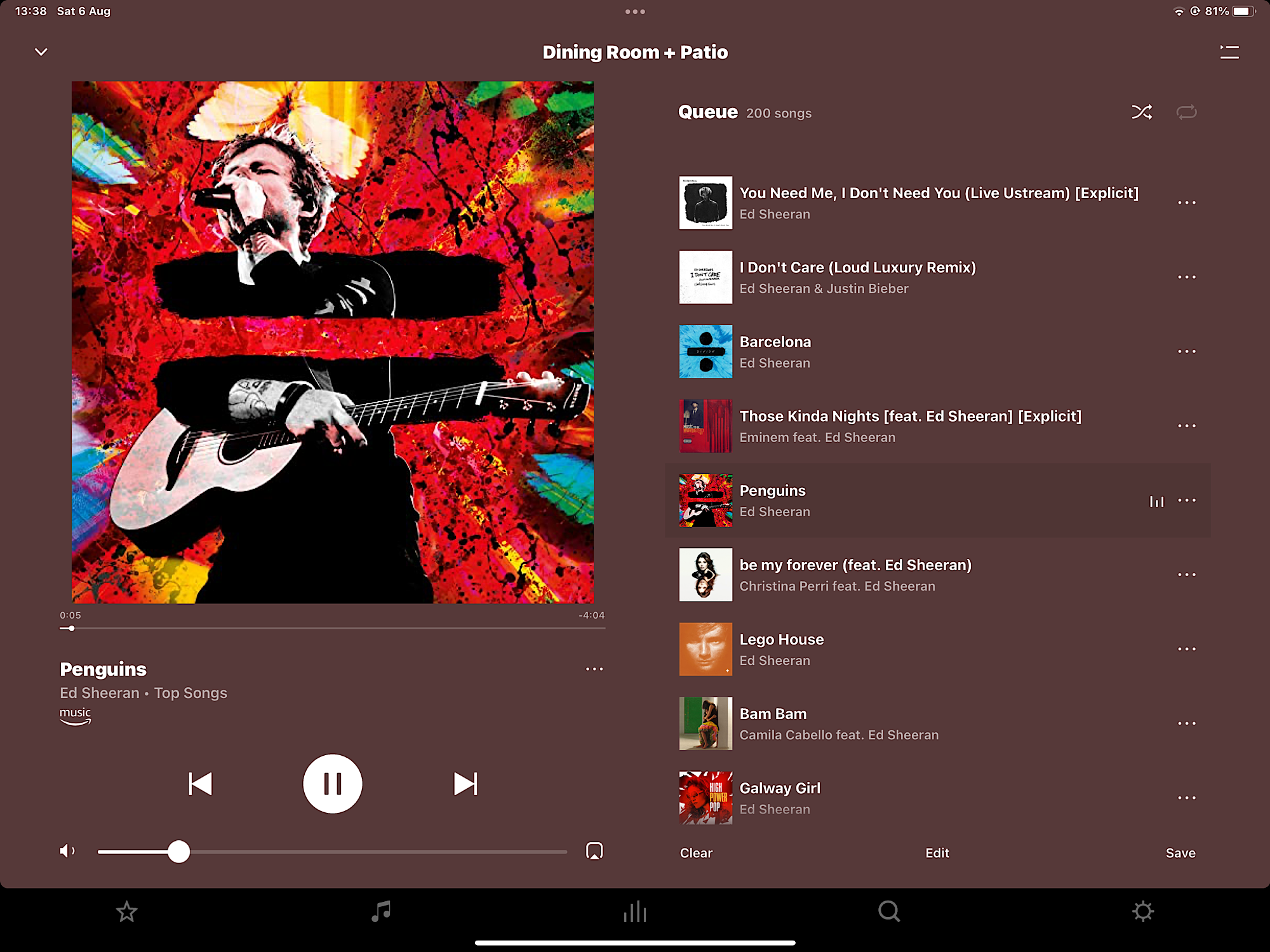
Yes I like the iPad version too .. here’s the current S2 App:

My Sonos Tab:

Sonos Radio from the Browse Tab:

Now Playing Screen:

I think the look is similar, but seems slightly richer in its presentation, with things separated out on the different tabs. I like the ‘Dark Mode’ option too.


After you have done something 10 times, you remember, its second nature.


That’s exactly what’s wrong with Sonos. You should never, ever have to do something 10 times to remember how it works.


Yes I like the iPad version too .. here’s the current S2 App:

My Sonos Tab:

Sonos Radio from the Browse Tab:

Now Playing Screen:

I think the look is similar, but seems slightly richer in its presentation, with things separated out on the different tabs. I like the ‘Dark Mode’ option too.


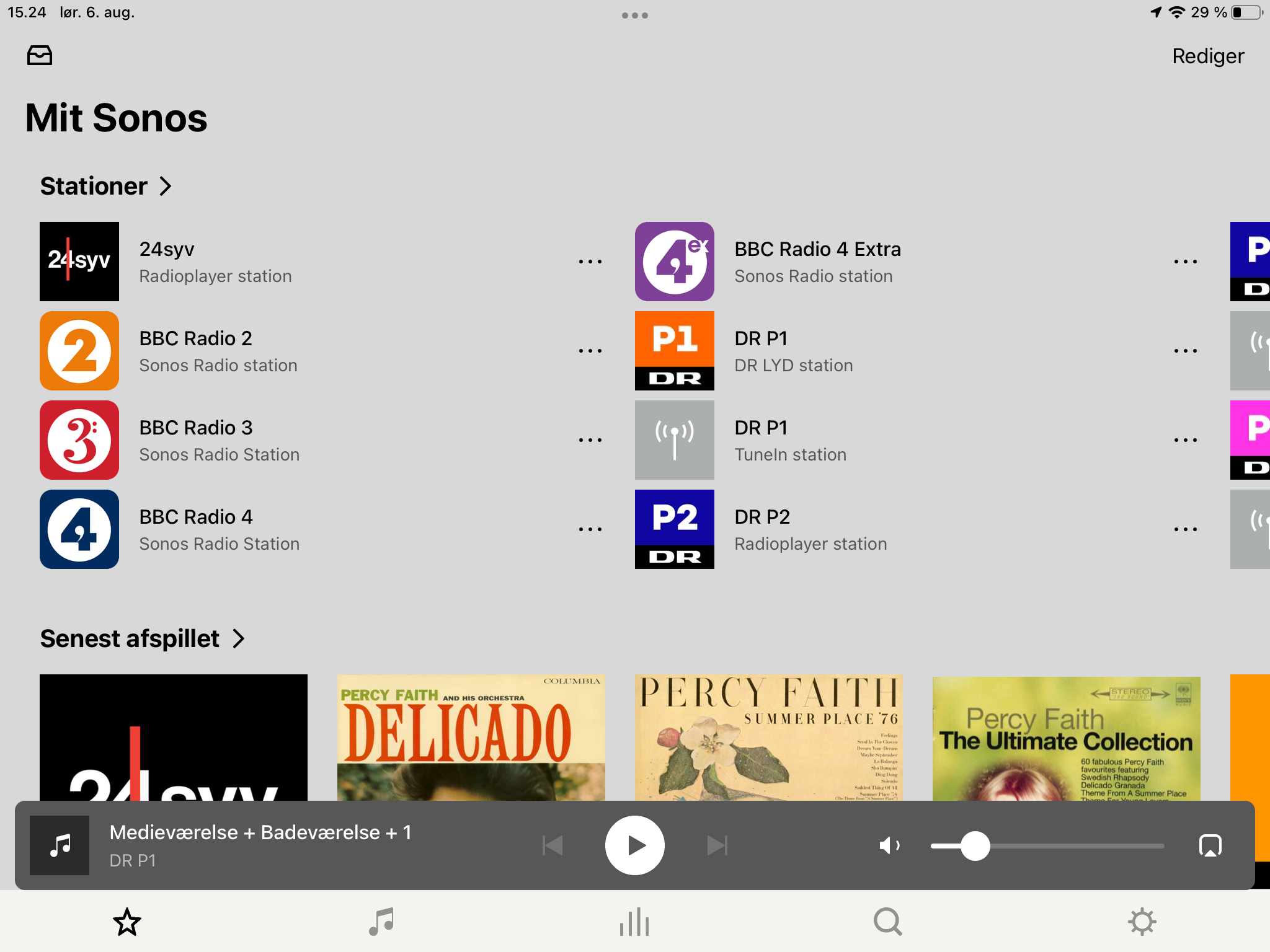
And this is my, “My Sonos” page, I don't think it will win any prize in an app design competition.With the S2 app, it is also not clear, for a new user, how to switch between the different sources, it was much more clear when you had listed all the options on the left side off the screen.


Have you never encountered a UI where you scroll side-to-side (carousel) as well as up-and-down? 


After you have done something 10 times, you remember, its second nature.


You should never, ever have to do something 10 times to remember how it works.

Maybe some people may struggle with simple tasks, and have to repeat the task many more times before something ‘clicks’ and they then understand how intuitive it is.

Others may get it a lot sooner, as its similar to something they have done before.

A few may never get it.

The 10 times was a generalisation.