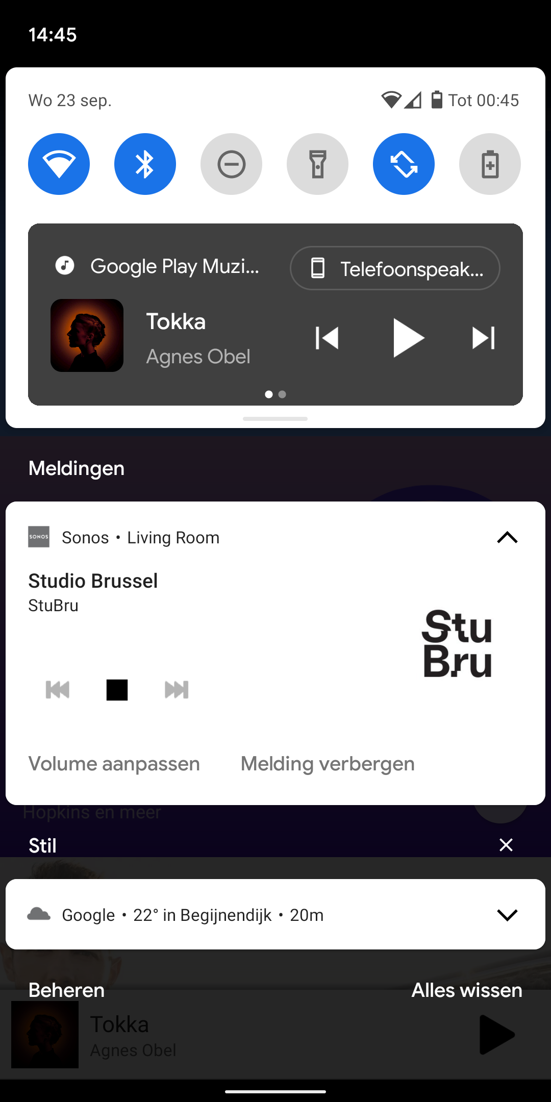
In Android 11 media apps have their controls residing above the notifications in a separate section where you van swipe left and right between controls from different apps. Sonos controls are however not in this section but are sitting between the regular notifications (see screenshot).

Please include them in the proper place.
 

Interesting.  Don’t have android 11 to take a look at this, but on my android 10, whatever app is currently playing audio/video gets pushed to the top.  Sonos does as well (I think, can’t verify at the moment) but if a different music app that plays audio/video on the device itself would be at the top, whether playing or not (I think, again, can’t confirm).  I think it’s a matter of what app currently has control over the local audio, or Sonos if nothing else present.

You might want to try closing down Google play music, and seeing if Sonos then gets moved to the top?


Hi @Brecht Germis.

Welcome to the Sonos community and thanks for reaching out to us.

I do agree with @melvimbe. You may want to try force closing all running back ground applications from your mobile phone, try rebooting the mobile phone as well just to be sure and once the mobile phone is back on, try and re-open just the Sonos app and check if there are any changes. Once the Sonos App is open, can we try to re-open Google Play music and check if the issue has been fixed based on what was mentioned by @melvimbe  about the app currently in-control/playing audio vs secondary app.

Please let us know how it goes. We are always here to help.

Thanks,


Hi @melvimbe and @Paul A ,

I have tried these steps. But that doesn't change anything.

Indeed on Android 10, media control notifications were stacked above each other and the one that was playing was on top, but this changed in Android 11. Now they are next to each other. If you look at the screenshot closely you see 2 dots in de media control tile of Google Play Music. That is because another tile (local radio app) is standing next to it.

Another way you can tell that the sonos tile is not a media tile is due to the design of the tile. You can try any media app on android (spotify, Google play music, youtube music, radio apps, ...), the media control tile has the same layout (color dynamic based on album cover, 3 lines of text in the same spot (typically app name, artist, song), album cover in the same place, controls in the same place (which controls can be customised by the app developer)). The tile for sonos looks different and always has looked different.

Maybe there are technical limitations because you are not controlling audio that is playing on the device, or there are limitations regarding volume control etc. But that is something the development team can investigate.


(Off topic: Hi there from a fellow Dutch speaker, non-Belgian though 😉 )


I posted something similar a year ago, when Android 10 introduced “dark mode” and a live progress bar for media playing apps. The latter was never implemented by Sonos either.

As you already pointed out, my guess is that the API that triggers this type of notification, is an API that is used by apps that are actually playing or streaming media on/to the Android device itself. The Sonos app is merely a remote control, so Sonos have likely modified a “standard” notification to include playback controls on it. I've noticed the same behavior with BubbleUPNP, which is also an app that can be used to control media streaming outside of the device that the app is on, and also features a “custom” notification. It seems plausible to me that it's not technically feasible to have these apps use the “normal” notification UI for media apps.

 @Paul A, this is not so much an issue we are experiencing, as it is a UI/UX design that does not fall in line with how other media apps behave on Android.


Hi @melvimbe and @Paul A ,

I have tried these steps. But that doesn't change anything.

Indeed on Android 10, media control notifications were stacked above each other and the one that was playing was on top, but this changed in Android 11. Now they are next to each other. If you look at the screenshot closely you see 2 dots in de media control tile of Google Play Music. That is because another tile (local radio app) is standing next to it.

Another way you can tell that the sonos tile is not a media tile is due to the design of the tile. You can try any media app on android (spotify, Google play music, youtube music, radio apps, ...), the media control tile has the same layout (color dynamic based on album cover, 3 lines of text in the same spot (typically app name, artist, song), album cover in the same place, controls in the same place (which controls can be customised by the app developer)). The tile for sonos looks different and always has looked different.

Maybe there are technical limitations because you are not controlling audio that is playing on the device, or there are limitations regarding volume control etc. But that is something the development team can investigate.


Thanks for the further explanation.  I agree that if it can technically be placed at the top, it should be.  Perhaps Sonos has already looked into this, but I would not be surprised if they have not yet addressed this, given everything going on with them right now.


(Off topic: Hi there from a fellow Dutch speaker, non-Belgian though 😉 )


I posted something similar a year ago, when Android 10 introduced “dark mode” and a live progress bar for media playing apps. The latter was never implemented by Sonos either.

As you already pointed out, my guess is that the API that triggers this type of notification, is an API that is used by apps that are actually playing or streaming media on/to the Android device itself. The Sonos app is merely a remote control, so Sonos have likely modified a “standard” notification to include playback controls on it. I've noticed the same behavior with BubbleUPNP, which is also an app that can be used to control media streaming outside of the device that the app is on, and also features a “custom” notification. It seems plausible to me that it's not technically feasible to have these apps use the “normal” notification UI for media apps.

 @Paul A, this is not so much an issue we are experiencing, as it is a UI/UX design that does not fall in line with how other media apps behave on Android.


I could be completely wrong on this, but I thought android’s had a sort of ‘controller class’ of app/notification that could display notifications as if they were playing locally and also could be the focus of the volume control buttons. It’s also what allows Sonos to play audio files off the phone.  In contrast, Apple did not have this class of app and Sonos had to sort of hack it to get those features.   And of course, they couldn’t continue support as Apple versions came out, because Apple didn’t support it.

At of curiosity, do the android phone volume buttons still work to control Sonos volume?


Yes, but only when the app is open. This has always been the behavior. Outside the Sonos app, even with the notification present, volume buttons control device media volume.