I’ve been running my system for 10+ years now, and one little feature always bugged me in the Desktop controller. I am predominantly using the Desktop controller to run my Sonos system, via a mini PC connected to my TV.
The issue:
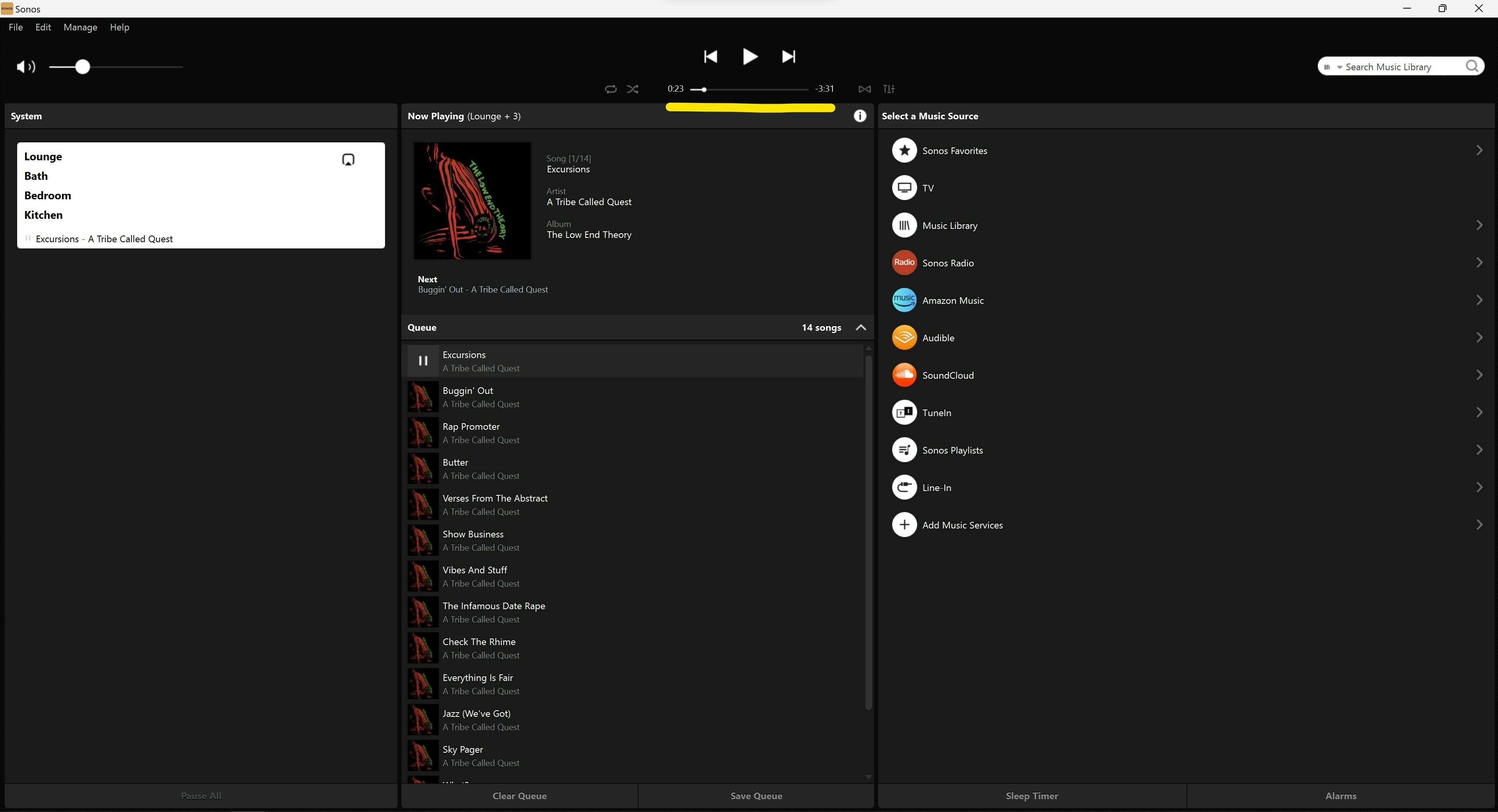
The progress bar for any music I play is occupying only a minimal part of the screen in the top middle. There are miles of space to the left and right of it, space that is completely unused.
I have used music players on my PC that will use the full width of the window for the progress bar, and adjust the size of the progress bar relative to the window size (i.e. Mediamonkey, MusicBee and others), allowing for much more precise control when trying to skip through audio files.
Now on my 65” TV, the bar is just ridiculously tiny and skipping to a specific part of an audio file, especially in an audio book for example, is very tedious - and, imho, unnecessarily so.
I have attached a screenshot, underlining in yellow the current progress bar. Clearly, making use of the full width of the screen would be so much more helpful.
Thanks for reading
Muldino


