Contributor I
September 21, 2024

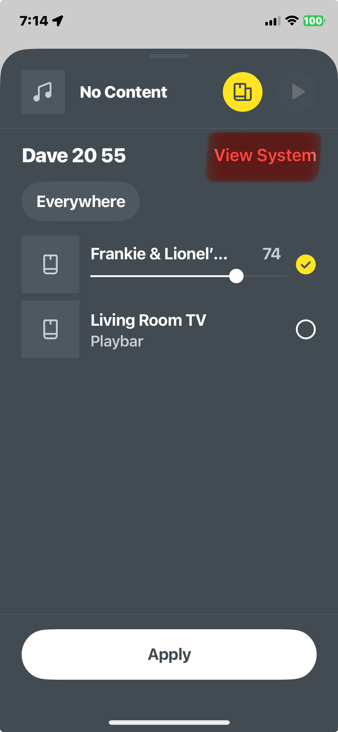
why does “View System” not more obviously a button

  • September 21, 2024
  • 4 replies
  • 103 views


This topic has been closed for further comments. You can use the search bar to find a similar topic, or create a new one by clicking Create Topic at the top of the page.

4 replies

controlav
Lead Maestro
September 22, 2024

Why is so much done with sliding up/down now instead of buttons?

For an “improved” user experience. Hmmm yeah right...

Author of the leading independent Sonos apps for Android, MacOS, iOS, Windows and Xbox.
DDiddly73Author
Contributor I
September 22, 2024

Not a fan of that either TBH. 
the old apps may have not been perfect but still far more useable that this PoS

Ken_Griffiths
September 22, 2024

Yes, the ‘slide-screens’ are making appearances in quite a few updated iOS Apps - seems to be the new design, in place of tabs.

I’m okay with the new Sonos App, it works fine here with my setup. I prefer the phone App compared to the tablet App, but my ol’ peepers 👀 prefer the larger display these days. I would like to see some of the tablet screens/overlays fit better on screen in some areas, (eg. Now playing and queue playlist screens), as shown in the attached.

The App seems to be (better) designed for the smaller phone display.
almazri
Prodigy I
September 23, 2024

Not a fan of that either TBH. 
the old apps may have not been perfect but still far more useable that this PoS

I opened up my Sonos app to see what you are talking about and the app crashed. repeatedly. Back to SonoPhone it is. 🤦‍♀️
