Edgie70
Renowned Enthusiast I
December 17, 2021

s2 app ui

  • December 17, 2021
  • 12 replies
  • 209 views

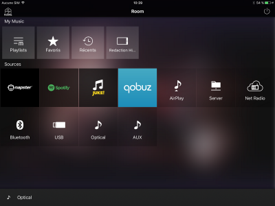
Hi all , been using the Sonos S2 app for a couple off weeks now , not sure if there's a suggestion thread but perhaps the app UI could be made to look a big nicer / classy ?? Tbh it looks boring and compared to the Yamaha I've come from the Yamaha one looks way better , the colour theme for the room runs through the app , Yamaha one seems to be easier to navigate too 

Sonos app is just white or grey , needs to be made to look nicer to match the quality of their speakers etc , I've attached pictures so you can see .
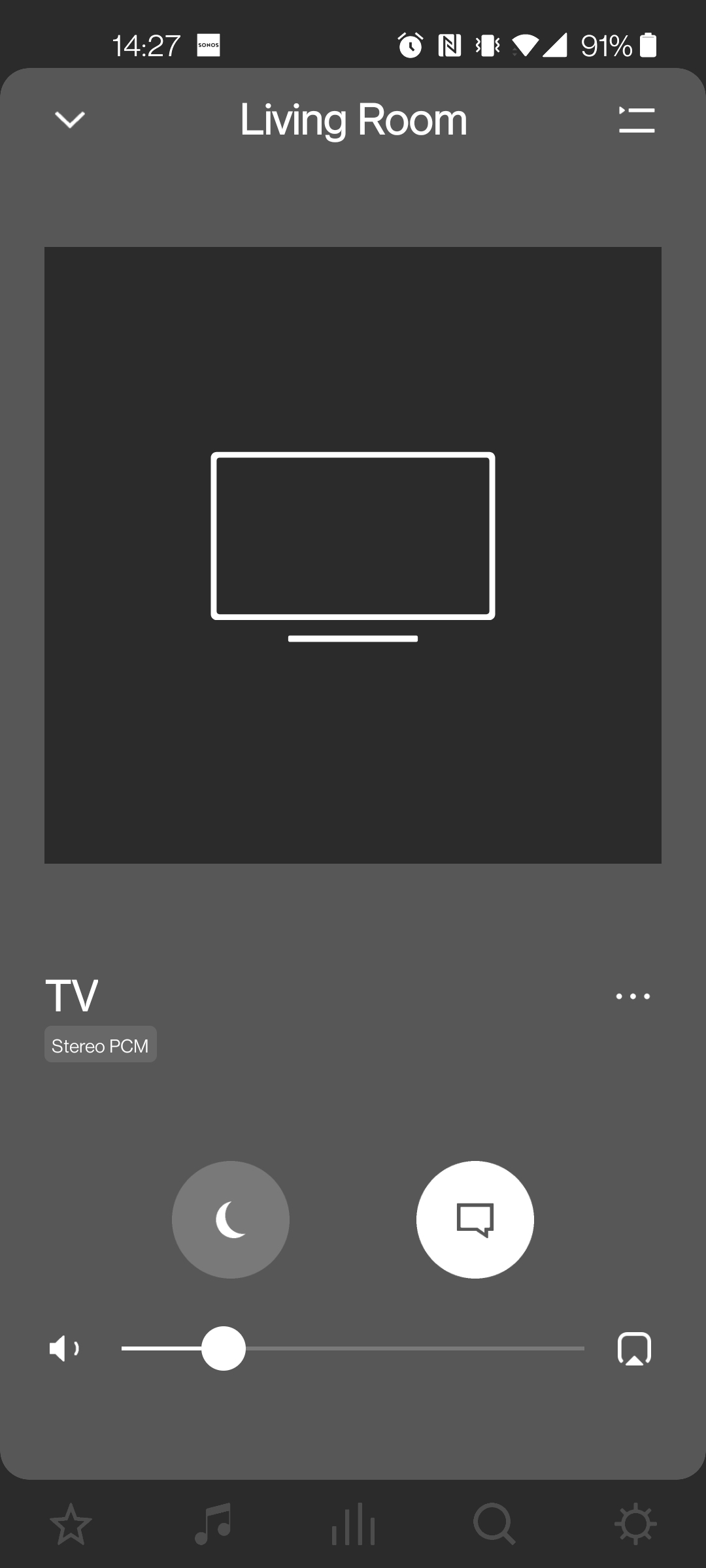
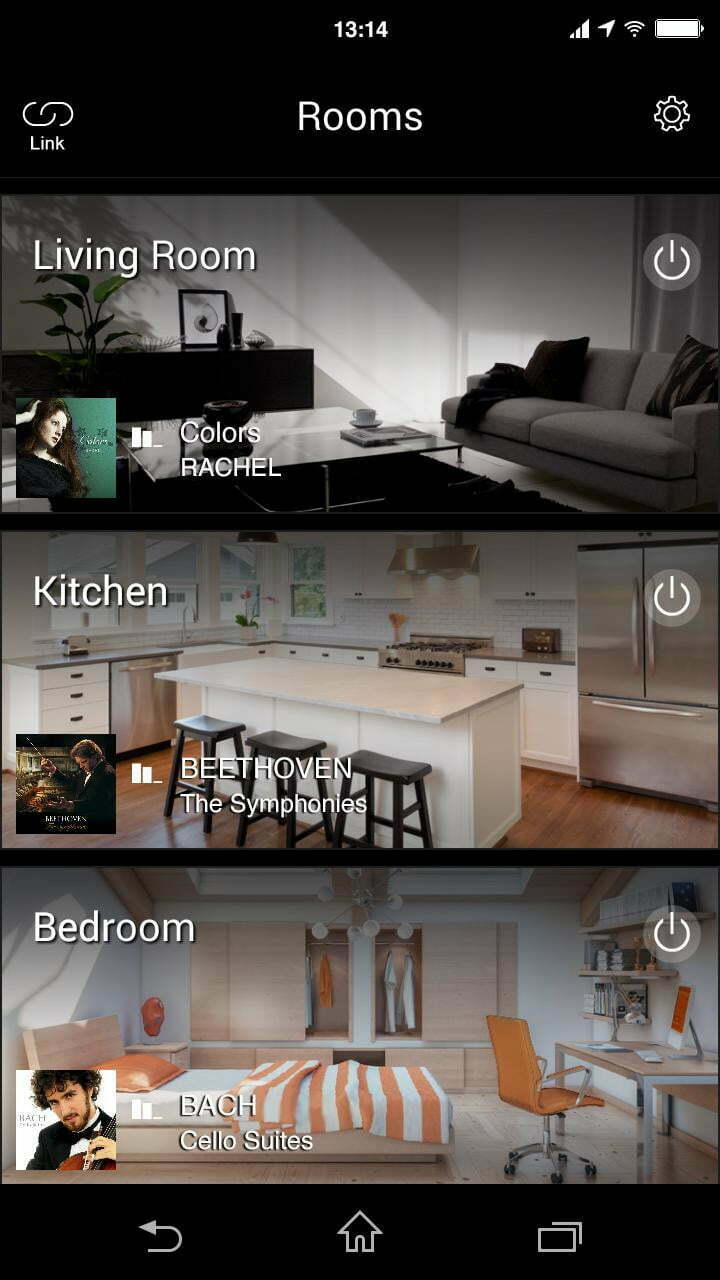
Top is Sonos , middle and bottom Yamaha .

This topic has been closed for further comments. You can use the search bar to find a similar topic, or create a new one by clicking Create Topic at the top of the page.

12 replies

Ken_Griffiths
December 17, 2021

Im not trying to manipulate or twist anything , the now playing screen for music looks fine , just thought for TV something a bit nicer . If you just use stock background in Yamaha you just get the grey but you can change it , that's all I'm saying , not trying to upset anyone ....

I thought you were referring to the Sonos App in general - I find it okay and colourful/easy to use - it could be quicker in places, but I suspect my old iPad, in general, could be quicker too. I need to upgrade it, perhaps🤔?

The Sonos App features work well and I’ve got quite used to it .. the TV ‘now playing’ screen is sparse, but functional. I don’t use it anyway (truth be told), as I’m usually looking at the TV screen, rather than the App and can access night mode and speech enhancement (if needed) when that screen is minimised anyway. It’s not a huge need to change this for my own use-case.

Edgie70
Edgie70Author
Renowned Enthusiast I
December 17, 2021

Im not trying to manipulate or twist anything , the now playing screen for music looks fine , just thought for TV something a bit nicer . If you just use stock background in Yamaha you just get the grey but you can change it , that's all I'm saying , not trying to upset anyone ....

I thought you were referring to the Sonos App in general - I find it okay and colourful/easy to use - it could be quicker in places, but I suspect my old iPad, in general, could be quicker too. I need to upgrade it, perhaps🤔?

The Sonos App features work well and I’ve got quite used to it .. the TV ‘now playing’ screen is sparse, but functional. I don’t use it anyway (truth be told), as I’m usually looking at the TV screen, rather than the App and can access night mode and speech enhancement (if needed) when that screen is minimised anyway. It’s not a huge need to change this for my own use-case.

Thats fair play and personal choice, after coming from the Yamaha app which ( I think ) looks that bit nicer I just thought the Sonos app looks a bit bland , that's all , I'm not criticising the Sonos app I just think a setting to choose a theme would be nice .