
Is the new community your idea of an improvement? It is anything but an improvement. Several important threads I started have lost content. When I try and type a response, I can't see the entire response I am creating--it only allows me to see a couple of lines at a time.
I am a long-time Sonos user, and I feel that I have been slapped in the face. Sonos no longer has my endorsement.

This topic has been closed for further comments. You can use the search bar to find a similar topic, or create a new one by clicking Create Topic at the top of the page.
Page 6 / 12
 +18
+18
One of the largest benefits of this platform over the forums is single sign-on. On this site, you login with the same account you use to sign in to Sonos.com. It probably wasn't a big issue for most of you, but people don't expect to have to create separate accounts for the Sonos website and the forums. It was confusing, clunky, and Sonos staff dealt with password recovery and account management problems from the forums for years.
A single account is simple, seamless, and opens up some intriguing possibilities in the future, like possibly tying into system registration or beta participation. It was an overdue and necessary improvement.
I'd also keep in mind that we've migrated to a single, unified platform which combines all the content from both ask and the forums. That was our number one priority, and migrating the content remains our focus even a week after the launch. Having two separate spaces was not ideal, and each site had it's own strengths which we believe have been combined to create the best of both worlds (forum style layout with clearly marked question and answer capability).
In addition to that, there was no mobile version of the forums. I know the mobile version has some issues now, but issues can be identified and corrected. I never found reading the forums on my smartphone to be a great experience. I managed with a lot of scrolling and pinching. There's been a huge shift since the forums were first founded and having a true mobile version is now a fundamental requirement of any site.
Thanks John. Do you have any ability to reduce the amount of white space that the forum pages use? Additionally, while there's a mobile version, the "full web" version isn't responsive, so on my 13" Macbook Air, I have to have my browser just about full screen to be able to read the content. And only about a 3rd of the page is content. Also, who chooses the quotes that appear after people's posts. Is there an option to turn them off?
+18
You're welcome reddot and thanks for sharing a bit more about what your experience on the site is like. What's your monitor resolution? I'd expect you to see more than 1/3 of the page as being content. For example, I'm on 1680x1050 and in a browser window which is about 2/3 of my desktop, I see 2/3 of the page as text.
To answer your question, changing the forum layout is likely possible, but I don't want to say it would be easy. I'm very much not a design expert, but we did take a look at the Docker forum buzz mentioned earlier in the thread since it's being compared often. They're using 70% of the space in a window and we're using 62%, so I don't think the difference quite as pronounced as I've read in some of the comments. I'm sure it's more than just percentages used though, so if anyone has some additional comment on it, please do share.
To answer your question, changing the forum layout is likely possible, but I don't want to say it would be easy. I'm very much not a design expert, but we did take a look at the Docker forum buzz mentioned earlier in the thread since it's being compared often. They're using 70% of the space in a window and we're using 62%, so I don't think the difference quite as pronounced as I've read in some of the comments. I'm sure it's more than just percentages used though, so if anyone has some additional comment on it, please do share.
+18
Oh, I almost forgot. The quotes after people's posts are how signatures appear.
Thanks! I was likely being a little pessimistic. In doing a more precise measurement, it's 50% of the screen. The 13" Macbook pro runs at 1440 x 900.
I also see strange blocky artifacts when writing a comment. Image below.
Have a good weekend.
I also see strange blocky artifacts when writing a comment. Image below.
Have a good weekend.
+18
Awesome, thanks for sharing the screenshot. Very helpful. Hope you have a great weekend as well.
I'd also keep in mind that we've migrated to a single, unified platform which combines all the content from both ask and the forums.
In addition to that, there was no mobile version of the forums. .
The first was a problem Sonos itself created by bringing about ask though, and if as I remember the main reason for ask has now been junked here, it sounds quite funny - and I hesitate to concede going backward as a benefit. I suppose it is one of sorts though, although outweighed by losing the much higher user friendliness of forums.
I can't comment on the mobile aspect, I don't use that route.
+18
I'd also keep in mind that we've migrated to a single, unified platform which combines all the content from both ask and the forums.
In addition to that, there was no mobile version of the forums. .
The first was a problem Sonos itself created by bringing about ask though, and if as I remember the main reason for ask has now been junked here, it sounds quite funny - and I hesitate to concede going backward as a benefit. I suppose it is one of sorts though, although outweighed by losing the much higher user friendliness of forums.
I can't comment on the mobile aspect, I don't use that route.
There's a bit more to the situation than how you've characterized it. One of the key reasons why ask was implemented was because there were many people who found the forums to be user unfriendly. The older look and feel, the inability to quickly find answers in threads, the separate login...there were people who found these to be barriers to using the site. We turned to ask to help bridge those gaps and compliment the forums, and it was successful in that regard.
What we're working towards with this change is a solution that satisfies both groups. We knew it was going to be hard, and acknowledge that the transition hasn't been perfect, but I'm hoping that the people in this thread will try to work with us before resorting to walking out the door. I say this sincerely and without agenda: the people on these boards have contributed to making Sonos what it is today. Please don't give up yet.
I am sure you must have factored in some loss of expertise when you decided to make this move, and you have to hope that the loss with stay within that reckoning. In time I suppose we will see what in audio is called the burning in thing where one gets used to the new and attributes this to equipment burn in.
On a 1920x1080 screen the new forum uses about 1/3 of the screen. See attached.
You make some good points about the benefits of the combination of the two forums which I hadn't appreciated.
There still is no effective mobile platform is there?
ie. no favourites navigation method, no post editing, no "me too" voting facility, no "me to" visibility, no "link to url" facility for referring to prior posts, no "Newest first" sequencing option.
And I could repeat myself, and come up with a list of similar length for important facilities now lost from your traditional forum facility.
I accept the honesty of this. What would help would be if Sonos soon summarised those shortcomings which they have accepted & are working towards repairing. This problem is that there is a lot that is now impaired due to the move. A lot of people have made a lot of complaints and suggestions. Nobody has any idea which parts you heard, which parts you accept, what importance you apply to things, nor what you intend to do about it.
If left like this it will be running sore.
I would like to see a list of accepted issues, and then some periodic reporting identifying progress, and any shift of the goals due to hurdles.
It is no good if this handled in the "ask.sonos" way; ie. an idea as marked as "Under Consideration", and then sits there growing cobwebs for 3+ years, gaining more customer votes, complaints and comments, but without update nor any further commentary from Sonos.
Neither is it any good just saying "Trust Us, we know what we are doing". Frankly, I don't think that we do. You said this that would be good and exciting. It isn't. The pleasure coming from being a part of this is evaporating. You said that workshopped this with a group of Regulars. I don't think that you did. ... Does anyone want to self-identify as being part of that process
In my view "working with us" would look something different to the usual level of conversation that Sonos enters into with its customers. In the case of the rebuilding of a community forum this would appear be a good idea, and should energise faith, patience and support. ... Are you up to it?
The problem of space is compounded by the very strange mix of font sizes. Why do quotes, signature lines and headings such as "2 Attachments" and "Reply" need such a large font? Other than the strangely shrunken breadcrumbs at the top, the smallest font is that of the actual post text, which is precisely where the eye is trying to focus. Zooming of course is half a solution, but that compounds the problem of low on-screen information density.
And as for the font size in the box in which I'm trying to type, things are even more of a struggle. Given the strange decision to hide the BBcodes behind a help button it's little wonder that posters are frequently messing up the quote tags, for example by failing to notice a missing bracket. It's almost as if someone designing the thing said "Bother! We forgot to make the edit pane resizeable, let's just make the text smaller". (At this point I'd add a wink smiley but they're so small I can't reliably make out which is which.) Why not at least add a preview facility, at a reasonable font size, for proof reading.
John M, I appreciate your participation in this thread but I have to agree with BarryM that a list of planned short- and medium-term fixes is pretty essential to try and head off the kind of sentiment expressed here.
Userlevel 5
 +11
+11
I bet this thread is tough reading for the new admins.
Sorry to add another negative post here, but I also am struggling a little. My suggestions for improvement would be:
1. A "New Posts" button as per every other forum I use, which lists the threads with simple information showing thread title, started by, latest post by, total number of posts/reads and an indication on if I have posted in the thread already.
2. Easier to read pages. I also am seeing far too much white - it is hard on the eyes and doesn't make me want to stay here reading for long.
3. Make it easier to find. I'm a two or three times a month user and this was my first visit since the aforementioned asteroid. It took me a while to find the right link and work out which email I needed to use to sign in. I think I used to sign in with my username?
Keep it up, I have seen IT types with major forum changes struggling under the pressure, but IMO if you are open about resolutions, then most will understand.
There are a lot of comments about large, bright white space, here is another viewpoint.
Should one live long enough, one will be developing cataracts and floaters. Large, intensely white backgrounds complicate viewing by older adults -- viewing can be outright uncomfortable. Younger eyes cannot fully appreciate this experience, but if you look through a slightly dirty or fogged window, then sharply light the fogged layer, you can begin to appreciate the visual complication caused by cataracts. I'm sure that automobile drivers have faced this situation when oncoming headlights hit a slightly fogged windshield -- whiteout!.
It's really difficult for generations to appreciate the different perception capabilities of another generation. My father had hearing damage resulting in the top few notes of a piano being mechanical thuds, there was no pitch. As a small person I could not understand how we could come to such different conclusions about an "obvious" event -- each of us feeling so strongly that the other person was, er ... WRONG! ... out of it! I was at the other end of the spectrum, "bat" would be a good description. I could hear all of the high frequency stuff that was out of reach for him, and he noticed low frequency stuff while I was distracted by the highs. Eventually, I figured out and appreciated what was going on, unfortunately he never fully made this leap.
I'm currently experimenting with Google's High Contrast extension for Chrome, with this site set to Inverted Colour. At least the unrelieved mass of white is now black.
Using AdBlock Plus, select Block Element and the (now white) top bar can also be removed. The page is then mostly white on black, and the immovable header no longer takes up excessive screen space on a 768 pixel display.
Using AdBlock Plus, select Block Element and the (now white) top bar can also be removed. The page is then mostly white on black, and the immovable header no longer takes up excessive screen space on a 768 pixel display.
White compounds the problem that all computer displays have, of aggravating the eyes. Which is why it isn't easy to sleep directly after using one, as an example.
That's where Kindle scores with its passive technology where reading it is very close to how it feel to read a book, at least from a purely visual perspective, and it doesn't interfere with the going to sleep process. While this isn't the same on an iPad, which is as aggravating as a computer.
White is tolerable on the controller where one isn't looking at it for long durations, but is terrible for long use active displays.
In fact you can use AdBlock Plus to de-clutter the display no end, suppressing footers, 'related', signature lines, badges and so forth, thereby modestly improving the genuine information density.
The element containing the 'like' and 'quote' buttons can also be taken out, squishing things up some more, though the loss of 'quote' could be a mild nuisance.
My objections to this change are pretty varied, but most of it fits in the categories of 'privacy' and 'usability'.
I'll take the latter first. What I say here is meant to apply to the desktop metaphor, but there are lessons for the mobile designers as well.
After years of using vBulletin forums, I'm very much acclimated to them. I think they represent an enormous segment of the membership-driven forums for a good reason. They are incredibly configurable, easy to find one's way around, and very solid. I'm a member of several enthusiast sites that have been running that platform for 15 years, and aside from server upgrades and slight re-skins, everything works and works well.
I've seen a few notable, irritating trends come and go in the past twenty years in media. Back in the mid-late 90s, when "shaky cam" was getting popular on police procedurals and other tv shows, and the blink tag was frying our brains on the early, grey Tripod and GeoCities pages, print media used these aggravating lines to "call out" pieces of text. By the time the trend started to fade, it wasn't uncommon for a regular two page article to look like it had been attacked by string art wielding maniacs with a fixation on 90 degree angles.
Later on I saw some minor trends like pointer rollover sounds and popups, overuse of animation and embedded video, and social media links everywhere, but nothing really major jumped out, until just a few weeks ago. Now I see the new trend is towards endless scrolling pages with gigantic white or colored areas. Apple recently "updated" their site to incorporate this, and its not good. They previously had one of the easiest to use sites on the net. Not anymore. Now simply looking for specs on a piece of gear means scrolling several pages of ad copy instead of getting to the point. You should only need to scroll when you can't fit all the relevant info in a single page length at your most common resolution. It seems to me that the screen real estate is mostly wasted and the scrolling is then needed to get some info - ANY info - to the user.
I have a fairly large 27 inch display. At 2560x1440 resolution I shouldn't have to scroll anywhere to read the first page of a site. Yet when I look at the Community home page, what should fit in one page now requires 2.5 pages. This takes the new "scrolling for the sake of scrolling" paradigm to a whole new level. Optimization obviously wasn't given a priority. On the Community home page I'm confronted with several unnecessary things, swimming in a sea of white, with a gigantic, useless banner "welcoming" me by name, and fat black bands at the top and bottom.
The top band could be optimized and kept. Its very useful and should contain the most important empiricals.
Theres a 4x4 matrix of items with only three buttons used? Flatten that matrix. Get rid of the cart and "Find a Dealer" and move those to the Shop pulldown. Move the language tab to the main bar as a country flag. Now its a slim, useful toolbar.
Get rid of the giant Community banner. The search/ask box can be added anywhere else. Its doesn't need its own country taking up one third of the page.
The "popular tags" callout underneath it - what is that for? You shouldn't see a popular tags list unless you are in an advanced search window.
"Popular tags" are "#Playbar, #sonos," etc? This isn't Twitter. There is absolutely no need to use the '#' in front of anything searched on this site. And for those of use who grew up prior to Twitter, that reads as "Pound Playbar, Pound Sonos". Its ridiculous. Like Twitter users who respond to people in forums by calling them "@Name".
Section headers are in 32pt type? Why?
Putting "most recent questions" up for each section is great - when you can read them. As I post this, here's some of those questions:
"Question: So, what's the plan Sono..."
"Question: Sonos Controller lost co..."
"Question: Why won't my playlists f..."
"Question: anyone made the leap and..."
See, they make no sense, and add no value to the user experience. To make things even more confusing and useless, you have a column on the right side that has perfectly readable questions divided up into recently answered and unanswered. Either make the "most recent question per section" concept work, or stay with the column and reclaim that section real estate. Personally, I'd go with the column. But when using the column, make sure its relevant to the section. When I click one level deeper from the home page, the column should show me answered/unanswered for that section, not the same things as the home page. And it definitely doesn't need to keep showing me my profile. Also, frame the damned column. There is no need for it to scroll with the rest of the page unless it scrolls to reveal more information, not more white space.
That useful column is wasted on a couple of things, like the Badges and Most Liked. These are not front page items. This isn't a popularity contest. A badge system for participation is fine, but put the badge next to the user's name in their posts, not on the front page. And "Most liked this month"??? This isn't front page news. vBulletin used rep dots under the person's avatar, and it was an easy, efficient way to monitor a person's contributions.
The remainder of the column is wasted on displaying half of my personal profile, the other half of which is viewable if I click on that part of the column. This is useless, wasted space. Do it like a real forum, and put my name up in the bar as a pulldown, with quick links underneath it.
Here's one last note about the usability that needs to be addressed, and that is the posting window. As I post this message, I am typing in a non-expandable box that is exactly 7 lines high. Once I get past a paragraph I lose track of what I've already typed, and its harder for me to edit my post.
Next up: privacy.
+18
On a 1920x1080 screen the new forum uses about 1/3 of the screen. See attached.
Thanks for sharing the screenshot, it really is helpful to see firsthand what you're describing. On a 1920x1080 resolution, I have to say this is what I would expect most websites to look like. Namely, a fixed width with fairly large amounts of white space on either side. Take a look a look at the two screenshots I've attached as an example.
If the forums did not limit horizontal width this way, I'd expect that's a side-effect of the age of the system, rather than a deliberate choice.
ie. no favourites navigation method, no post editing, no "me too" voting facility, no "me to" visibility, no "link to url" facility for referring to prior posts, no "Newest first" sequencing option.
And I could repeat myself, and come up with a list of similar length for important facilities now lost from your traditional forum facility.
I acknowledge that mobile isn't at 100 percent parity with the desktop version at the moment. There's still a significant difference between having a mobile platform which can be built and improved upon versus having none at all.
Heard and understood. We'll focus on an issue round-up and a more effective way to communicate with you over the next week. It might be helpful for us to create separate threads to discuss specific issues and really focus in on certain areas of feedback. Will keep you posted.
That's not our intention and not what we want either. There's a big difference between what we're doing here with this community platform as compared to the product development conversations in Idea threads on ask.sonos.com. There's some necessary restrictions on how much we can comment on product development and we admit the idea topics weren't a natural fit for Sonos. We aspire to engage in more open and transparent communication but the trappings of the Idea system (accumulated voting, fixed and inflexible statuses) weren't the right way to do it. We learned and moved on.
Emphatically, yes. More communication and feedback was one of the number one themes from the forums over the years, and we're taking what we learned from the experience with ask and applying it to this new, unified site. I won't ask you to simply trust us to know what's best for everyone, we need to hear it from you, but I will ask that you reserve judgement until we're further along than just over a week.
I prefer to maintain my anonymity, and it becomes increasingly difficult to do that when you have an outside party aggregating all the information about you and your hobbies, beliefs, etc, across every site you frequent. When I first signed up for the Sonos forums, I was pleased to see that Sonos had resisted the "Disqus" movement. I abandon sites that move to that system.
After getting my initial questions somewhat answered, I left off the forum for a month. When I came back, I couldn't find the forum. I searched all over the site and couldn't remember exactly how I got into those forums. There was some link for an eye-searing, hard to read thing called the "Community" which looked nothing like the forum. I finally figured that I must have lost my login somehow and tried to re-register. I ended up getting sent to some kind of outside site, which proudly proclaimed that I was now a member of some "family of sites", that my information would be spread across these sites, one login for everything, and that they would be happy to use my information and posts for their own benefit. In short, Discus all over again.
I complained loudly to both Sonos and the other party. I said that I signed up under Sonos but ended up farmed out to this other site and never had a chance to read or approve of their misuse of my information. I demanded that the account be closed, deleted, and excised from any backups. Allegedly this was done.
Now, here we are on yet another forum, and this one is a "community" (I dread buzzwords, whether its in the real world or online). Its "powered by" some new company, InSided. Is this simply software that replaced vBulletin? Or have the forums been moved into "the cloud", and the whole thing is a redirect to their servers? I would hope Sonos has still kept some control over their forum, but I have no idea. We've been migrated, but there has been no disclosure about who controls our info. I certainly hope that InSidious, or whatever they're called, is simply a server software provider and not that other bunch under a different name.
So.. who has our info?
+18
The problem of space is compounded by the very strange mix of font sizes. Why do quotes, signature lines and headings such as "2 Attachments" and "Reply" need such a large font? Other than the strangely shrunken breadcrumbs at the top, the smallest font is that of the actual post text, which is precisely where the eye is trying to focus. Zooming of course is half a solution, but that compounds the problem of low on-screen information density.
And as for the font size in the box in which I'm trying to type, things are even more of a struggle. Given the strange decision to hide the BBcodes behind a help button it's little wonder that posters are frequently messing up the quote tags, for example by failing to notice a missing bracket. It's almost as if someone designing the thing said "Bother! We forgot to make the edit pane resizeable, let's just make the text smaller". (At this point I'd add a wink smiley but they're so small I can't reliably make out which is which.) Why not at least add a preview facility, at a reasonable font size, for proof reading.
John M, I appreciate your participation in this thread but I have to agree with BarryM that a list of planned short- and medium-term fixes is pretty essential to try and head off the kind of sentiment expressed here.
This is very good, very specific feedback. We're going to review as part of a larger feedback round-up this week and we'll communicate back here as part of that effort. Thank you for sharing,
+18
Sorry to add another negative post here, but I also am struggling a little. My suggestions for improvement would be:
1. A "New Posts" button as per every other forum I use, which lists the threads with simple information showing thread title, started by, latest post by, total number of posts/reads and an indication on if I have posted in the thread already.
2. Easier to read pages. I also am seeing far too much white - it is hard on the eyes and doesn't make me want to stay here reading for long.
3. Make it easier to find. I'm a two or three times a month user and this was my first visit since the aforementioned asteroid. It took me a while to find the right link and work out which email I needed to use to sign in. I think I used to sign in with my username?
Keep it up, I have seen IT types with major forum changes struggling under the pressure, but IMO if you are open about resolutions, then most will understand.
Thanks for the support Legnum Nick. We don't mind reading criticism and I don't think your post is negative at all. There's a big difference between calling out what you don't like, or what you'd like to see improved, and negativity just for negativity's sake. We truly appreciate your help in setting the tone here.
As to your specific points, we'll be rounding-up everyone's feedback on the new site in the coming week to see what the common points are between everyone. New topics and white space are definitely the top trends so far.
There will always be teething problems, and shooting the messenger is not helpful at all. But Ask ran in parallel with the 10 year old Forums for some 3 years. Despite all that accumulated history this board appears to have been crafted in haste without sufficient consideration of typical regular user interactions.
To judge by the corresponding section over there, the replacement TomTom forums evidently had just as troubled a genesis.
Forums software is of course quite different from that in the actual Sonos Controllers and Players, but a casual visitor could be forgiven for associating one experience with expectations of the other. That's the last thing we want to have happen.
I would have loved to be part of a forum alpha / beta test... I know that my participation has been erratic of late (and strangely, I'm participating more now after the switch...).
I have been a BoingBoing reader / commenter for a number of years and have sharply dropped off after their forum switch. I think that a lot of it was the attitude of the people they had representing the company who "everyone" felt were quite antagonistic to the members when questions / concerns / suggestions came up. While I like Discourse, I'm not sure how much of a fan I am of Jeff Atwood, at least from an interactive perspective. I am mostly a fan of his work though.
I have been a BoingBoing reader / commenter for a number of years and have sharply dropped off after their forum switch. I think that a lot of it was the attitude of the people they had representing the company who "everyone" felt were quite antagonistic to the members when questions / concerns / suggestions came up. While I like Discourse, I'm not sure how much of a fan I am of Jeff Atwood, at least from an interactive perspective. I am mostly a fan of his work though.
Also, I forgot, Plex just had a forum transition and the new forum uses Vanilla Forums, and there are also some growing pains, but I think perhaps not as bad? Honestly, I haven't spent as much time there with their new forums than with Sonos' new ones. The old Plex forums also weren't as good as the Sonos ones, I think.
OK, thanks. I suggest that while separate threads for each issue would be a good thing, it would also be great if you could create a single thread which listed your action plan to restore facilities lost or damaged during the move. That way we will all notice it, and review it.
I the meantime I will create some more threads if the issues which are important to me don't already have a thread of their own.
Thanks for the response John. That sounds hopeful. I am thinking that our current role is, to quote one of our departed politicians, to "maintain the rage", and to keep you to your word, as it would be pity for both parties if the Sonos forums became a dysfunctional ghost town.
I sit in front of this screen all day, and IMO it is not what a lot of good website look like.
I could of course post images of older-style forums, which make very effective use of the screen real estate. But even if I just restrict myself to newer form-over-function style forums, the current Sonos layout is very very poor. Look at attachment one where I have compared the CrashPlan forum to your new one. Notice how the real estate afforded to the actual posts is twice what your designers have delivered. I could look for other examples, but that's labouring the point isn't it?
Also the website (Ars Technica) which you used to illustrate your argument, also illustrates another point under discussion. See that the site offers the following theme toggle.
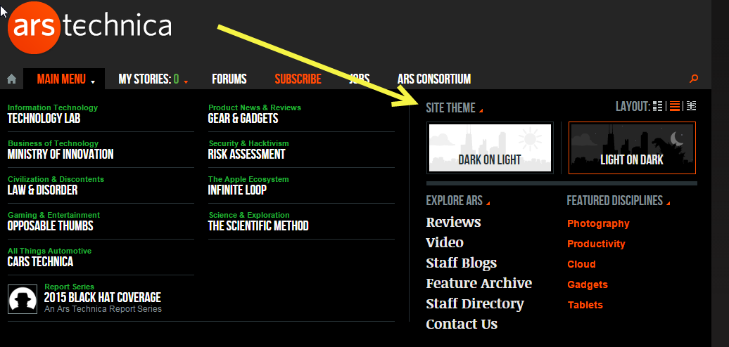
This means that the screen grab which you attached could have been displayed as shown in my last attachment, which would be a heap better. I have a lot of trouble with black on (lots of) white for the reasons already covered by Buzz.
Page 6 / 12
Enter your username or e-mail address. We'll send you an e-mail with instructions to reset your password.