

This topic has been closed for further comments. You can use the search bar to find a similar topic, or create a new one by clicking Create Topic at the top of the page.
Page 5 / 7
I don't recall seeing the new white background going through Beta.
Please give us the option to switch between the white and black background. Thanks.
Please give us the option to switch between the white and black background. Thanks.
Userlevel 3
It is simply: fire this software engineer, and switch back to the old one, job done.
We all can make mistakes, just try to corrigate it! 😉
We all can make mistakes, just try to corrigate it! 😉

#KILLTHEWHITE
Userlevel 7
 +17
+17
Just google 'Sonos 7.4 apk' and install the old version again
Userlevel 3
 +1
+1
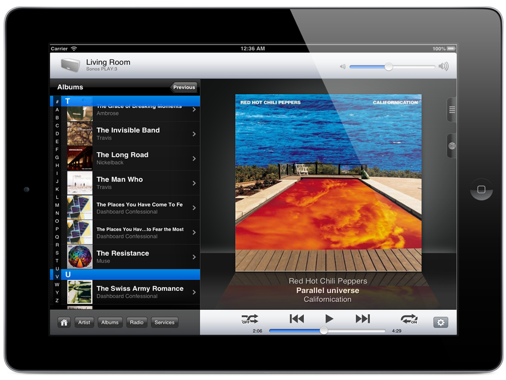
Did you already noticed that when browsing through a compilation album, Sonopad actually shows the artist next to each track where the Sonos app lets you guessing who the artist is? Love this function! Something I was always missing in the Sonos app.
Interesting to see that this one guy who developed and wrote Sonopad achieved to create a better Sonos interface than the whole Sonos software team combined! Shame on you Sonos!
Userlevel 3
+1
Not as fancy as Sonos 7, Sonopad shows it more like on the CR200 remote, but of course larger screen and higher resolution. Still, way better than Sonos 8 and with nice reflection effect.
Userlevel 3
+1
If you're on iOS: Sonopad!
I'm starting to feel like a salesman, but trust me, I'm not ?
Userlevel 5
 +4
+4
dpnfinance - I think you have the wrong man! Try BoredofBalham earlier in this thread (who made the whining sense of entitlement comment).

I agree with Flatliner: I can deal with the poor choices made in changing the app if they would just get rid of the white. It's fracking annoying particularly at night.
Another vote for dark background. Or at least offering a choice.
+1 for giving us the option for a "Night Mode" or darker theme. With wall mounted iPads this new change to the bright white background has ruined the aesthetic of an "always on" SONOS app and cheapens the experience.
I agree, plese bring back (or add an option) the dark background for Android controllers. Only the white one is horrible!
Another unhappy user here - the new controller app for the iPad is a major retrograde step over the previous version. The layout is far less intuitive; finding common operations is far more fiddly - and the white background looks dreadful. Please at least give us a settings option for a dark background. (Or just reinstate the version 7 controller app in its entirety...)
Uncool, Sonos! I think they deliberately made the background so nasty we would have to set up an account to complain about it. Much prefer the dark background. Give us the choice!
The new bright skin is ugly and intrusive -- I absolutely hate it. Give us an option for the dark skin please.
The new android app sucks. Navigation is much harder -- you have to remember how to get to the main functions -- those dumb buttons at the bottom of one of the screens -- and you have to remember what those buttons do. The old app was much, much easier and more intuitive to use. I hate the new app.
And when is Android going to get trueplay? Come on, Sonos -- your products are great, but your android software just got worse, and it's missing an important function that apple devices have.
I've got $1400 worth of Sonos gear -- $300 spent this this month for another pair of Play 1's. Make my investment worth it, Sonos -- fix your awful app, and give us trueplay.
I can live with/reluctantly get used to the other changes made in the latest Sonos update, but who in the world thought it it would be a good idea to change the black background to white??! It's terrible, offensive every time I use Sonos. Was this a mistake? Please change it back to black with the next upgrade. Please!! You've really messed with your otherwise sleek brand.
New to Sonos and this is my only gripe. Why can't users change there own background. You can create a great system like this but not supply consumer with this simple option...come on Sonos can't be that hard....

Nope user choice of software version for the speakers we own is not supported by Sonos.
Userlevel 7
+22
Absolutely - the tablet version should (in landscape mode) be the multi-pane version the desktop has. One of the best interfaces (along with old sonos blue mobile version). The desktop Achilles heal is it was done before universal search. A version like the desktop but with universal search would be terrific on tablet in landscape.
At a minimum just put the room list to the left and then the normal interface to the right.
At a minimum just put the room list to the left and then the normal interface to the right.
Userlevel 1
+1
For everyone that hates the new SONOS App, there is now an alternative. I use SonoPad for the iPad. It has a rich interface and is very sexy. I am no way associated with SonoPad, I paid for it and use it as my only controller.
check out
check out
Userlevel 1
+1
The desktop interface doesn't have universal search either, but I quickly got used to it again.
It'll depend a lot on being able to rely on a single source (e.g spotify) which can be selected upfront, or having to use 2 or 3 different ones with widely varying catalogs.
Nope user choice of software version for the speakers we own is not supported by Sonos.
I daren't update my PC App as its telling me to, because I don't know what it will do to it, has anyone updated yet and has it changed the interface on that aswell or is it still ok?
Clearly there is a cost issue in developing for multiple platforms (Windows, IOS, Android), and then for different screen sizes (phone, phablet, tablet), and then landscape and portrait). I guess modern multi-platform development tools that work for the lowest common denominator (ie smallest screen) is the cheaper way to go. .
I guess tablets are not for everyone but the old landscape app on the Ipad had a a real tangible sense of luxury about it.
With low power no-name tablets being so low cost nowdays (£50 isn't uncommon), maybe it might be worth Sonos considering buying in the hardware and selling a dedicated controller again with software they can write to maximise the potential of its larger screen. They can continue to write for the IOS / Android a more generic app. I could then forgive it looking like it does on my Ipad :-)
Andrew
There's no denying that phones are the primary device these days. especially on the go. At home you will find a - if not several - tablets though as they are better to lean back with, or use as a second screen.
As Sonos is typically found at home, the case for a tablet interface is likely bigger than average device usage stats might indicate.
Page 5 / 7
Enter your E-mail address. We'll send you an e-mail with instructions to reset your password.