

This topic has been closed for further comments. You can use the search bar to find a similar topic, or create a new one by clicking Create Topic at the top of the page.
Page 2 / 7
Userlevel 1
 +1
+1
Userlevel 1
+1
For everyone that hates the new SONOS App, there is now an alternative. I use SonoPad for the iPad. It has a rich interface and is very sexy. I am no way associated with SonoPad, I paid for it and use it as my only controller.
check out
check out
Userlevel 7
 +22
+22
Absolutely - the tablet version should (in landscape mode) be the multi-pane version the desktop has. One of the best interfaces (along with old sonos blue mobile version). The desktop Achilles heal is it was done before universal search. A version like the desktop but with universal search would be terrific on tablet in landscape.
At a minimum just put the room list to the left and then the normal interface to the right.
At a minimum just put the room list to the left and then the normal interface to the right.

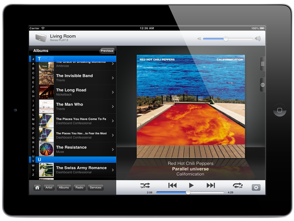
It would be really cool if we could have an IPad / tablet version that looks less like...
And a bit more like, oh I dunno ... this ?
The bottom one was done by an amazing company called Sonos.
No comparison, really ! :D
Andrew
And a bit more like, oh I dunno ... this ?

The bottom one was done by an amazing company called Sonos.
No comparison, really ! :D
Andrew

Nope user choice of software version for the speakers we own is not supported by Sonos.
Can I roll back the update to get the dark skin back?
New to Sonos and this is my only gripe. Why can't users change there own background. You can create a great system like this but not supply consumer with this simple option...come on Sonos can't be that hard....

Ok. Let’s wait to see what the future actually holds. No point in speculating.
It's as TheHellers says. This app shouldn't have gotten past beta, let alone go through several updates without any of the issues being addressed.
And given the extent of the backlash, Sonos response of planning to make some changes in future versions, doesn't sound like much of an acknowledgement or commitment to address the laundry list of issues.
The outcry over this app is not quite like we have seen before. I do agree that there are issues with it relative to the previous but I do not struggle with it half as much as others do.
Allow a bit more time to see how Sonos responds to the feedback. They have said that they are taking it on board. So let’s wait and see.
Allow a bit more time to see how Sonos responds to the feedback. They have said that they are taking it on board. So let’s wait and see.
I don't know what else to say except they just don't care about what anyone thinks. How this app got released even though people were complaining vehemently on the beta forum boggles my mind. Unless you go with "they just don't care".
Steve
Steve
+1
In this age of time this is not difficult to implement !:?
Agreed... I can totally understand that the space required to provide flexibility may be restricted on the players, but that's not the case for all modern controllers. Any half-way decent piece of modern software usually allows the user to tailor important aspects. I haven't 'upgraded' to the latest version, but even v7.1 is a nightmare on Android phones and tablets in a room with low lighting. It's hard to believe that any professional software designer could have come up with this, but then I don't think that UI issues are Sonos's forte...
I can live with/reluctantly get used to the other changes made in the latest Sonos update, but who in the world thought it it would be a good idea to change the black background to white??! It's terrible, offensive every time I use Sonos. Was this a mistake? Please change it back to black with the next upgrade. Please!! You've really messed with your otherwise sleek brand.
I wonder how 8.x on Android would look like with activated color inversion?! :8
https://support.google.com/accessibility/android/answer/6151800?hl=en
https://support.google.com/accessibility/android/answer/6151800?hl=en

I also want the option to chose a dark theme. Shouldn't be that complicated to offer that.
The new bright skin is ugly and intrusive -- I absolutely hate it. Give us an option for the dark skin please.
The new android app sucks. Navigation is much harder -- you have to remember how to get to the main functions -- those dumb buttons at the bottom of one of the screens -- and you have to remember what those buttons do. The old app was much, much easier and more intuitive to use. I hate the new app.
And when is Android going to get trueplay? Come on, Sonos -- your products are great, but your android software just got worse, and it's missing an important function that apple devices have.
I've got $1400 worth of Sonos gear -- $300 spent this this month for another pair of Play 1's. Make my investment worth it, Sonos -- fix your awful app, and give us trueplay.
+1
OLED uses less power on black because black is literally off.
What's going on at Sonos? White skinned app, an age-old macOS app and Alexa gimmicks. They are suddenly giving me lots of reasons to switch to Apple pods next year.
The "Dark" mode won't use less battery power than the regular mode. The backlight on the LCD screen burns the same brightness no matter what pixels are masking it. Reduce your brightness as a whole if you mistakenly think having a dark image on your screen makes any difference.
Uncool, Sonos! I think they deliberately made the background so nasty we would have to set up an account to complain about it. Much prefer the dark background. Give us the choice!
Another unhappy user here - the new controller app for the iPad is a major retrograde step over the previous version. The layout is far less intuitive; finding common operations is far more fiddly - and the white background looks dreadful. Please at least give us a settings option for a dark background. (Or just reinstate the version 7 controller app in its entirety...)
#BRINGBACKTHEBLACK
Another vote for the dark UI experience... combined with the artwork background (and intuitive navigation) from the pre-8.x app.
Sorry to those who have adapted to the new UI, but I am tired of hearing the cursing from those around me (and me too) when the app takes them to somewhere they didn't expect or want to be.
Has anyone else noted that the (dark) UI reached from the settings option looks largely unchanged from the pre-8.x app?
Suggests even more to me that the room/music navigation experience was someone's bright (sorry) idea and makes the app appear more disjointed than it should be.
Cheers!
Userlevel 2
Pull your finger out SONOS. Nobody likes your ‘update’. I’ve given up with it now and just use the SPOTIFY app directly instead. Much easier on the eyes.
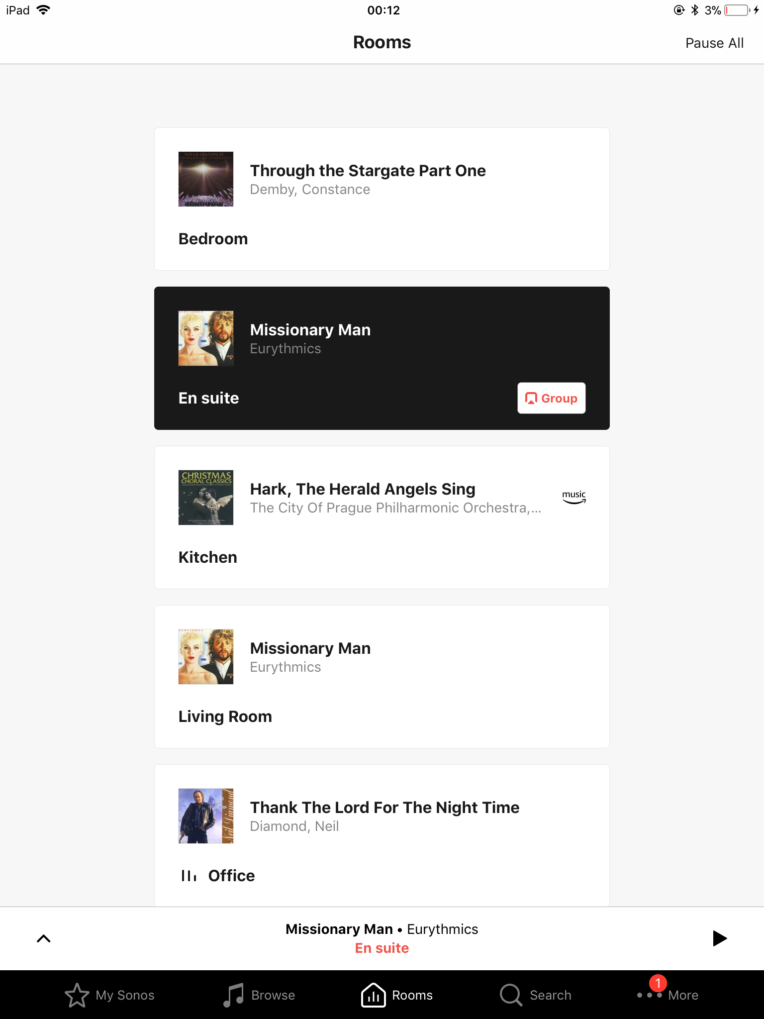
My Sonos requested that we did an update last night. Quite surprised about the change with the display and some of the layout. It would be useful if there were more options to re-arrange the layout to personal preference and change the background colour. I find this extremely bright and would imagine this will prove difficult for those who suffer from Dyslexia. More flexibility to suit bespoke requirements is required.
Page 2 / 7
Enter your username or e-mail address. We'll send you an e-mail with instructions to reset your password.