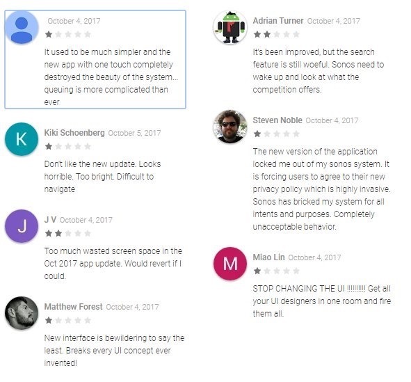
Sonos iOS update is shockingly bad - first impressions
Userlevel 5
 +6
+6
The whole My Sonos feature is confusing. The playlists are confusing, and huge graphics which means hardly any playlists can be shown. Was SO hoping the Mac app would get an update, but no such luck. Wait for more reviews before upgrading..... or am I missing something?
This topic has been closed for further comments. You can use the search bar to find a similar topic, or create a new one by clicking Create Topic at the top of the page.
Page 1 / 6
Userlevel 4
 +1
+1
I agree, it's a badly designed User Interface. I can't see me using the My Sonos function as it sadly requires much overuse of the fiddly "See All" button. The App also has a "Too White" colour scheme. The iPad version is even worse as it is basically the iPhone App with lots of blank space. The best iOS App was the original one, which was the same design as the old CR200 controller. It has been downhill all the way since then unfortunately.
Userlevel 3
Totally agree, this is the worst update ever, I can't figure out how to get 2 stations playing in different rooms. every time i try to switch room it wants to move the station with it.
Is there any way we can back out of this update until they get it working?
Also I'm not sight impaired, so drop the MASSIVE graphics and let me see more on the screen.
Did SONOS even approach any users to test this release, sorry but this is horrible!
Is there any way we can back out of this update until they get it working?
Also I'm not sight impaired, so drop the MASSIVE graphics and let me see more on the screen.
Did SONOS even approach any users to test this release, sorry but this is horrible!

Sadly I have to agree. More presses to get where I want to be and the My Sonos view is totally useless for me on the iPad because of the large icons and you always have to press something else to be able to see more than a few radio stations etc. I wish I’d not updated now.
Userlevel 2
Please give us the old app back - this is not intuitive. Way too many clicks to do anything.
What is up with My Sonos and favorites...alphabetical order only, and only listing the first 8? And if I want to get to anything in my favorites beyond item 8, I have to hit “see all” EVERY...SINGLE...TIME?
I bet a UI study would find the top click is “See All” in this app, really?
What is up with My Sonos and favorites...alphabetical order only, and only listing the first 8? And if I want to get to anything in my favorites beyond item 8, I have to hit “see all” EVERY...SINGLE...TIME?
I bet a UI study would find the top click is “See All” in this app, really?

I have owned Sonos since 2009. I usually don't wade into these kinds of posts as it is always down to a matter of opinion, and I hate getting dragged into the 'my opinion is better than yours' types of argument.
I say usually, but it's hard not to have a strong opinion (one way or the other) on October's developments.
A good test is if you can hand the app to others to see if they can use it without being shown. If Sonos want an example of excellent design (both visually and from a usability point of view) they need to look no further than their own CR200. It was an awesome piece of kit, and it was very rewarding to see people who had never use it before pick it up and make it do exactly what they wanted.
Regardless which side of the fence you sit on, the same can't be said of the new app. It simply isn't obvious how to get where you want. We can all get there in the end, we will all figure it out after stabbing at buttons for a bit. But that kind of design isn't elegant, it's broken. And when I now hand someone the app, I get asked 'how do i......'. And if nothing else, that saddens me because it wasn't always this way.
So, it is true that some people may like the new visuals --- that is down to personal taste. However I would find it hard to be persuaded by anyone who states the new app has a better interface. My own personal opinion of that is badly designed. And I wasn't expecting that from Sonos in 2017.
Andrew
It’s aweful , can we have the old version back.
My misses will never work this out if I struggle with it.
My misses will never work this out if I struggle with it.
Userlevel 2
I am so pissed off! I can't even figure out how to play more than one zone at a time. Actually, i dont think you can. no way to have more than one group at a time. so we lost a key benefit to investing in SONOS because the APP team needed to do something fresh... WTF? opposite of intuitive!!! How do you release something so shitty... you need a beta test group of customers. they would have begged you to shit can this disaster. my 10 year old looked at me and said, "what where they thinking." Goof balls! I am now seriously considering going all Apple.. and I have $1,500 worth of this product. Morons! And I am filtering my thoughts...
Yes, very terrible update. Need option to rollback or customize.
Userlevel 5
+6
And the white buttons against v light grey is a poor choice.
Userlevel 4
 +1
+1
The new update is extremely frustrating. The interface is not intuitive and it takes 2-3 more clicks to perform the same functions. Please return to the previous UI until you have resolved these issues.

The new interface is beyond bad. It looks like they took the same poor interface from their forums, took a lever and forced it into a phone. Just total shit. They have made opaque the best features of SONOS. Wish I could go back to old interface.
Userlevel 5
+6
My long wait for support today indicates to me they have problems...... Someone posted this on twitter. Not sure where it's from....
They turned a simple easy to use UI into a more complicated mess. We switched to a whole house Sonos system because my wife could never come to grips with all of the remotes and inputs and zones of our previous A/V setup. What used to be accomplished with one or two taps now takes many more confusing steps. This is progress?
Userlevel 1
Sonos 8.0. Wow, I was beginning to think it was me. I know we are supposed to give app updates a chance to get used to but this is atrocious. I loved my favourites screen on the ipad but now you have to scroll down and then 'see all'. Frustrating to use and not intuitive.
Why can't we at least have a customisable option and have some control over this mess?
Come on Sonos, we don't deserve this and you can do better,
Simon
Why can't we at least have a customisable option and have some control over this mess?
Come on Sonos, we don't deserve this and you can do better,
Simon
I suppose I can get used to most thing, even if I don’t like them and no doubt I will get used to the new app. But I agree the app on the IPad.especially looks very amateurish and not at all slick or sophisticated.
Andrew
Andrew
Completely unnecessary change. It's pretty, but...
Getting to the "favourites" list seems to be harder. You need to do a "My Sonos->Other / See All" (instead of "Music->Favourites" on desktop / previous iPad client). The split between "favourite albums" (albums) and "favourite others" (artists) is odd. As is the "first 8 favourite bands alphabetically then you need to hit see-all" listing. Given that the entire point of "favourites" menu is fast access to the stuff you listen to most, this seems odd. Desktop controller is thankfully unaffected for now.
And of course the year-old play/queue interaction bugs remain thankfully un-fixed, as the difference between "play all" (replace queue and play album) and "play now" (insert album into stopped queue at position 2 for "play album followed by tracks 2-end of yesterday's listening") is blindingly obvious.
Totally agree. I went to bed last night thinking that I have probably had enough of this and wondering how much I could sell my Sonos gear for.
Userlevel 1
I don't normally make comments anywhere on any forum, but I joined this one just to express my annoyance at the new version of this app. I work in IT, so I am used to change in software, but I have to agree with the criticisms here. It is a really, really poorly designed app. I have multiple rooms set up - 10 rooms/devices in fact. It is really confusing to group rooms together and select music for a specific room. There is nothing intuitive about it. Even after getting used to the new layout, it remains cumbersome and awkward. I find myself going back to the PC interface now, where I never bothered about that before. What have you guys done? I use the app everyday and you have made what was an easy interface into something I feel like i am wrestling with! Please fix this ASAP!
There are are lot of people — some first time posters — saying they don’t like the app.
There are about 3 posters trying to persuade them they are all wrong. Why is this?
Andrew
There are about 3 posters trying to persuade them they are all wrong. Why is this?
Andrew
Userlevel 2
There are about 3 posters trying to persuade them they are all wrong. Why is this?
Andrew
Same as 5.0, the app you now love. Besides, I'm not telling you you are wrong and on many points I agree the new UI needs tweaks. I'm just saying the vitriolic, overarching, hyperbolic hatred you and others are experiencing just may be partially due to unfamiliarity and muscle memory. Unless 5.0 has undergone drastic changes since it was released (it hasn't), that was most certainly the case before, for I highly doubt the thousands of posters who wrote reams of rants against that release actually made good on their threats to abandon the platform. After all, nicka99 is still here. Myself, I learned from experience that with anything new it pays to give it time to sink in before breaking out the torches and pitchforks, it often saves one some embarrassment later.
The old "blue" UI (whatever version it was), was far more efficient than either of the ones that came after. The just superseded version was more efficient than this new one. I don't understand who thought that taking more steps to achieve a goal was a good idea.
ot put in simple terms, I taught 60+ year olds how to use the old blue app in about 20 minutes - one single session. The last one required usually two 20 minute sessions. The latest one... I am still counting.
In terms of a clean slate, the "teaching an old old person" timer is about as good a metric as I can come up with. Glue that menu bar across the bottom, and it'll help significantly, as apposed to hiding everything in favour of a HUGE area of white empty space.
Z...
Agreed. Truly terrible “upgrade”, with so much competition from the likes of Amazon and Google Home how have they managed to get it so wrong?! Completely unnecessary change.
Agree - what a crock of crap. The saying "if its not broke dont fix it" comes to mind. After this people will flock to Amazon Alexa for the simplicity ....with the new sonos one that could be why they've done it?
Words fail me on how much I *HATE* this latest update. I have 7 rooms. I used to be able to tap 'Rooms' and switch between them with one finger. If I do this now it does not change the room, but reverts to the wrong (original) room. Now I have to tap 'Rooms', add the room I want to listen to - ensuring that it *AND* the previous room are selected, then touch "Done". Then I have to click 'Rooms' again, de-select the previous room - leaving the new room selected, then click 'Done'.
THIS IS NOT AN IMPROVEMENT IN WORKFLOW. Is *anyone* listening at SONOS ? Was this ever tested ?
I used to recommend SONOS to all my friends wanting multi-room music. With the current state of the UI I can no longer in good conscience recommend this to anyone. My wife has simply stopped using SONOS, she just can't make the new app do what she wants.
If there was an easy way to select local content on Google Chromecast audio I'd be selling my SONOS on craigslist tomorrow.
You know, I'm not crazy about this new look and feel of this update. I can get used to it, but worse is the non functional, frustration inducing room grouping feature that has been changed. Sonos made several steps backwards in what looks like an attempt to fix something that was really not broke. But now it really is broke and is crushing (in the negative meaning) the whole sonos experience. It will not switch rooms no matter the sequence of rooms deselected and rooms selected. it just doesn't work . Come on Sonos, say something... Something this bad needs attention rightaway! Just own it and let us know you are fixing it immediately...
Userlevel 4
 +13
+13
The valid comments and criticisms have now been aired here fully so now please Sonos don’t let this continue. Acknowledge “issues” and tell us customers you are going to address them ASAP.
Page 1 / 6
Enter your E-mail address. We'll send you an e-mail with instructions to reset your password.