
Sonos iOS update is shockingly bad - first impressions
Userlevel 5
 +6
+6
The whole My Sonos feature is confusing. The playlists are confusing, and huge graphics which means hardly any playlists can be shown. Was SO hoping the Mac app would get an update, but no such luck. Wait for more reviews before upgrading..... or am I missing something?
This topic has been closed for further comments. You can use the search bar to find a similar topic, or create a new one by clicking Create Topic at the top of the page.
Page 6 / 6
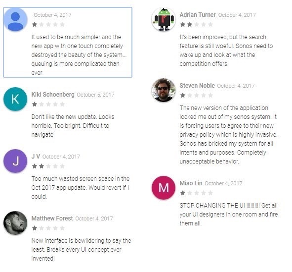
It’s aweful , can we have the old version back.
My misses will never work this out if I struggle with it.
My misses will never work this out if I struggle with it.

Completely unnecessary change. It's pretty, but...
Getting to the "favourites" list seems to be harder. You need to do a "My Sonos->Other / See All" (instead of "Music->Favourites" on desktop / previous iPad client). The split between "favourite albums" (albums) and "favourite others" (artists) is odd. As is the "first 8 favourite bands alphabetically then you need to hit see-all" listing. Given that the entire point of "favourites" menu is fast access to the stuff you listen to most, this seems odd. Desktop controller is thankfully unaffected for now.
And of course the year-old play/queue interaction bugs remain thankfully un-fixed, as the difference between "play all" (replace queue and play album) and "play now" (insert album into stopped queue at position 2 for "play album followed by tracks 2-end of yesterday's listening") is blindingly obvious.

I suppose I can get used to most thing, even if I don’t like them and no doubt I will get used to the new app. But I agree the app on the IPad.especially looks very amateurish and not at all slick or sophisticated.
Andrew
Andrew
Userlevel 5
+6
My long wait for support today indicates to me they have problems...... Someone posted this on twitter. Not sure where it's from....
Userlevel 3
Totally agree, this is the worst update ever, I can't figure out how to get 2 stations playing in different rooms. every time i try to switch room it wants to move the station with it.
Is there any way we can back out of this update until they get it working?
Also I'm not sight impaired, so drop the MASSIVE graphics and let me see more on the screen.
Did SONOS even approach any users to test this release, sorry but this is horrible!
Is there any way we can back out of this update until they get it working?
Also I'm not sight impaired, so drop the MASSIVE graphics and let me see more on the screen.
Did SONOS even approach any users to test this release, sorry but this is horrible!
Sadly I have to agree. More presses to get where I want to be and the My Sonos view is totally useless for me on the iPad because of the large icons and you always have to press something else to be able to see more than a few radio stations etc. I wish I’d not updated now.
Please add Artist back to the album view per-song, mainly for various artist albums but also albums where there were a lot of colabs
Moderation Edit: Added title of the topic into the post, then moved the post to app update feedback thread.
Moderation Edit: Added title of the topic into the post, then moved the post to app update feedback thread.
It states to swipe up anywhere to view the navigation bar but if you swipe up on iPhone, the Apple control centre is displayed. You used to be able to swipe right when playing music to access other music sources, this is no longer available.
Userlevel 4
 +1
+1
I agree, it's a badly designed User Interface. I can't see me using the My Sonos function as it sadly requires much overuse of the fiddly "See All" button. The App also has a "Too White" colour scheme. The iPad version is even worse as it is basically the iPhone App with lots of blank space. The best iOS App was the original one, which was the same design as the old CR200 controller. It has been downhill all the way since then unfortunately.
Userlevel 5
+6
And the white buttons against v light grey is a poor choice.
Userlevel 5
+6
After all this time, I guess I was just hoping for something 'wow' and ended up with 'meh'. Sad face (but still love the sound).
Page 6 / 6
Enter your username or e-mail address. We'll send you an e-mail with instructions to reset your password.