
New App Upgrade - HORRID
The new interface is nearly impossible to use... it doesn't even make sense how it works in relation to the previous interface which was better than good enough. As someone that has thousands of dollars invested in sonos I have to voice my utter disgust for this new app. PLs comment below and lets get Sonos to roll back from this atrocious attempt at an upgrade.
This topic has been closed for further comments. You can use the search bar to find a similar topic, or create a new one by clicking Create Topic at the top of the page.
Page 5 / 5
Userlevel 2
I never make the effort to sign up to things usally to complain. i love my sonos speakers. But this new app has driven me to it. I hate it. Not user friendly. Bring back the old. So much better. Please sort it sonos.was considering getting a new speaker but might look else where if i have to live with this sh#t app.

Terrible upgrade. Made me actually post on the App Store-and I NEVER post on the App Store!!
Userlevel 2
I agree this is a huge move backward. If I didn’t have so much money invested in my system, I would move to something else.
Userlevel 2
Personally this latest update feels like a real step backwards in user friendliness.
The 'MY SONOS' tab... Use far too much space displaying content, I always have to press 'show all' button to see what I need to, so why bother with the new BIG look?!
The 'ROOMS' tab. Again, the new layout uses to much space and makes it much more difficult to see what's playing in each room at a glance (which is surely the point?) Now only shows 3 rooms on screen, a completely unnecessary waste of space when the old layout showed much more. I would like to be able to see many more rooms/speakers.
'SEARCH' & 'BROWSE' tabs - why are there two tabs for an almost identical function?!
Another slight annoyance is when on the expanded playing screen... The new tabs across the bottom VANISH (on my phone) so there's barely any point having them if they're supposed to be short cuts... I still have to hit the tiny arrow in the top left corner to get anywhere!
On a plus, the quick grouping of rooms does seems slicker/better, but overall I'm pretty unimpressed!
Userlevel 4
 +1
+1
Yea, most users hate it.
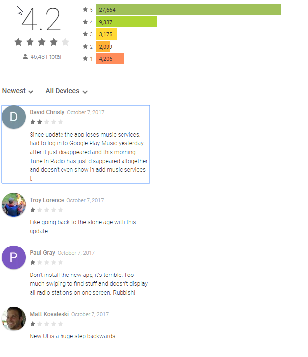
Change in Google Play Store reviews from 10/7/2017 to 10/13/2017:
5 star: +7
4 star: -1
3 star: +16
2 star: +97
1 star: +288
I would be interested in stats from the Apple Store. Judging by the newest reviews, the response is similar.
Screenshot from 10/7/2017
Screenshot from 10/13/2017
Change in Google Play Store reviews from 10/7/2017 to 10/13/2017:
5 star: +7
4 star: -1
3 star: +16
2 star: +97
1 star: +288
I would be interested in stats from the Apple Store. Judging by the newest reviews, the response is similar.
Screenshot from 10/7/2017
Screenshot from 10/13/2017

To sum up-very few longtime users like the update-most hate it including myself
Please allow us the ability to go back to the better/older software that made sense
Please allow us the ability to go back to the better/older software that made sense
Userlevel 4
 +3
+3
I agree - it's an insult to all my investment too. No extra features, but all of them are harder to find! I hate the bright white light theme also - bring back the black!
Page 5 / 5
Enter your username or e-mail address. We'll send you an e-mail with instructions to reset your password.