
New App Upgrade - HORRID

The new interface is nearly impossible to use... it doesn't even make sense how it works in relation to the previous interface which was better than good enough. As someone that has thousands of dollars invested in sonos I have to voice my utter disgust for this new app. PLs comment below and lets get Sonos to roll back from this atrocious attempt at an upgrade.
This topic has been closed for further comments. You can use the search bar to find a similar topic, or create a new one by clicking Create Topic at the top of the page.
Page 2 / 5
Anything else?
Yeah, instead of your ridiculaous hashtags, how about posting actual constructive feedback that Sonos can use to make the current app better.

#MYAPOLOGIES YOUR GREATNESS
Anything else?
Anything else?
You aren't getting a freaking rollback! If you want to be usefull, stop this rollback nonsense and instead, give some actual constructive feedback on how to improve the new app.
And no, saying "Make the new app like the old one" is not actual constructive feedback.
And no, saying "Make the new app like the old one" is not actual constructive feedback.
Update 11/29: Now there are 6100 reviews with 1 star.
SONOS: LISTEN TO YOUR COMMUNITY
#ROLLBACK
Yea, most users hate it.
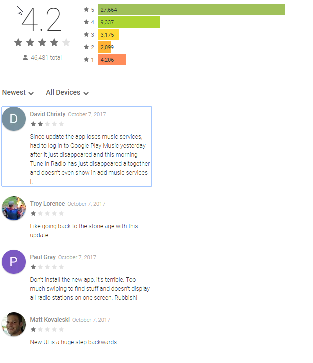
Change in Google Play Store reviews from 10/7/2017 to 10/13/2017:
5 star: +7
4 star: -1
3 star: +16
2 star: +97
1 star: +288
I would be interested in stats from the Apple Store. Judging by the newest reviews, the response is similar.
Screenshot from 10/7/2017
Screenshot from 10/13/2017
SONOS: LISTEN TO YOUR COMMUNITY
#ROLLBACK
Change in Google Play Store reviews from 10/7/2017 to 10/13/2017:
5 star: +7
4 star: -1
3 star: +16
2 star: +97
1 star: +288
I would be interested in stats from the Apple Store. Judging by the newest reviews, the response is similar.
Screenshot from 10/7/2017
Screenshot from 10/13/2017

It's infuriating.
Search for an Artist returns values from Amazon Music (which I do have) and Spotify (which I do not, and thus is useless). It does not return any music from my local Kodi music library even though it is connected to Sonos.
If I select and album from Amazon music I can add it to the queue; if I select an album from my local library I can only add a song to the queue, not the album.
It's broken in all sorts of ways 😞
Userlevel 2
I showed my wife what to do if any of the speakers didn’t come on, she’s not very tech minded but could understand and use the old app, but now, with this new app, she’s lost! No good asking me wife coz I’m lost too!! Hate it!
Userlevel 1
I completely agree. I haven't been on the forum in years, but signed in again to lend my voice on this pile of garbage.
And keep our fingers crossed they wont make things even worse.
Out of curiosity, and an attempt to be constructive, what controller device do you primarily use? I think the change from 7.4 to 8.0 may have been a much bigger change for tablet users than phone app users. That is obviously a generalisation and there are clearly some unhappy phone users. But I wonder if it might be a part of our widely differing perceptions?
And keep our fingers crossed they wont make things even worse.
You think they will listen to both of us?
I am one of many who have said the nav bar should always be visible. I think that will happen sooner rather than later
Because the facility on the Now Playing screen that one poster called the 'red speaker selector' is not that at all. It works as a 'quick grouping' facility but if you want to select or manage rooms you had best do so in the Rooms screen. I don't use the quick group tool at all and I have no problems with room selection.
Personally I would scrap the quick group thing but in the meantime your sanity is best served by ignoring it,
I have trouble with both intermittently. Before the update to 8.0 I never had these issues. The tool bar across the bottom needs to be pinned to all screens. It would simplify navigation to jump immediately to a different screen rather than hitting back, back, back , back, then swipe.
May I ask those finding room selection frustrating .... are you using the 'quick group' facility that is near the bottom of the Now Playing screen, or are you using the Rooms screen?
Because the facility on the Now Playing screen that one poster called the 'red speaker selector' is not that at all. It works as a 'quick grouping' facility but if you want to select or manage rooms you had best do so in the Rooms screen. I don't use the quick group tool at all and I have no problems with room selection.
Personally I would scrap the quick group thing but in the meantime your sanity is best served by ignoring it,
If I want to de-select a room from the list and select "Done", there's a 40% chance of it doing nothing, a 30% chance of the sound stopping but the app still telling me it's playing and a 30% chance that it actually does what I asked.
If I've been listening to music spread over two rooms, and want to play music in two different rooms instead, it's hit and miss as to whether it works (perhaps optimistically 50%). Even when it does work, I sometimes get several seconds of 'spinning cursor' before it kicks into life. Around 20% of the time (after whirring for more than 5 secs), the music stops completely and the app defaults to my Living Room, regardless of whether it was part of the selection.
This evening, it's started the habit of playing in the room I selected but selecting a different room in the app (forcing me to open the other menu to manually select the right room).
Having spent thousands on Sonos, I'm feeling peeved to say the least. App version downgrade is the least we should expect.
Some would say that it's pointless to vent but as the owner of a Canary device until recently (sold it on eBay for a loss, due to the 'business decision'), I'm more than happy to vote with my feet if they don't sort it out. They'd soon get the message if the same happened to them (look at Canary on Amazon to see what I mean).
I'd be surprised if this was the version they fed out for beta testing (or perhaps they ignored the feedback).
I am having the same results as you using iOS and Android
Having the bottom button bar visible at all times would help remove some “feeling lost” confusion as well as reducing some of the extra steps which now seem to be required.
And reducing the size of the massive room buttons would help make rooms and their current content visible again.
I agree it would be nice to be able to select a darker skin to ditch the white background.
Our home scenario sees room selection and grouping changing frequently each day as multipurpose rooms with multiple types of speaker move between breakfast alarm Radio on a 5, to afternoon radio on a group 5, 3 & 1, then maybe dinner time Spotify on the 5 & 3 and perhaps an evening film on the playbar and the 1s or even TV sport on all of them. Such moving of use was easy on the old app but has now become long winded and somewhat counter intuitive at times.
I want embrace new looks but this feels as though it had a lack of beta testing in real world situations.
I hope they listen to this forum and make some simple changes quickly to regain the focus of the brand...”simple, effective and high quality”. It’s just lost the first point for me, and I’m gutted!
I'm all for upgrading UI/UX to give a refresh to those who are never happy with someone that just works (I work in Digital myself). However, having Sonos spread over 6 rooms in the house, the red speaker selection function (at the foot of the app) is not working as it should (on a Samsung Galaxy S8)!
If I want to de-select a room from the list and select "Done", there's a 40% chance of it doing nothing, a 30% chance of the sound stopping but the app still telling me it's playing and a 30% chance that it actually does what I asked.
If I've been listening to music spread over two rooms, and want to play music in two different rooms instead, it's hit and miss as to whether it works (perhaps optimistically 50%). Even when it does work, I sometimes get several seconds of 'spinning cursor' before it kicks into life. Around 20% of the time (after whirring for more than 5 secs), the music stops completely and the app defaults to my Living Room, regardless of whether it was part of the selection.
This evening, it's started the habit of playing in the room I selected but selecting a different room in the app (forcing me to open the other menu to manually select the right room).
Having spent thousands on Sonos, I'm feeling peeved to say the least. App version downgrade is the least we should expect.
Some would say that it's pointless to vent but as the owner of a Canary device until recently (sold it on eBay for a loss, due to the 'business decision'), I'm more than happy to vote with my feet if they don't sort it out. They'd soon get the message if the same happened to them (look at Canary on Amazon to see what I mean).
I'd be surprised if this was the version they fed out for beta testing (or perhaps they ignored the feedback).
Userlevel 1
Yes, I've sussed it all out, but IMO Sonos have been arrogant in releasing a heavily changed interface without providing help for existing customers.
I suspect everyone who has posted a negative comment here have better things to do with their time than spend it having to find their way around a new interface that has replaced one they were previously perfectly happy with.
Whatever the reasons for the change, it was badly done and Sonos should take heed for the future.

Thanks. So not a peep from the horse’s mouth but a rumour.
Userlevel 7
 +20
+20
It took me 30 seconds to figure out the new model. Same for my wife. Now I like it, subject to making the bottom tabs permanently accessible, whcih is apparently on its way. I'd go for a couple of other minor tweaks, but they're no big deal.
John B's tutorial covers everything you need to know. The only thing I'd add is that you can change the order of the categories in the 'My Sonos' view by using the Edit button and dragging the categories as you wish (on iOS, at least). This is done on a per-controller basis, so different controllers can have different orderings.
Here is my tutorial for the new app. If you haven't sussed the tab bar (and it seems many users haven't) then you have missed the key to easy selection of room and music
All you need is a Room and some music. To select a room, press the Rooms button on the tab bar
There are, as there always have been, three ways to select music:
1. Search (Search button on the tab bar)
2. Browse your sources (Browse button on the tab bar)
3. Choose from your own Playlists and Favourites (My Sonos button on the tab bar)
For non-day-to-day things like Settings, it's the More button on the tab bar.
If the tab bar is not shown, swipe down the screen or hit the little arrow in the top left.
That's about it really. Most of the things from there on are as in the previous app, although that is less true of My Sonos.
I hope that the tab bar will be made visible on the Now Playing screen soon (it really should be already) and that will save some swiping hassle.
This new upgrade makes me want to throw my SONOS out! Please let us go back. It's impossible to figure out. Who decided this was a good idea?
The slider bar disappeared. I uninstalled and reinstalled the app and the slider bar reappeared.
Page 2 / 5
Enter your username or e-mail address. We'll send you an e-mail with instructions to reset your password.