
New App
The new app is terrible to use and makes what was a simple easy to use system over complicated, is there a way of using the previous App?
This topic has been closed for further comments. You can use the search bar to find a similar topic, or create a new one by clicking Create Topic at the top of the page.
Page 1 / 2
Userlevel 7
 +22
+22
no you can not roll back to prior app. Per sonos in master thread some updates or coming fairly soon based on feedback in that thread.
JGatie also says that support for the issues with the new app is dwindling, yet nearly 3 months on, people are still signing up to voice their disapproval. Look at the reviews on the iOS App store from Oct onwards and you will see that JGatie is in a minority.

So is this an example of: -
1 unintuitive or poor design. For example unlabelled bars or chevrons, with screens sliding in and out of view, and a lack of consistency with other screens which are selected by labled tabs. If so this would be the fault of Sonos’s software engineers.
Or
2 a failure of the users muscle memory. If so the fault lies with the user.
Just asking :D
Andrew
Bit more research required next time JGatie if you want to stay top dog ?
https://www.theregister.co.uk/2014/05/21/sonos_slips_out_new_speaker_control_app/
"Really like the Update to the iPhone app, but very disappointed with the iPad version. It seems like a cost cutting exercise to basically have the same app on the iPhone on the iPad, which they have succeeded in."
My memory serves me correct that when 5.0 was released the phone app and tablet app was pretty much identical. The tablet app was changed to provide a better experience.
I don't need one of your lists. You are trying to go off on a tangent, v5.3 was an improvement on v5.0 for tablet users and my 'research' shows there was a fairly significant change which seems to have slipped your memory.
Userlevel 7
+22
I don't believe he asked for an update on jgaite. I will stick with my post informing what is going on.
Chris, I wasn't responding to you. But the forum cartel have stated that negative support for the latest release is dwindling when it clearly is not as people are signing up to show support so I am keeping the vibe alive.
Userlevel 7
+22
I do think it will dwindle once tweaks are made based on feedback.. I can’t claim others opinions. I personally give it a few more weeks.
Just got back home to the new app and I'm still scratching my head. It's different on every one of four devices. On my Samsung tablet, there's no bottom bar (My Sonos, Browse, Rooms, etc.) so that device is useless to me. If I don't start playing music from another device, I can't do a thing with that device.
I logged in for the first time just because this is so incredibly frustrating. Any idea when this will be fixed or where I should direct feedback?
I logged in for the first time just because this is so incredibly frustrating. Any idea when this will be fixed or where I should direct feedback?
Userlevel 7
+22
Inhave to say I haven’t tried on my iPad to see tablet differences. No bar?. Have to check that out. I would expect tweaks coming next few weeks or so. Please leave any suggestions you have (no bringing back old version suggestion won’t work).
Here you go... no bar.
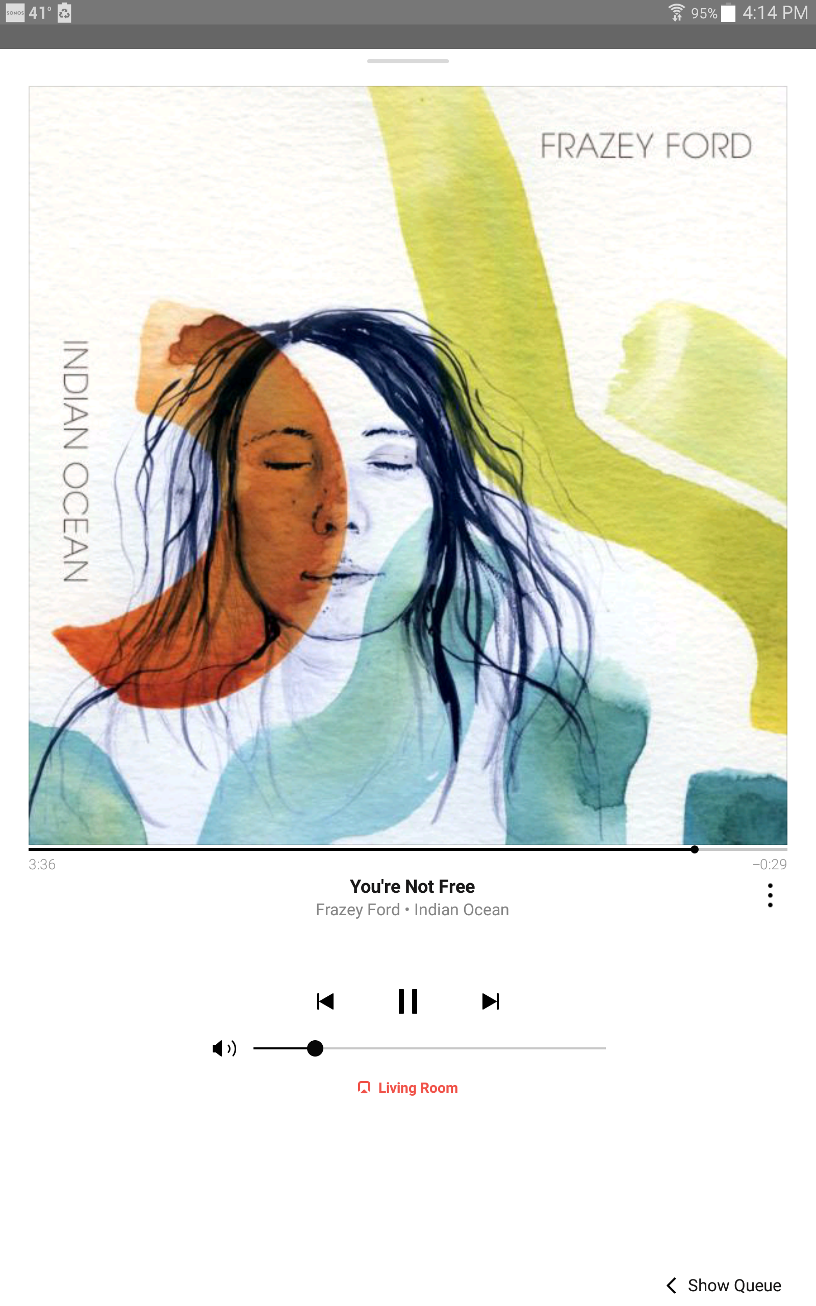
Hit the little bar at the top to lower the Now Playing screen and reveal the tab bar.
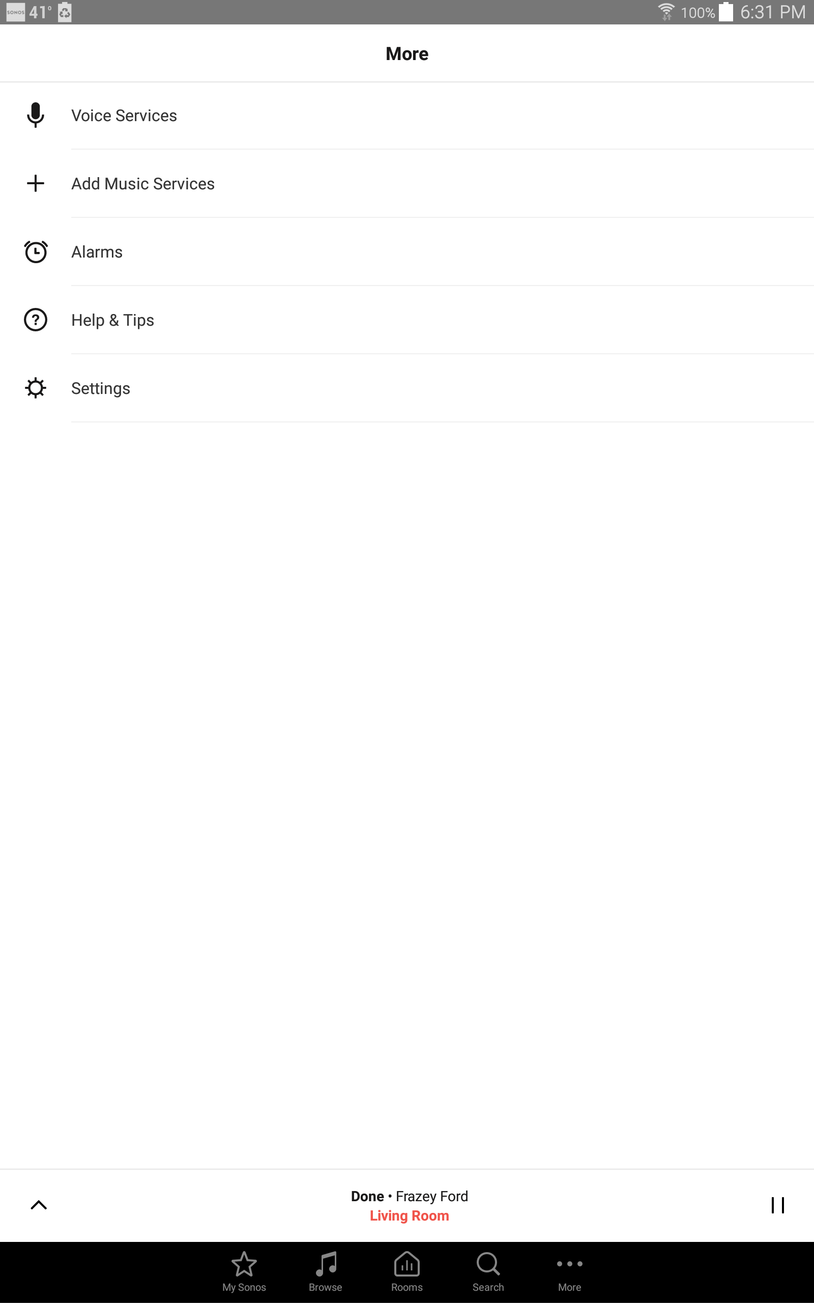
"Title bar" ??? There's a little grey bar at the top. Tapping that takes me here:
Userlevel 7
+22
Try a swipe down on now playing screen
Tried that. I either get the Android menu (running apps, settings, etc.) or nothing.
Userlevel 7
+22
It would be an example of bad design mimicking non-multiroom native apps. Needing corrected in next release.
I've repeatedly said not having the tab bar visible at all times is the worst part of the new design. So yeah, bad design.
Nice try though, andrew. You were soooooo close! ?
Nice try though, andrew. You were soooooo close! ?
Re: User issues. That's certainly possible, but I still don't understand why the UI would be completely different from one device to another. I have 1 iOS and 3 Android devices. This issue happens on one Android device, but not on the other two. One of the functional devices is also from Samsung, if that means anything.
FWIW, I've tried tapping all over the screen. Other strange stuff that happens;
- Multiple different taps on the Album Cover (in Now Playing) result in different screens. One time I get the "Add Music Services" UI, another time I'm prompted to configure Amazon Alexa. Most times, though, I'm prompted to set an alarm.
- When tapping the room (in red, at the bottom), it lists the two rooms I have configured in my home. I cannot select the other room without first selecting both rooms and tapping OK, then selecting the room at the bottom again and de-selecting the room that I don't want to manage, then tapping OK again.
At the bottom of the screen above is the Tab Bar. From that you can choose Bowse, Search, Rooms, etc. Right now you are on the More screen, which allows you to access Settings, Alarms, etc.
Userlevel 7
+22
Interface should be same on all. All of them clicking the little arrow in top right corner or flicking the now playing down should all give you navigation bar at bottom. Not calling it a good design but all should be very much same if all on same version.
Userlevel 7
+22
Ok some observations from tablet version. Ok none have the down arrow anymore just a little tab thing. Kinda dumb but I’m sure they will clear all that up next version
The browse section. So much wasted space. Seems like more could be going on here.
The browse section. So much wasted space. Seems like more could be going on here.

The worst part of the new design is having a tab bar navigation in the first place. Half the issues are a direct result of it.
Nice try though 😉
Awwww, I've got a puppy!
That's great! Hope it keeps you busy and of this forum for a while. 😉
Page 1 / 2
Enter your username or e-mail address. We'll send you an e-mail with instructions to reset your password.