
New App
The new app is terrible to use and makes what was a simple easy to use system over complicated, is there a way of using the previous App?
This topic has been closed for further comments. You can use the search bar to find a similar topic, or create a new one by clicking Create Topic at the top of the page.
Page 1 / 2
For someone not concerned about winning, you spend an inordinate amount of time following me around trying to prove me wrong. How about I have my opinions and you have yours? I won't ask you to stop posting yours, you don't ask me to stop posting mine?
I'm not here to debate the borderless buttons, you can take that fight up with someone else ?
Life isn't about winning JGatie, it is about getting the facts correct.
I never said there weren't improvements. I stated there were tweaks, which is exactly what they are mentioning. What I said is there were no changes to the things most people were complaining about, the color scheme, the borderless buttons, the layout, the unused space on the tablet app, the iOS 7 look and feel, the bad portrait view, etc. none of which changed
Bottom line, you are arguing something I agree with already. If that makes you feel like a winner, go for it! :8
Bottom line, you are arguing something I agree with already. If that makes you feel like a winner, go for it! :8
https://www.theregister.co.uk/2014/05/21/sonos_slips_out_new_speaker_control_app/
"Really like the Update to the iPhone app, but very disappointed with the iPad version. It seems like a cost cutting exercise to basically have the same app on the iPhone on the iPad, which they have succeeded in."
My memory serves me correct that when 5.0 was released the phone app and tablet app was pretty much identical. The tablet app was changed to provide a better experience.
I don't need one of your lists. You are trying to go off on a tangent, v5.3 was an improvement on v5.0 for tablet users and my 'research' shows there was a fairly significant change which seems to have slipped your memory.
Userlevel 7
 +22
+22
As I mentioned some minor tweaks to the app and tablet mode. Nothing major it’s basically the same with tweaks. Obviously tweaks made it go from most hated to beloved. So that is good history that with tweaks everyone will be loving this one.
Top dog? Pffft. ratty is and always has been the Top Dog around here. I'm a frigging piker compared to him.
But maybe you should do more reasearch. Would you like me to list the things people complained about that didn't get changed on both the phone or tablet version? It's a pretty long list.
Bit more research required next time JGatie if you want to stay top dog ?
Except for the progress bar, all those were on version 5.0. The difference was the queue view.
Besides, what about the terrible color scheme, the bad borderles buttons, the lack of three panels, the terrible swipe down action, the unintuitive interface, etc., that everyone complained about. What happened to that?
Besides, what about the terrible color scheme, the bad borderles buttons, the lack of three panels, the terrible swipe down action, the unintuitive interface, etc., that everyone complained about. What happened to that?
Also new in the update is an updated user experience for iPad users that offers new, separate views for currently playing music and discovery features:
More engaging browse experience for tablets. Version 5.3 provides separate views for music discovery and what’s currently playing.
More engaging browse experience for tablets. Version 5.3 provides separate views for music discovery and what’s currently playing.
V5.3.
https://9to5mac.com/2015/03/03/sonos-controller-iphone-ipad/
https://9to5mac.com/2015/03/03/sonos-controller-iphone-ipad/
No. They didn't. They never made it a full blown tablet app. They didnt fix the unused space. They didn't fix the portrait view. They didn't fix the color scheme. They didn't fix the single panel view to the three panel view everyone liked. They didn't fix the grouping. All these things were bashed voiciferously, and they never changed them. They fixed the queue view and tweaked a few things like adding a track progress bar. That's it. The basic layout, design, color scheme, controls, and functionality of the tablet app stayed exactly the same from 5.0 to 7.4, except for the infamous queue changes. Yet, people claim to love it now after the entire design was originally declared crap.
Chris, your posts are confusing me. One minute you are saying nothing changed from v5 to v7.4 (25 releases btw) and now are stating that they added tablet customization which in my view changed it considerably from a phone app which worked on a tablet to a full blown tablet app in it's own right.
OK, I'm stumbling along here. Still don't like the seemingly-arbitrary differences between the UIs on various devices, but I'm starting to figure it out.
Sadly, I'm now finding the Windows app more reliable and useful than on any of my Android or iOS devices... Ugh.
Sadly, I'm now finding the Windows app more reliable and useful than on any of my Android or iOS devices... Ugh.

I have coped with the new tab layout reasonably well without thinking it better than the previous approach. Notwithstanding I agree with User103951. The source of concern that people have is the direct result of moving to the tabbed approach. Of that I am sure. I dealt with it well but it is not necessarily best for a multi room set up. It works quite fine for native apps.
Not a nightmare for me but clearly for others.
Not a nightmare for me but clearly for others.
Userlevel 7
+22
Actually I have to disagree regarding the tab bar. I think it is a welcome inclusion from versions 5-7 where you had to know where to swipe or press. The original Sonos interface had some similarities and I don’t think they should have moved away from it.
The tablet version has been moving toward more harmonization with the standard version for years. However 5.0 when it came out had this issue and they slowly added back some tablet customization.
In my personal opinion the landscape on tablet should look like the desktop version with an all in one page type interface.

If you on Apple just get SonoPad and Sonophone, couple of £ far better, frustration removed, logical in functionality.
That's great! Hope it keeps you busy and of this forum for a while. ;)
Talk about not getting the bit. :8
Some consequences of this, it seems to me:
1. The limitations of the space available on a phone screen are artificially imposed on the tablet, hence the general feeling expressed in these threads that the app on a tablet does not make good use of the space available.
2. People used to the tablet app, which resembled the existing desktop controller, suddenly found they had to navigate to places that previously were all on a single screen (this is really just an inevitable consequence of point 1).
3. For new users, without the 'baggage' that the rest of us carry, a single look for all mobile apps is probably a good thing in itself. Opinions will differ on whether it is enough of a gain to justify the downsides.
I make no judgements on whether this was a good idea or not on Sonos' part, it's just my take on an aspect of the change. Has this been little commented on because nobody else thinks this is relevant?
.

That's great! Hope it keeps you busy and of this forum for a while. 😉
Awwww, I've got a puppy!
The worst part of the new design is having a tab bar navigation in the first place. Half the issues are a direct result of it.
Nice try though 😉
Userlevel 7
+22
Ok some observations from tablet version. Ok none have the down arrow anymore just a little tab thing. Kinda dumb but I’m sure they will clear all that up next version
The browse section. So much wasted space. Seems like more could be going on here.
The browse section. So much wasted space. Seems like more could be going on here.
Userlevel 7
+22
Interface should be same on all. All of them clicking the little arrow in top right corner or flicking the now playing down should all give you navigation bar at bottom. Not calling it a good design but all should be very much same if all on same version.
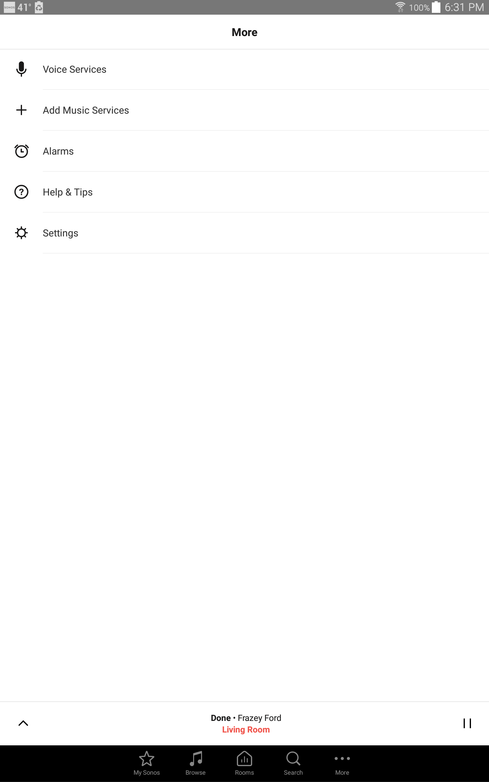
At the bottom of the screen above is the Tab Bar. From that you can choose Bowse, Search, Rooms, etc. Right now you are on the More screen, which allows you to access Settings, Alarms, etc.
Page 1 / 2
Enter your username or e-mail address. We'll send you an e-mail with instructions to reset your password.