

This topic has been closed for further comments. You can use the search bar to find a similar topic, or create a new one by clicking Create Topic at the top of the page.
Page 3 / 4
3: Controller Layout:
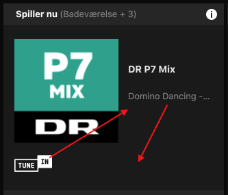
- Why is the 'Track info text' placed in a narrow location, with a simple icon for Tune In is placed there?
It Makes No Sense!
With both Heos and Bluesound making moves in the marked, this is a huge step back.. sadly!
I could'nt agree more. I use both the Windows and IOS version, and they both needs a better, more intuitive, user interface. I often feel it is a step backwards, when a new version is released. User friendly interfaces is the main reason for having systems like Sonos.
Userlevel 4
 +1
+1
They took a perfectly suitable button that said "group" and changed it to an icon

The new Group icon looks like the Apple Airplay icon to me. It's definitely not a good choice of icon to denote Grouping zones/rooms.
my pc interface no longer gives me the option to add speakers. has this happened to anyone else?
Userlevel 7
 +23
+23
Well yes, everyone who uses the PC or Mac apps. Sonos don't care about us any more.
Userlevel 1
Yes, as noted, Sonos intentionally deleted this capability on the PC (or Mac) Controller,

I suspect they either finally deprecated the old API / RPC calls the desktop app was using, or refactored the app in such a way that the development effort needed to maintain full functionality on desktop wasn't deemed worth the money, given the data they have on the percentage/trends of Sonos users who have access to a PC/Mac but no recent Android/iOS device.
But you never know, maybe the directive really was to spend development time to ensure that the desktop apps couldn't be used for setup/admin. Sonos have a habbit of making interesting software design decisions...
Userlevel 7
+23
It certainly wasn't the former as the API is still there - exact same API the mobile apps use. There is no *technical* reason for the change, and I can say this having worked in the actual Sonos codebase. It was purely a "we don't want to support non mobile users configuring systems" decision, likely done by disabling menus and buttons. It looks to me like the code is still in the binary, actually. The resources are certainly still there for the deleted functions.
It certainly wasn't the former as the API is still there - exact same API the mobile apps use. There is no *technical* reason for the change, and I can say this having worked in the actual Sonos codebase. It was purely a "we don't want to support non mobile users configuring systems" decision, likely done by disabling menus and buttons. It looks to me like the code is still in the binary, actually. The resources are certainly still there for the deleted functions.
I don't have access to the code, I'm not developing a Sonos app. I'm holding off on the upgrade for now. I don't know for sure what has changed in the new desktop app (eg. fully deprecating old APIs, full rebuild switching between WPF/electron/Xamarin/etc. frameworks, or just a new set of UI assets). I don't know whether it's the ongoing cost of development, support and testing of these admin features that would prompt their removal. I assume that the Sonos user experience across the official controllers continues to be different because of limited development resources.
I also assume that, given they don't actually build their own controllers and require customers to supply the hardware, Sonos would like their speakers to work with as many devices - and therefore potential customers - as possible (assuming the user base is large enough to be worth it). If it is a directive by Sonos that "customers must have an Android/iOS device to use Sonos" then I guess you'd ultimately find that out if your 3rd party app was prevented from implementing selected admin functions.
Userlevel 7
+23
Fortunately that has not happened, yet anyway. Given sufficient time and effort I can add many of the now-deleted admin functions back to my app. However there are some features that are simply not practical to attempt, such as updates. There also appear to be a few new features that do NOT use the long-standing UPnP API, but some new mechanism involving encrypted REST APIs. 3rd party apps can't do those.
The new color scheme is not terrible, but it's not great. The mix of low contrast (grey on black) with high contrast (white on black) features creates a visually jarring juxtaposition. And the grey-on-black probably doesn't show up well on cheap or poorly calibrated monitors. An option to choose between a black-on-white menu and a white-on-black menu would be nice.

Indeed, I concur.
Per my report on Desktop Controller for Windows v9.2 earlier in the thread, v9.3 persists in huge "placemat" takeover of screen real estate.
What was a bug is now a "feature"? LOL
I've been nagging about the Sonos FIXED interface for years - it can't be changed, resized, or rearranged and yet they say they'll pass the feedback to the design team. Does the design team come in once a decade? And the best they can manage to do with their 1990s interface in all this time - is change the colour and position on screen? Really? Dis I really pay that much money and get this as an interface? (I guess I did.. thinking it was going to be cutting edge and remain so...)
We can send a probe to the outer reaches of our solar system and the best we get from Sonos is a colour change?? I'm no fan of WMP but at least there's a choice, limited maybe, but still more choice than Sonos' NO CHOICE, TAKE IT OR LEAVE IT format.
I also agree with the poster who says it's not as clear - it isn't - I have a high res screen and it's terrible. How about being able to alter the image sizes or the font sizes etc? That's probably about the easiest thing to do in any program, yet sonos are keeping with their rigid controls and NO user CHOICE. Come on people - join us in the 21st century - this is so 1990s
Releasing software is a judgement call. Sometimes you release when it's "done". Sometimes you release when it's "good enough". Sometimes you release "whatever you have on deadline day". And then you have to prioritise what to fix based on the severity of the issue. Given the Sonos attitude to fixing bugs and UX problems and unfinished features (basically "we don't. ever."), I wouldn't expect anything to happen soon.
One more reason to stick on 9.1 until I'm forced to upgrade.
One more reason to stick on 9.1 until I'm forced to upgrade.
Yup - just updated and its all back.
I would guess that it was just an oversight, and that functionality (screen position) would return in the next update.
But I'm completely guessing on that.
But I'm completely guessing on that.
Sonos reads everything, but the window issue was brought up in the main announcement thread as well. I suspect we'll see an answer to that question their before one shows up here.
I can't say that the new interface is the end of the world to me. Not remembering size/position is certainly a bummer, but I would expect a quick fix for that.
I had an interesting experience when installing the new version though. I pressed "Update now", got the UAT prompt, I pressed OK, and I continued reading in my web browser. All of a suddent I was looking at a uniformed coloured background some spinning dots and the text "Restarting". That is, Windows restarted. I'm not say that the Sonos installer iniated a reboot of Windows. In fact I find that unlikely. Maybe there were just some unfortunate circumstances on my machine. Still, anyone else who have seen this?
I had an interesting experience when installing the new version though. I pressed "Update now", got the UAT prompt, I pressed OK, and I continued reading in my web browser. All of a suddent I was looking at a uniformed coloured background some spinning dots and the text "Restarting". That is, Windows restarted. I'm not say that the Sonos installer iniated a reboot of Windows. In fact I find that unlikely. Maybe there were just some unfortunate circumstances on my machine. Still, anyone else who have seen this?
Userlevel 2
+1
I am all for skinning options for the App, that is a fine thing, make it like many other softwares where you can pick the "skin" or color way, but this nonsense is like something Apple would do, let's make things less clear, but "cleaner looking" and let's force the change.
Sonos a bit of advice: Jony Ive is a bad interface influence. Ignore him.
Sonos a bit of advice: Jony Ive is a bad interface influence. Ignore him.
It feels a bit like the dev department got thinned out and all what's left is a bunch of Apple brand design aficionados trying to 'smooth out edges and corners'...
Pity.
Pity.
@anorakus Yes! I get the same thing. Quite annoying that!
Userlevel 2
And after all these years we still have microscopic album covers. I'd happily pay Roon prices for full Sonos functionality with Roon's music interface.
Mine did exactly the same on the day I installed it (2 days ago) but I've tried it a few times this morning and it has closed straight away. I'll keep an eye open for it happening again.

I seem to be the odd one out here - I like the new design. The colours aren't the most inspiring but it is quite readable. I especially like the top section where all the music controls are in one place. Sensible & logical. I'd agree with others that having the ability to choose a colour scheme / skinning would be much better.
No Alt Text (?) when hovering the mouse over the new Group icon is very poor - it's not an icon that speaks "Group"!
Thumbs up from me.
No Alt Text (?) when hovering the mouse over the new Group icon is very poor - it's not an icon that speaks "Group"!
Thumbs up from me.
A serious question. Apart from the obvious "features" of the new desktop controller (ie. new different-from-mobile look and removal of setup /admin features), are there any UX changes that might tempt us to upgrade or stick with 9.1? Do favourites still work as one big list? Can you have favourite playlists (and fast navigation to them)? Are "artists" still called "artists"? Do you still get the "add favourite to favourites" option (and the other we-ignore-current-play-context design that is the Sonos way)? Does it still basically act like the old desktop controller we know and, er, tolerate?
Page 3 / 4
Enter your username or e-mail address. We'll send you an e-mail with instructions to reset your password.