... or to keep repeating what others have already said, time and time again, in the various threads on the forum. .
And if people don't say it, and keep repeating it, then we know from past experience that Sonos will totally ignore it.
...The software has been released as a 'public beta' and that usually means the company will be listening to the views of the public, before finalising things.
And therein lies the problem - you do not release 'beta' software into a live environment - if you do, then you allow regression. It really isn't rocket science.
I think many here should just wait and judge things by the final end product and not keep attacking the same points (over and over again) on what is 'clearly' still very much 'a piece of work in progress'.
If it's in a live environment then it is the finished software - and I can understand people's frustration in not knowing how long they'll have to live with this. It doesn't affect me personally - I now so distrust the quality of Sonos software that I will not 'upgrade' unless I absolutely have to - but I can understand why people might feel strongly about it.
...just give Sonos time to look at what people’s general views are and let’s see what they come up with next.
It's rather more usual to put these views as input into the design process, not wait until it's live and then see what people say. That's the cowboy method of software development.
Guy_19,
The voice control and ongoing enhancements are in many ways 'free' to existing hardware owners and clearly both Amazon and Sonos will want the public either to buy their hardware, new and old, or subscribe to the available streaming music services they provide.
I think we should not expect absolutely everything here for 'free', especially in the early days of development... I’m sure Amazon would like to see us all subscribe to either their 'Prime', 'Ultimate' or their 'Shared Family' Music services and purchase one, or more, of their echo devices. In the same vein, Sonos will be hoping to encourage customers to buy their hardware, particularly the new Sonos One speaker.
The developers may go onto develop 'complete' voice control for locally stored libraries, but from an earnings/business-growth perspective, I don’t think either Amazon, or Sonos, would decide to put that development work at the top of their priority list. Its all about sales and profit in the end and so I think the voice control of locally stored music is something for them to look at later, me thinks.
I think we should all be very grateful that Sonos have decided to make these 'free' voice-control upgrades available to existing owners of their legacy hardware and have taken us with them on their journey. They could easily have confined the development to the new 'Sonos One' and any future Sonos products in the pipeline, practically forcing us all to buy their new speaker in order to voice control things.
I am grateful for the work and service the two companies have provided already this year and so far it has cost me very little in real terms... so you won’t hear me complaining about me not being able to play my local library when I now have voice-controlled access to Amazons 40 million tracks for a small monthly outlay. My local music is still available anyway via the app and once an album or playlist is started, I can use voice to then control things anyway.
I think it’s been a great first round of 'voice control' development ... and I’m quite sure there is plenty more still to come our way in the next few months and years.
I agree that having the Echo provide some voice control is an unexpected bonus - and a feature I could live without.
My comment about having a prioritised backlog of requirements and deploying change quickly, was more about development of the app. Dark theme being right at the top of my prioritised backlog, swiftly followed by usability that matches v7.4.
Guy_19,
I really hope you get what you wish for ... we shall have to wait and see what the next update brings.
Amun,
I see no harm in a public beta, now and then, to get wider feedback to help drive the business forward. None of us were truly forced to update, that’s usually the case with many software updates... some folk prefer to wait and see and others (like me) just go for it. It’s each to their own and I quite like the update on iOS, particularly the new 'My Sonos' tab ... the 'Browse' tab is similar to the previous app anyway.
Yes I too want to see smaller icons, less white, and a few other things besides, but the advantages for me still outweigh the disadvantages and I’m happy to patiently wait for the next release, as it was my decision to upgrade to v8 in the first place.
And if people don't say it, and keep repeating it, then we know from past experience that Sonos will totally ignore it.
Nonsense. People didn't clamor on for lot of things Sonos has done in the past. Crossfading showed up out of nowhere, as did pointing to a share that is not the root. There are many others.
And therein lies the problem - you do not release 'beta' software into a live environment - if you do, then you allow regression. It really isn't rocket science.
The Sonos app actually is not a beta, the beta is the Sonos skill for Alexa. Also, plenty of betas are released to the public, hence the term "Public Beta".
If it's in a live environment then it is the finished software - and I can understand people's frustration in not knowing how long they'll have to live with this. It doesn't affect me personally - I now so distrust the quality of Sonos software that I will not 'upgrade' unless I absolutely have to - but I can understand why people might feel strongly about it.
As stated, it is finished software, but not for the reasons you list. And in reality, "finished" means nothing, for it could change tomorrow, next week, next month,or next year. Indeed, Sonos listened to the rational posters who calmly made their case for additions and changes to the last app redesign. I imagine they will do the same with this one, if they can sort out the rational posters from the melodrama and faux outrage. Try being part of the former and not the latter and things may get done.
As to not trusting Sonos, if you are willing to live with the fact that eventually your music services will cease to operate and you cannot add new Sonos hardware, who are we to judge? Personally, if I were as disappointed as most of you seem to claim, my stuff would be on e-bay and I would never post here again. I'm not one to expect a company to bend to my wishes, I'd rather dump them for one that meets my needs. "Or the bunny gets it" is not how I roll. :D
It's rather more usual to put these views as input into the design process, not wait until it's live and then see what people say. That's the cowboy method of software development.
If you did not participate in the alpha/beta process, you have no idea who had input into the design process. You only know you were not. Though I will say that by the time the software enters beta, the design elements are pretty set.
I wait expectantly for the 'fanboy' accusations, but here goes..
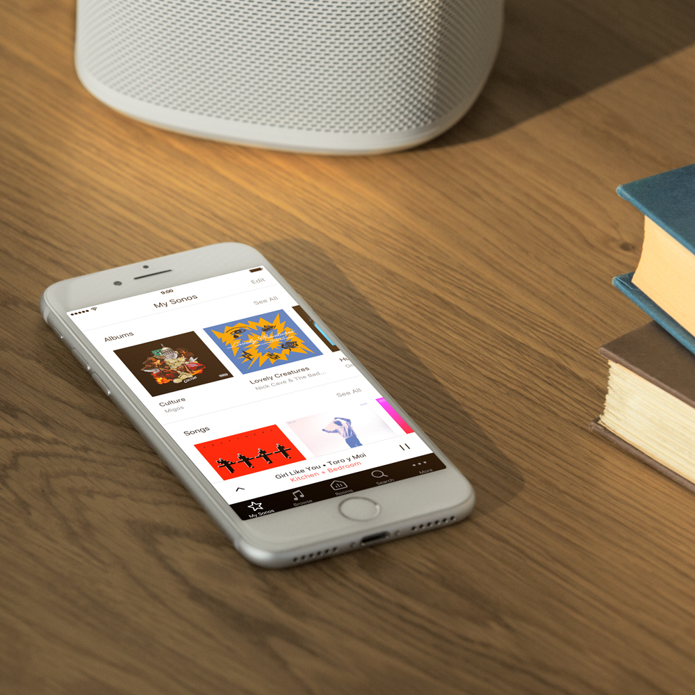
The new app has its flaws (more on that in a minute) but basically it is really simple to use. New things take a bit of getting used to. Most of those who have slammed the new app seem to have based their views on 2 minutes effort. The Sonos bar is key. I want to pick a room? Tap the Rooms button. Then a source? Tap Browse. The one inconvenience is that the bar doesn't appear on the Now Playing screen, but I hope that will change. But I just swipe down and there is the bar (and usually either the Rooms or Browse screen, saving me one of my button presses).
I came in this evening and in less than ten seconds of opening the app had my music library playing in the Living Room. How disastrous is that?
It is logically organised. Instead of a jumble of things on the main menu, Browse contains just sources (wish they had called it Sources), More contains the things I need much less often, like Settings and Setup. Search and Rooms are self evident. 'My Sonos' contains the things I have chosen myself and want to get at quickly. What is so ****** difficult?
Yes, the icons are too big. Yes the Sonos bar should be on EVERY screen. I'd like to see Playlists on the Browse screen and just selected playlists in My Sonos.
But come on guys. Get with it and make a bit of an effort. With a few tweaks this is going to be way better than 7.4. If you want to be left behind, that's your call.
Nope
NopeGood to hear that someone doesn't want to be left behind.
Haha hardly
There’s progress and then there’s regress
I’m sure it’ll be fine in a few iterations
You call it regress and I call it progress. Let's call the whole thing off.
I'm lost. Here's my level of ignorance: How do you downgrade? I show I'm on 8.0.
You can't - you're stuck with it - welcome to the wonderful world of Sonos.
Actually, that may not be true - IIRC, someone mentioned using an earlier apk to revert their phone. I have no idea whether this would work for a system wide 'downgrade'.
You can't - you're stuck with it - welcome to the wonderful world of Sonos.
Actually, that may not be true - IIRC, someone mentioned using an earlier apk to revert their phone. I have no idea whether this would work for a system wide 'downgrade'.
You aren't stuck with it and the download procedure described does work (on Android anyway: I neither know nor care about Apple). It only changes the app on your device and doesnt seem to do anything to the firmware in the Sonos units.
I came in this evening and in less than ten seconds of opening the app had my music library playing in the Living Room. How disastrous is that?
The disaster is that when you want to return to your music folders in order to play more music there doesnt appear to be any way of getting directly back to the folder you were in. You have to navigate all the way through the folder structure again starting from the browse screen. I have better things to do with my time.
I got round this by going back to the 7.4 version which does not have this feature/bug.
I came in this evening and in less than ten seconds of opening the app had my music library playing in the Living Room. How disastrous is that?
The disaster is that when you want to return to your music folders in order to play more music there doesnt appear to be any way of getting directly back to the folder you were in. You have to navigate all the way through the folder structure again starting from the browse screen. I have better things to do with my time.
I got round this by going back to the 7.4 version which does not have this feature/bug.That is simply not true. Or I am misunderstanding what you mean. I just played some music from my library, swiped down the Now Playing screen, and there I am in the folder structure, not back at the top. Tapped another album by same artist. 7.4 is becoming a distant memory for me now, but I think that is just the same as it was. Even if I switch rooms and hit Browse I still end up in the folder structure. Just as before, as far as I recall.
I use to be able to go to my favorites and see a nice list. Now I go there and I get these huge icons, the I have to tap it twice to play what I want, argh. Who tested this before rolling it out? I emailed your support asking how to go back to the previous version and it's been days with no reply. Come on Sonos! I was always singing your praises but something has gone wrong at your company.
I gave this app a few day ps as any new GUI takes some time but nope, still sucks. Everything is more steps to do what I use to do on a daily basis. Hate it!!
I was just forced to upgrade to your new ios app a few days ago and I hate it. Now ther's more steps to change music in individual rooms and other headaches. And it's much more confusing to navigate. I have no use for Alexa or Siri navigation as I use neither. I just want the old app back. i wish you didn't force unwanted changes on us. Not to mention I recently bought my 87 year old Mom a Sonos speaker that she quite liked and was able to navigate the old app quite well. She now tells me she no longer wants the Sonos after it forced her to upgrade, it's too complicated for her now and she's very disappointed. I'm no longer very happy like I was with my Sonos system, I may have to go with something else now.
I was just forced to upgrade to your new ios app a few days ago and I hate it.
Who forced you to upgrade?
I sincerely hope that the development team and their leaders are reading these messages with their overwhelming negative responses to the app redesign (white background, over sized logos, menus etc).
Of course the frustration comes from the fact that we as customers have NO other option if we want to use a system that many of us have already SPENT HUNDREDS of dollars purchasing.
I had hoped that SONOS would not fall into the trap of 'we know best' and not asking the customer what they want or giving them an option to pick ... (was the white background shown in the beta? i cant believe there were no comments on it if so)
I have a long background in Customer Support (retail and IT Tech Support) and as a Manager for Tech Support for a software company my driving philosophy is 'the customer is right (even when i think he may be wrong)' Its about how you react to your customer that is the difference between good support and bad.
A customer PAYS money to buy your software or purchase your speakers and then when presented with something that overwhelmingly does not work for the CUSTOMER - who is the one using your product - the right response is not silence or vague promises to make changes.
So Sonos - you decided to change something that was not broken - why? - but then you are ignoring your customers' overall negative reaction ... in what comes off as arrogance. (The glare of the very bright background is particularly concerning - why insist on a feature that HURTS your customers?)
Yes there was a beta - which only a small portion of your customers took part - for something as big as a redesign of an app (that is the MAIN method of running your product) you could introduce a public beta BUT KEEP THE CURRENT APP available.
Please release an official statement with a timeline of changes to reflect your customers increasing requests.
This is in response to jacob_7 who asked me "who forced you to upgrade."
I would say Sonos forced me to upgrade, if I wanted to use my Sonos system my only option was to upgrade to new app before it would allow me to play anything with it. Same thing happened to my mother. I don't know what you call it, but I call it being forced, I was given no other choice if I wanted to continue to use my Sonos system.
Same thing to me. I did not want it but couldn't do anything with it, only option was to upgrade. Did you guys get hacked by the Russians and forced this out early. Ow two days and no response to my help email.....
I don't like everything about the new app either, but I wouldn't want to go back to the previous version ... The "long press" to add to, or remove from, a group, without need to find a controller, is the most useful feature that they have added for some time IMO.
That is simply not true.
Of course it's true. Otherwise I wouldn't have written it.
I have no idea how it works on your device but on my phone V8 goes straight back to the browse page when I step back, and then I have to navigate through all my folders again. V7.4 just returns to the folder I was on before, which is what you describe and what I want.
Anyway, it's not an important issue as until they sort out the awful white screen I certainly wont be installing V8 again.
I would say Sonos forced me to upgrade, if I wanted to use my Sonos system my only option was to upgrade to new app before it would allow me to play anything with it.
For me the update was requested on my phone and I had the option of not doing it. I did actually update, didnt like it, and have gone back the previous version which does everything I need without blinding me at night.
So at no point did my system insist on the update in order to keep working. Maybe there is something different about your equipment?
I came in this evening and in less than ten seconds of opening the app had my music library playing in the Living Room. How disastrous is that?
The disaster is that when you want to return to your music folders in order to play more music there doesnt appear to be any way of getting directly back to the folder you were in. You have to navigate all the way through the folder structure again starting from the browse screen. I have better things to do with my time.
I got round this by going back to the 7.4 version which does not have this feature/bug.That is simply not true. Or I am misunderstanding what you mean. I just played some music from my library, swiped down the Now Playing screen, and there I am in the folder structure, not back at the top. Tapped another album by same artist. 7.4 is becoming a distant memory for me now, but I think that is just the same as it was. Even if I switch rooms and hit Browse I still end up in the folder structure. Just as before, as far as I recall.
Yes, I agree with John B. If you 'browse' your music library folders and then decide to navigate away from that tab, by either going to the now playing screen, or any other tab like 'My Sonos' or 'Rooms' or 'More' tab etc. and then return to the browse tab, I find that I am still at the exact same place I had navigated to in the music library structure. To get back to the 'beginning' of the browse tab, a user can click or tap the browse tab twice ... and then you can start from scratch and begin the browse tab navigation again.
So my thoughts are that Darrel must somehow be double clicking his browse tab and that means he is having to navigate things all over again.
Well that’s what I think appears to be happening in this case.
Sorry but every version since the awesome tri sectional blue screen has made accessing music etc worse...this is no exception....multiple clicks sub menus and weird placing of menus just makes you want to use another app...such as Sonopad..
The basic concept of Sonos is a multi room music system..so what better view would you want when you open the app to see than A your players or rooms?....B the source of music stored or streaming service and C what’s playing now...
instead opening the app now starts part way in..its like opening a book at page 73 and wondering who these people are and what’s happening....
It’s ironic Sonos have created a sort of floating bar at the bottom which shows they know people want the overall view ....it’s far more logical to select room music play ....why would you have to constantly have to guess where things are?...
And why the hideous glaring white screen..it’s far to big there’s so much space it’s a waste...
Want to see your stored music?..right let’s make the icons so big it takes endless scrolling to find them....
Now the Alexa skill.....why?..i know it’s a beta but what exactly does it do for anyone not signed up to Amazon prime?...it won’t play stored music....asking it to play bob fm on sonos in the living room results in it being barely audible even with the player turned up to 10 so that’s useless...any other function?..errr no....