
Ryan S
Retired Sonos Staff
October 2, 2017

Now Available, the New Sonos App
Related content:Software


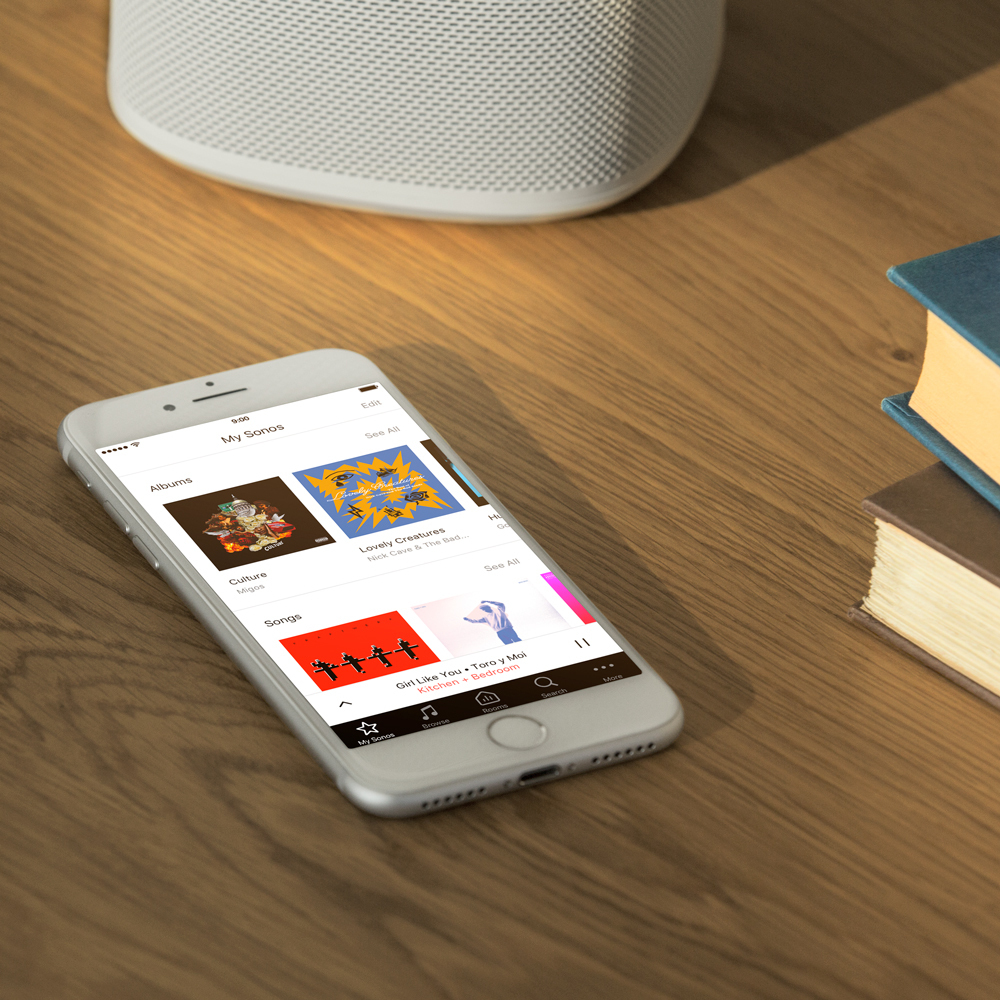
Sonos version 8.0 is introducing a brand new controller for iOS and Android. The new Sonos app makes it even easier to navigate, access, and control your music throughout your home. This new app comes side by side with voice control through Alexa devices, more about that here.

Check out our blog for the Remastered Sonos App. Full details on the new apps can be found here on their respective product guide pages. Let’s take a look at the new app:


Introducing Navigation with Tabs:


The Sonos app now has five tabs visible at the bottom when not in the full playing screen. The tabs are My Sonos, Browse, Rooms, Search, and More. See here:



Now your most used options are available with just one click, and Now Playing is always just one tap away.

My Sonos
We’ve consolidated all your personally curated Sonos Playlists, music service playlists, and Sonos Favorites into one, easy to use page on the Sonos app. You can edit fields to move around the order, or delete them entirely. You can now have up to 40 favorites total, up from 32.

Browse
Browsing your music is even easier as it no longer hides your other options. You can browse and move to different rooms all while keeping your place in the browsing menu. There’s also a dock on the bottom of the app that gives you easy access to the navigation tabs. You can swipe it up to reveal it at any time, then back down. We’ve separated browsing your music and the menu for Settings, so it’s even easier to find what you’re looking for.

Rooms
The menu starts highlighted on the active room, featured right on the app so that it’s even easier to see what’s playing in each room. There’s now an icon on that screen to show you where the music is coming from too. That includes if it was started by Alexa. The active room has a Group button to have it add others to the party.

Search
It hasn’t changed, just moved to an easy to find spot.

More...
All the settings and options are in here. You can add services, make alarms, get some help, and access all your settings. We think this will make it a lot easier to find what you’re looking for. And speaking of settings…


Explicit Language Filtering


Within Settings > Parental Controls, you can set a system-wide setting to filter songs with explicit content. Right now, this is working for Apple Music, and we’re hoping to add it for more services soon. Once the setting is on, Apple Music songs with the explicit tag will no longer play on your system.

Long Press to Group


Making it even easier to play music. With 8.0, you can press and hold the Play/Pause button (or mute on older players) to have your player join the most recently active player as a group. First, you have to start playing music on a player, (it can be from an alarm or any other source), and then just hold the button for a few seconds on another player. That second player will join the first one’s group and start playing the same music in sync.

There's another function of the long press, and that's being able to move recently stopped music to another room. First, stop playing music in any of your rooms. Then, press and hold the play/pause on another player for a few seconds. (Make sure that you don't start playing music anywhere else.) The queue or source will move to the unit you held the button for and start playing. The players won't group together and any existing queue will get whiped out in place of the new one.

iOS 11 and Android O Support


Lastly, version 8.0 has support for the latest operating systems from Android and iOS. This includes iOS 11 support for Trueplay on Sonos. Trueplay isn’t available on Android at this time.
This topic has been closed for further comments. You can use the search bar to find a similar topic, or create a new one by clicking Create Topic at the top of the page.

527 replies

Chromatic Producer I
October 8, 2017
Plus one for being able to order lists, especially Stations. I have a lot of stations which I then have to press See All, then scroll down to find my favourite Radio Paradise. I'd like to be able it move it up so I can see it on the My Sonos screen in Stations without further multiple key presses.

If you long press the name of the station you get the option to rename it. I then just prefixed the station using a number ie. 1.Radio One, 2. Radio Two. They then jump to the top of your list :-)


Thank you for finding this trick. It helps a little bit however the size of the icons is still ridiculous and a big design mistake. I do appreciate you posting this trick
Southern Gal
Lyricist I
October 8, 2017
What's with all the white? I'm learning the functions but this all white just hurts my eyes!!
Contributor III
October 8, 2017
Two thumbs down! Luckily, my system works fine, but the new app is clunky, counter-intuitive and aesthetically unappealing. I really hope there's a remedy on the way.
Trending Lyricist I
October 8, 2017
I also can’t change the order of radio stations with either the Android or iOS Sonos apps. Am I missing a trick? I just edited the names and stuck 1(space), 2(space) etc. in front. They then follow the number ordering.

OMG! Thank you so much for this! It’s driven me nuts since the day I installed that some stations were named with numbers before call letters and others with call letters first.

It seems that the MySonos only shows the first 8 stations from the list (of only 12), and I had to use the “see all” option to see the ones at end of list .... and by virtue of Murphy’s Law 9, 10, and 11 are the ones I listen to most often.

Now those three are at least sorted to front of the ginormous icons.
testcard
Prodigy I
October 8, 2017
Whilst giving radio stations a number prefix to re-order them is a useful workaround, it really shouldn’t be necessary. I can’t belief that it would require huge amounts of coding to enable re-ordering by simply sliding stations up and down the list view, something that’s a common function in many third party iOS apps.
Lyricist II
October 8, 2017
To Ryan S. It’s all well and good for you to say you’ll pass along the issue that Thousands of us are complaining about the White blindness but will you? Will anyone pay heed or has Sonos become arrogant like Apple? The old interface was excellent and best of all, it WAS EADY TO TEACH NEW CUSTOMERS. Many older people were buying Sonos and I won’t recommend until this is straightened out. It is confusing, cumbersome and so unnecessary. The old interface was a breeze. Improve the product, introduce new speakers esp for outdoors but leave the interface alone. You screwed the pooch on this one. BTW .. not only Not a novice, I train.
Not a Novice. Don’t require a ‘badge’ to be an Expert user.
jgatie
October 8, 2017
I laugh because the exact same things were said about the last major UI change (and every one prior to that); the old was simple and intuitive and the new was cumbersome and ugly. Fast forward, and the new has become the old, muscle memory has been retrained, cumbersome has become intuitive, and ugly has become familiar and beautiful. Nobody likes change, but sometimes it is unavoidable. Better to accept; the sooner one does, the faster it will make the transition from new to familiar.
Avid Contributor I
October 8, 2017
"Search
It hasn’t changed, just moved to an easy to find spot."

Now I have to use a tab to go the search mode. How is that easier than tapping the search icon on the current page?

And the glaring white screen is really annoying. Do the guys who "updated" this app actually use it personally? Doubtful. I am really geting tired of "improvements" that are nothing more than moving crap around and changing colors.
Avid Contributor I
October 8, 2017
Nobody likes change, but sometimes it is unavoidable. Better to accept; the sooner one does, the faster it will make the transition from new to familiar.

I like change when it actually makes something better. Just different isn't better. And yes the new one will become familiar but that doesn't make it better. Too many tech companies seem to think that they have to keep making "improvements" that really aren't so they can look like they are 'improving" the product. We're not that stupid. Different isn't always better. When you have something fully functional, just leave it alone.
Lyricist I
October 8, 2017
Half the system is lost - the ne CRApp is lackluster at best - how about you refund my money or make a system that actually works?