Like Will and Lyra, in Philip Pullman’s His Dark Materials trilogy, I have the power to pass between parallel universes. I have just returned from one that is identical to our own except for one thing. What we call v8 of the Sonos app was v7 there, and vice versa. Here is a post I read on the Sonos forum.
“SONOS WHAT WERE YOU THINKING ABOUT!!?? I HATE the new app. Where has our lovely light, bright app gone? The new one is so dark and depressing. Every time I open it I feel like committing suicide.
As to the new Favourites structure, well there isn’t any. It was logical to have the different types separated out as they were in My Sonos. Now my Favourite playlists are jumbled in with radio stations and songs etc etc. WTF? Who goes looking for a playlist then decides to put on a radio station? You have created chaos out of order.
But the worst crime of all is the scrapping of the Navigation bar. Whether I wanted to select a room, browse my sources, search for music, or get to my Favourites, I just needed to go to the navigation bar. Everything in one place. Now if I want to change rooms I have to touch the currently playing room name at the top of the screen (how unintuitive is that!?), if I want to search I have to touch a symbol in the top right of the screen. And to find my music sources I have to swipe in a screen from the left hand side – it took me 30 minutes to find that. And when I do I find more chaos – music sources in the same place as stuff I hardly ever use like adding music services. Are your programmers completely stupid?
I know I have been using the previous app for a couple of years, but if the new app were truly intuitive like the last one, I should be able to know instantly how to do everything in the new app, even though it’s different.
So please, SCRAP THIS RUBBISH and roll us back to our previous, perfect, entirely intuitive app. And I warn you, not only will I never buy another piece of Sonos equipment if you persist with this travesty of an app, I have my son’s pet rabbit here and I have a gun to its head. Roll back or the bunny gets it."

This topic has been closed for further comments. You can use the search bar to find a similar topic, or create a new one by clicking Create Topic at the top of the page.

At least in the parallel universe they can view their new app without temporarily going blind.
I have eyes that need correction in many ways before I can see properly, and the white does not bother my old eyes at all with our without my glasses. Perhaps it is meant for the older set?:D
Great post, John. It also always puzzles me how liberal people are with the word HATE and that too in caps. It is such a severe word, to be applied to murderers and rapists in my book.
Great post, John. It also always puzzles me how liberal people are with the word HATE and that too in caps. It is such a severe word, to be applied to murderers and rapists in my book.
Save that post. I predict you will see hundreds just like it when the inexact "science" of UI design comes full circle back to dark backgrounds in a couple years, just ike the retun of bell bottoms and miniskirts.

I have said something similar elsewhere but, without any apologies, I’ll repeat it here.
All the people who dislike v8 are here to tell Sonos their views. That is how it should be. They are not here to persuade others to dislike it.
It’s great that some love it. Their views should be heard too. But why try to persuade the others? It’s like me trying to persuade you to like asparagus soup (assuming you don’t like it, that is 😃 ). I can give you lots of logical reasons why it is a good thing and better than tomato soup, but really - why bother. If you don’t like it, you don’t like, and no one should really be trying to change your viewpoint anyway.
A lot of the dislikes may not have given constructive reasons why they don’t like it, but really — for the peace of the community, let them have their voice heard and move on. They paid their money and they are entitled to this, at least - aren’t they ? If these forums are swamped with ‘bad’ posts, that’s Sonos’s problem. Invest your energies where it’s most helpful in helping those with problems, not those with a differing opinion.
Enjoy the music !
Andrew
I am not trying to deny anyone a voice. There has been some calm, reasoned and justified constructive criticism. I seem to recall saying that yours had been so on another thread. My post is about the nature and tone of some posts, and the mistaking of familiarity for intuitiveness.
This was not in any way an attempt at persuasion. I find the new controller too bright and lacking in contrast myself. My post is not about the specific details at all, but about the nature of some of the responses.
This was not in any way an attempt at persuasion. I find the new controller too bright and lacking in contrast myself. My post is not about the specific details at all, but about the nature of some of the responses.

I like that John B - “mistaking familiarity with intuitiveness”. I myself would not deny anyone a voice but truly struggling to agree that the app is unintuitive. When it changed I probably sat with it for 10 - 15 minutes max before I thought I understood it most if not all. My wife never even made a single comment on the change. We just carried on enjoying the music.
Nice analogy on the asparagas soup. When I was a small child, and refused to eat something without even tasting it, threw tantrums, held my mouth closed, and dumped the plate on the floor, my parents chastised me and explained to me the logical stupidity of hating something without even giving it a chance. In some instances, like sauerkraut, they mixed it with a little applesauce so we were able to develop a taste for it over time. In all cases we were made to take a "no thank you" portion of a bite or two that we had to eat or no TV or playing outside after dinner.
My palate is the most far ranging that there can be today, and I thank my parents for their due dilligence in introducing me to wonders of the culinary world that go far beyond chicken nuggets and mac and cheese. Now you are going to retort that I was a child and Sonos owners are adults, to which I say: Have you actually read the posts? 😉
My palate is the most far ranging that there can be today, and I thank my parents for their due dilligence in introducing me to wonders of the culinary world that go far beyond chicken nuggets and mac and cheese. Now you are going to retort that I was a child and Sonos owners are adults, to which I say: Have you actually read the posts? 😉
Yeah but your just putting forward yet more reasons why people should be put straight.
Really my earnest hope was to suggest — even if you have reasons, even if you are demonstrably right — it’s only going to turn into a bun fight. Let people moan if they need to, let them let off steam. Just don’t try to persuade them they are wrong and you are right. Even if you are.
Andrew
Really my earnest hope was to suggest — even if you have reasons, even if you are demonstrably right — it’s only going to turn into a bun fight. Let people moan if they need to, let them let off steam. Just don’t try to persuade them they are wrong and you are right. Even if you are.
Andrew
In all honesty, I'm simply seeding the ground for calling people out on their hypocrisy in 2 or 3 years when the next UI overhaul occurs. Just as I did for 5.0. Sure it was much more of a gamble back then, for I had no history of this particular market to compare, but I thought I knew enough about UI change tantrums to take that gamble. And boy did my seeds bear fruit! ;)
Seriously, though. As what seems like a rational poster on this subject, even you must be embrarrassed by the childish rants over what is essentially an easily relearned interface to an extremely first world luxury music system. Yet it is being talked about like it has the impact of world hunger or climate change. Entertaining, yes. But also sad.
In fact, I'm not even saying I'm wrong and they are right. I'm saying to rant about it like your mommy just fed you spinach instead of chicken nuggets is undignified and silly, not to mention ultimately nearsighted and self-defeating. Nobody respects anyone who can't see the long game. Just ask nicka99.
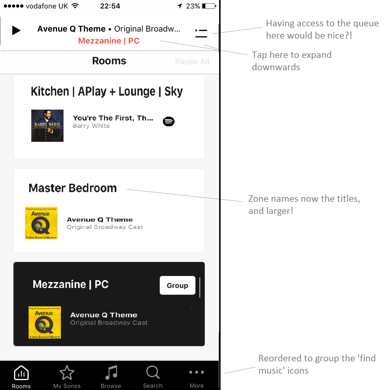
What does better actually look like?!
Ignoring the 'bright white' niggle, and the problem with having to scroll too much because of the amount of blank space... to me the changes in these screen shots would sort it out I think?
From the first time I saw it I like the 'quickly choose the rooms' thing from the bottom of the now playing screen. That's been missing for ages.
But the other niggles add up to something which is still hard work for me. I kind of like the above thread, but really we shouldn't need to be making excuses for Sonos not doing proper iterative user trials and a better job.
The counter-intuitive things (which I've tried illustrating by fixing them on the screenshots) mean it takes much much longer to develop new instincts of where to go.
My wife is still bamboozled and barely touching it. Kind of tragic.
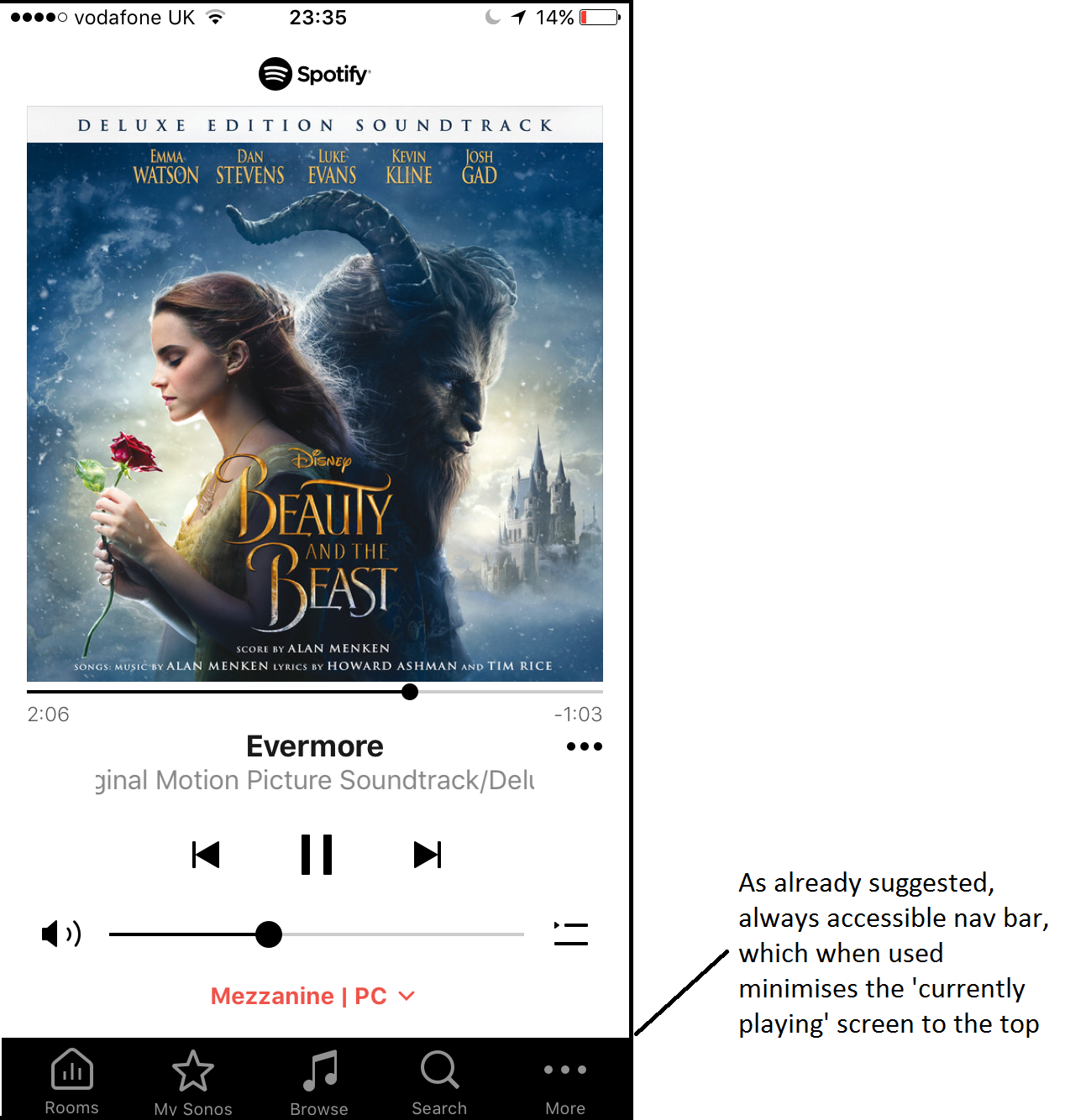
Come to think of it, if you tapped one of the icons on the navigation bar at the bottom time a second time, it could minimise the respective panel to redisplay the 'now playing' screen (i.e. which would expand down again from the top, and leaving the nav bar displayed as per the second 'screenshot'.)
Perhaps my inexperience as a UI designer is shining through.... but to my personal taste this would feel right - if only it could happen! The 'now playing' screen expanding down from the top, and the nav bar panels expanding from the bottom, would be intuitive reminders of where things are.
Having both the nav bar and the 'now playing' summary bar at the bottom is the root cause of most of the challenges imo.
Little details which might seem trivial to some but are nevertheless needlessly confusing.
Sorry if these posts take this thread off topic! Not too sure where to post them there are so many threads!
Exactly. And while I accept that for first world dwellers first world problems loom large because everyone needs their problems to do so, threatening to throw toys out of the playpen for something as trivial is childish. Particularly when there isn't an alternative that meets the feature set as a whole in a better way.
I am one of the people who are not happy with the new interface. My key criticisms are, that unlike the previous updates, this interface actually demands you concentrate on learning about it, and my children (8 &10), who both previously enjoyed their 3's, are now having trouble navigating intuitively in the interface.
Userlevel 7
 +17
+17
from https://en.community.sonos.com/controllers-software-228995/sonos-ios-update-is-shockingly-bad-first-impressions-6791365/index5.html#post16160283
@jgatie despite claiming 'not picking in you', here you are dragging my name into a topic I havent even posted in (until now). Apparently you consider me 'being one of the most vocal' and 'a good example of the phenomenon at work here' but the fact is I havent created a SINGLE topic amongst many many topics in the last weeks regarding the 8.0 interface, yet you see me as some kind of ambassador of hate. If you read my few contributions on any the 'negative' topics in the last few weeks I dont think any could be considered 'childish rants', 'undignified' or anything that I am remotely embarrassed about.
Also, for the record, I have never said the prior version was 'great' or 'easy' or held it in very high regard and nor have I written that I 'hate' this new one - just that the new version is, IMO, not an improvement over the old one and I am certainly not alone in that assessment. I am entitled to give that feedback without being jumped on as some kind of crazy anti sonos fanatic.
This is a Sonos community platform where Sonos encourage user dialogue and feedback and that is what many are giving - their displeasure with the new app. No one is 'right' or 'wrong' and this effort to single people out and 'shame' them for giving their opinion is counter productive at best. Sonos are not infallible and highlighting user concerns with the new app CAN lead to change as demonstrated here
https://en.community.sonos.com/controllers-software-228995/bring-back-album-art-in-the-queue-on-tablets-6571103/index1.html
Of course this is very much a 1st world problem but this community is designed to help users with their first world problems and suggest to Sonos their ideas to improve their first world speakers and software.
Lol, as I said.
Enter your username or e-mail address. We'll send you an e-mail with instructions to reset your password.