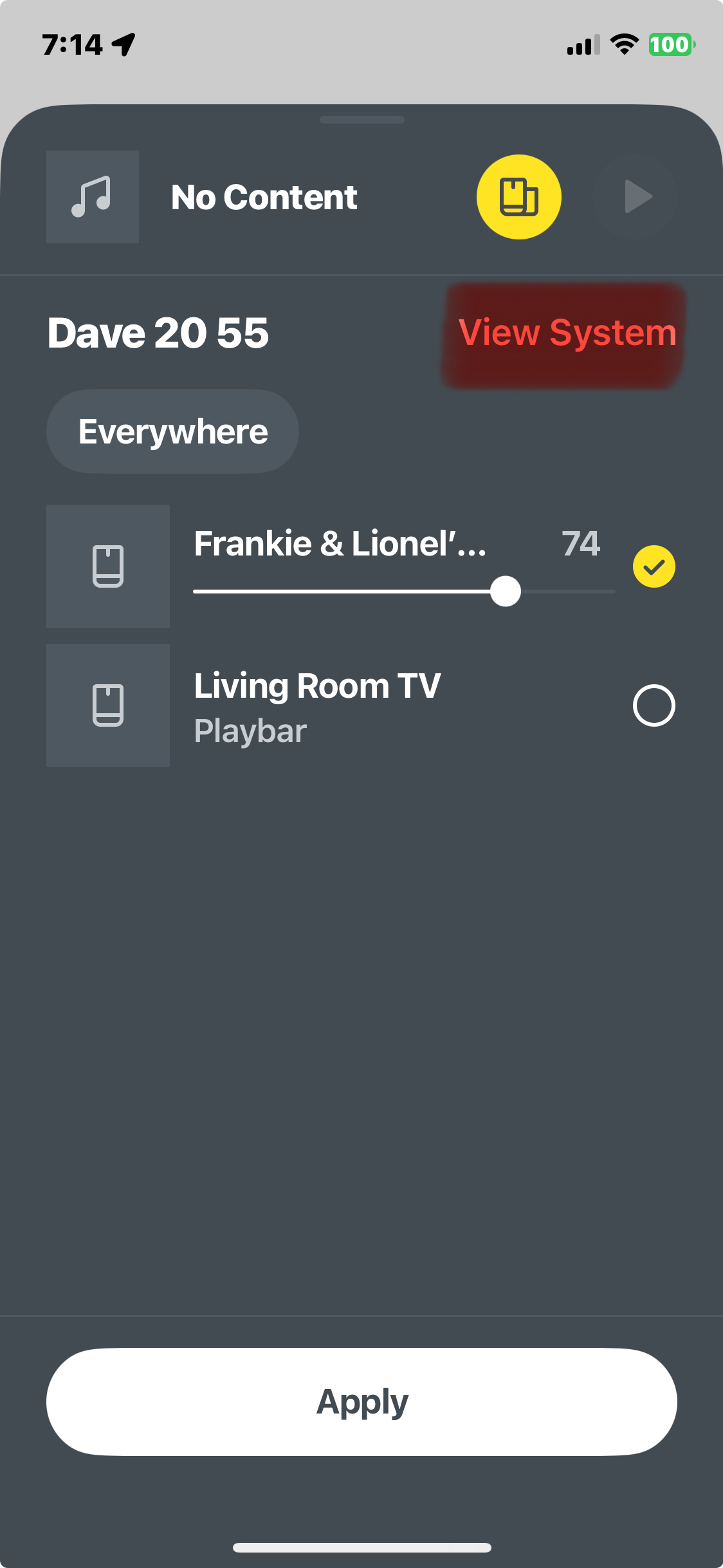
The new app would be greatly improved if the “View System” button actually looked like a button. Common feed back from my sonos clients is that it was not obvious that this is where you can zone your system.
Honestly it took me weeks to realise this myself. So much of my frustration in using this new version of app was the perceived difficulty zoning systems. Please make this obvious - it just looks like text - especially when it is right next to the system name which does nothing .
I’m so suprised that this has not been done or pointed out already as my clients always pose this question to me - especially people familiar with any of the other sonos versions


