

I was shocked, shocked I tell you, to discover the web app actually shows the queue.
Anyway, could you please remove the icons for the music service from them, the Apple red circle (and the YTM one) look terrible on the otherwise dark UX IMHO:
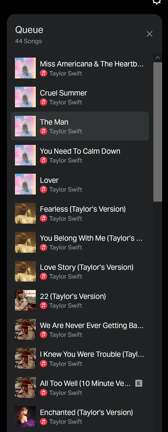
Also: I don’t care what music service they came from. If I need to know for some reason, I can look at the main Now Playing area (where it shows it with a subtle little Apple icon, not the garish red music service circle).