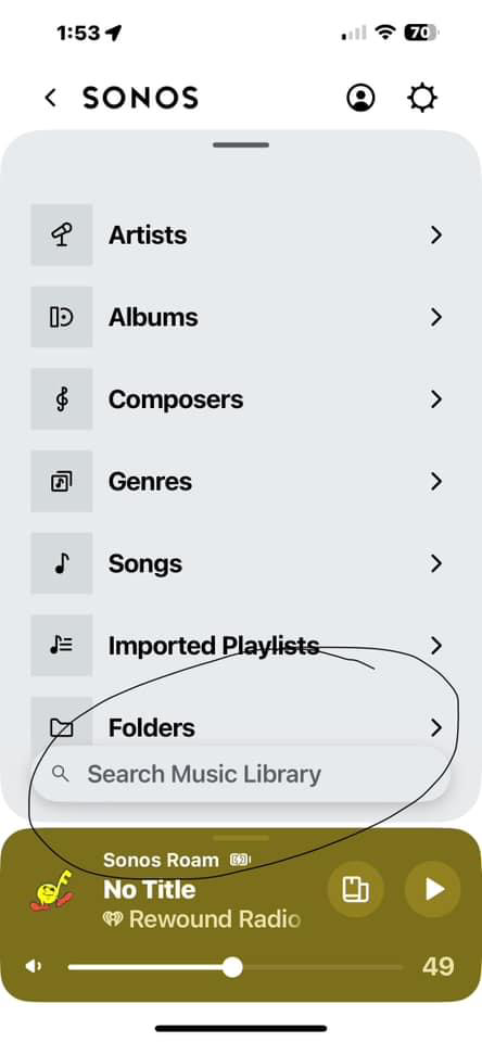
The latest Sonos iPhone app update (80.06.03) and the latest Sonos IPad app (in landscape mode) has an issue with an “overhang” of the “Search Music Library” box on top of the “Folders” button.
When I go to “Music Library” and then scroll down to “Folders” you can observe from the screenshot (from an Iphone 14 Pro Max) above that a “Search Music Library” button now overhangs the “Folders” tab. So if I try to click on “Folders” to navigate to my various music folders, it instead opens up the “Search Music Library” window.
Sonos needs to space this out correctly and leave some room between the two buttons.


