Hi all,

Firstly, yes I am aware of the boost blue dot issue, I've read the thread and am similarly frustrated by the activity. What I would like to know is if anyone else is experiencing issue with their back button?


Let me elaborate...I'm in the minority and use my system predominantly to stream locally stored music files. I view by folder (not artist or album) via the Android app because that is just how my brain is wired to function and up until the latest update I had no issues. However.…

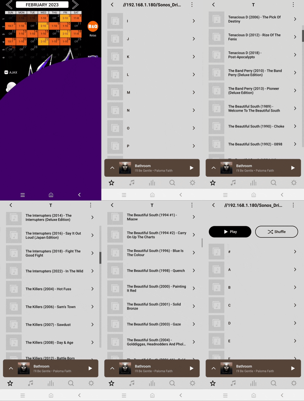
Since the new version dropped, whenever I press the back button to go back a folder level (my folders are organised into letters, then sub folders with artist-album), the list super-scrolls right to the top. It does this when backing out of a single album to the artist-album list, and also from the artist-album list to the list of letters. (For the love of god, if anyone is following what I mean, well done). This is super annoying if you are at the bottom of a long list, and only wanted to go to the previous entry.

Anyone else, or just me??

I don’t have my my music folders stored the same as you, mine is just in the ‘usual’ sequence of Artists/Albums/Tracks and when navigating the local library to ‘tracks’ (and returning back again), I see this. (See attached - here I’m using an iPad controller, but it’s the same on an Android tablet too).


I don’t have my my music folders stored the same as you, mine is just in the ‘usual’ sequence of Artists/Albums/Tracks and when navigating the local library to ‘tracks’ (and returning back again), I see this. (See attached - here I’m using an iPad controller, but it’s the same on an Android tablet too).

My behaviour when viewing the music library like that is the same as yours. However, could you do me a favour and go into “music library” and view “folders” (not “artists” or “albums”), get a few levels deep, including some scrolling, then back out and see what it does? 


It seems to just be working the same/similar - see attached. Sorry about the quality, but there’s an upload limit here for files here and I have to keep within that limit.


Odd. Do you have a phone to try it on rather than a tablet? The issue isn’t present on my Windows desktop controller, so it may be something to do with mobile UI?


This is what mine is doing


Yes, your interface is behaving strangely, it seems to be scrolling up. Have you tried a Sonos App reset from ‘App Preferences’?

After that, fully close and reopen the App and go through the usual opening screens and accept the T&C’s and connect back to the ‘existing’ system and just see if that resolves your issue. 

Already done all that malarky, as part of the “let’s try and solve the current Boost issue” trials and tribulations and sadly it made absolutely no difference!!

It might be a device specific software bug perhaps? It maybe best to submit a Sonos system diagnostic report from within the Sonos App and either note/post it’s reference back here and then contact/chat with Sonos Support Staff via this LINK  and see what the Staff can suggest to resolve the matter.


Diagnostic # 175519008

Will see if I can get anywhere with support, and will update if anything useful arises


So, after speaking to Sonos support over the phone, NOTHING useful has come of this. According to the representative, this is an intended behaviour that has been pushed ONLY to android mobile devices (not tablets, ONLY phones) in order to bring the UI more in-line with the iOS experience.

What I would LOVE is for someone to explain to me how this functionality improves my preferred search experience? Why couldn’t it have been a toggle in settings, or an overlay button? Why change the function of the “back” button? Someone, PLEASE, point a representative my way who can clue me in 😡 #NotHappyAt All


Agreed.  As someone that likes to sorth through several folders at a time to add songs to a playlist, I don’t want to start back at “A” every single time.


We browse our folder structure in similar way. This "fast auto scroll to Top" is VERY ANNOYING.

Sonos, please give us a way to disable!