UI icons are too small

  • 12 March 2022
  • 2 replies
  • 60 views

Userlevel 3
Badge +5

The icons in the UI are too small for human fingers.   


My observation is that many apps suffer this problem and it’s likely an Apple issue (please confirm whether Sonos can code these differently).   I suspect this mechanism is also psychological, as it requires a very careful finger touch and brain focus (ie: keep you focused and engaged).


Specifically, let’s take a look at an example, the elements at the top of the app:


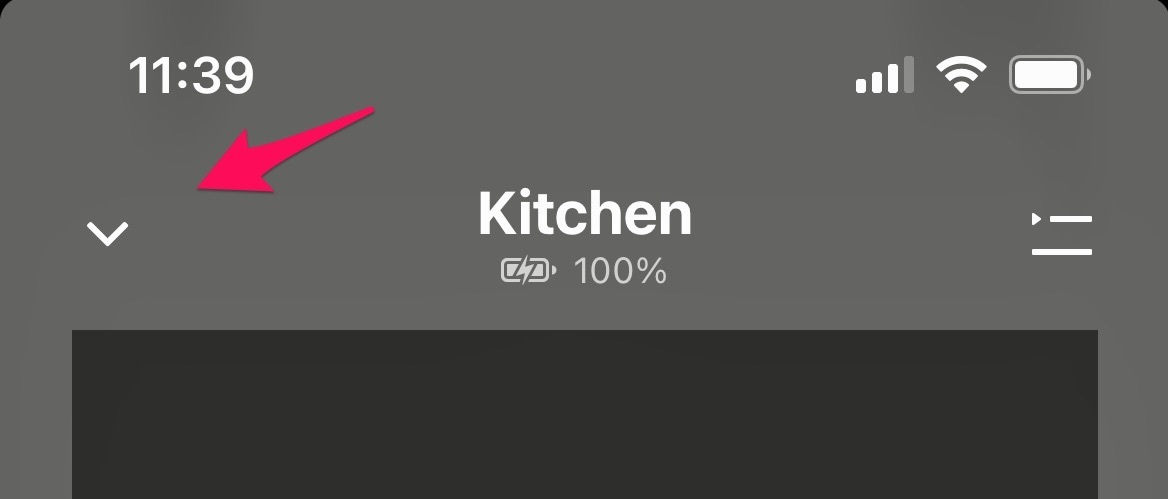
These UI elements are unrealistic for the human hand, at least for casual use.   Again, I’ve seen this problem in other apps, and I suspect a larger issue.  Feel free to change my mind.


Would Sonos please clarify the above?   Do you have the ability to override these unrealistically small UI elements?


2 replies

Userlevel 7

Your experience is not the norm for the vast majority of users. If you experience these issues with many different apps, more than likely it is a personal issue. Are your fingers larger than average? Do you have any visual impairments or physical disabilities? Have you looked at the Accessibility settings on your phone? Have you considered getting a phone with a larger screen?

The example you gave is not unrealistically small. The arrow icon is very responsive. You don’t even have to tap the arrow precisely to activate it.

I can sympathize. I have large hands and the active area for most symbols on most phone/pad Apps is too small. The current trend is to have large, numerous images and not much else visible. Lately the images are becoming larger and larger so that only one image is visible. Looks simple -- right? This annoys me because I must scroll forever in order to accomplish anything. The ‘>’ is often a single character link. The application designers could make the touch active area larger if they wanted -- without destroying their precious optics. Most desktop applications are not much better. I wish that the ‘>’ links were as large as “Buy Now” links.

I think that it’s a generational issue. As I observe the younger crew, they seem to be looking for pictures and excuses to stroke their pad/phone. In this context scroll forever is a great App feature.

Reply